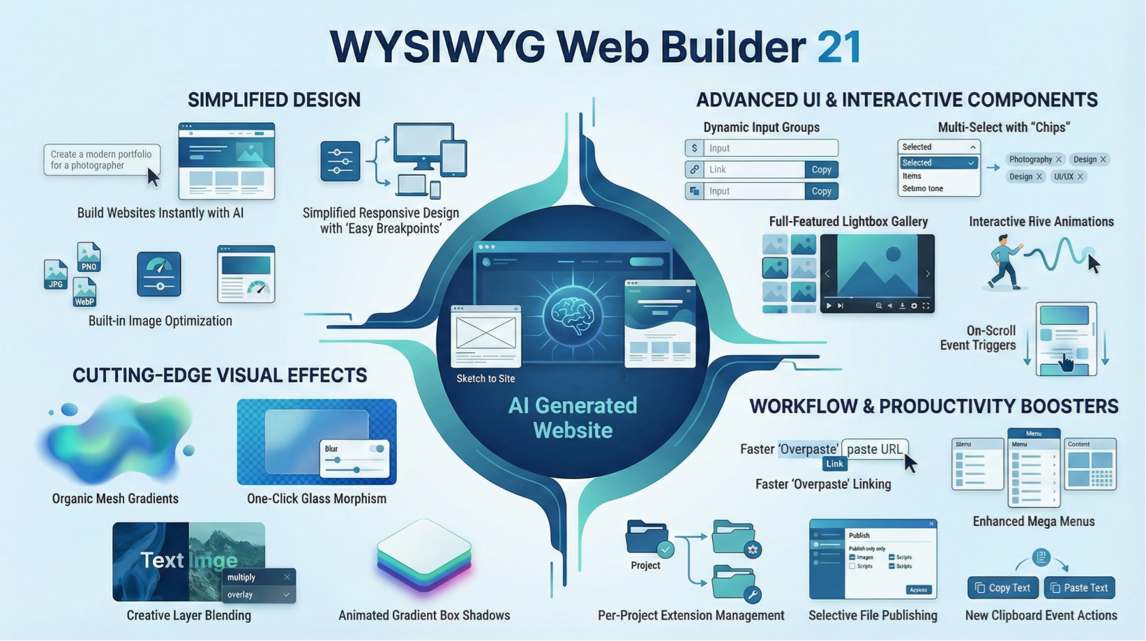
What is new in WYSIWYG Web Builder 21?
Welcome to WYSIWYG Web Builder 21, your next-generation toolkit for creating modern, powerful websites in 2026!
This release brings a wave of innovation, offering a polished interface, smarter workflows, and a wide range of brand-new features designed to boost creativity and productivity. Whether you re a seasoned designer or just getting started, you ll discover enhancements that make building professional-grade sites faster and more intuitive than ever.
Stay inspired. Stay ahead. Your best websites start here.
Easy Breakpoints
- New feature: Sometimes, when you want to make a web layout responsive / mobile friendly all you really want is to hide or show specific object, change the font size or use a different margin. In that case, adding breakpoints for the entire page may be overkill and difficult to maintain.
Introducing a simplified way to make specific objects responsive: Easy Breakpoints.

For most objects you can now simplify this task by using the new 'Easy Breakpoint' properties.
This is a single breakpoint where you can set some responsive properties just for that object, visibility, font-size, margin, padding or alignment.
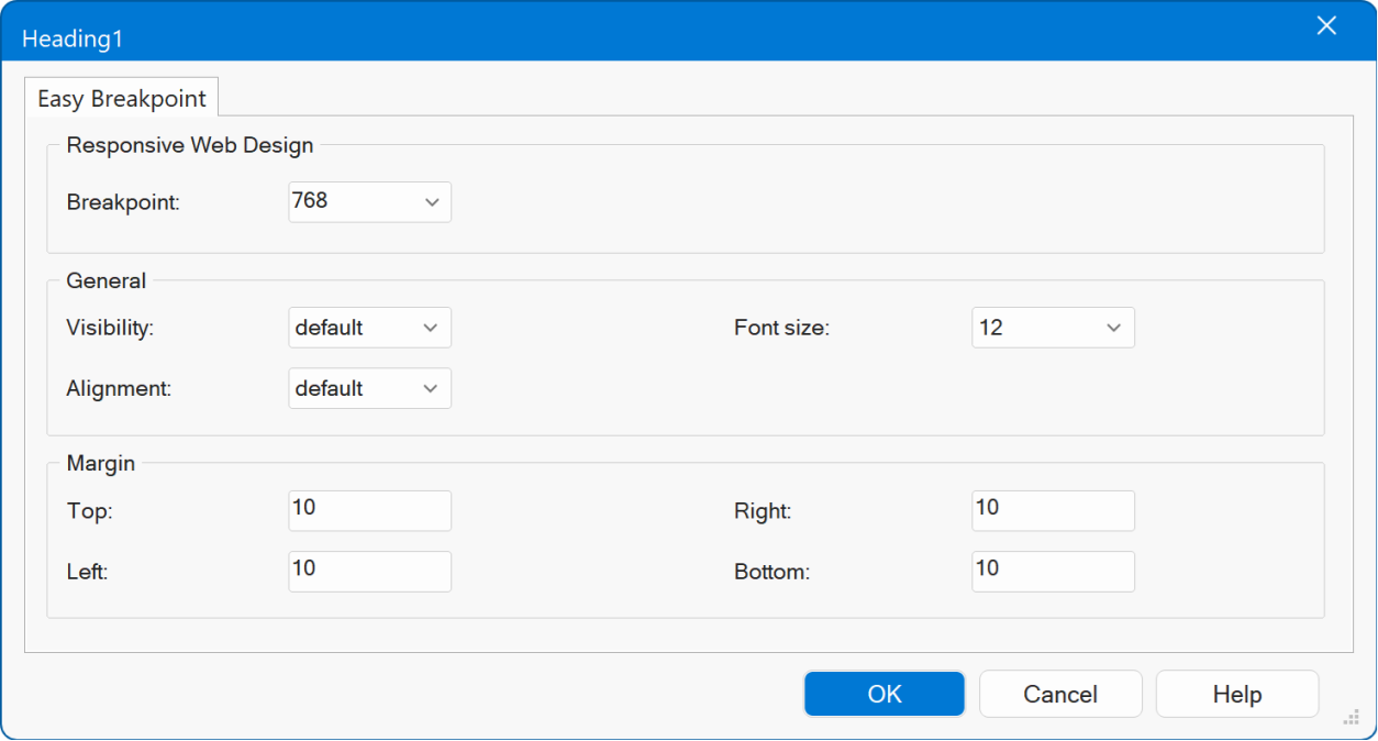
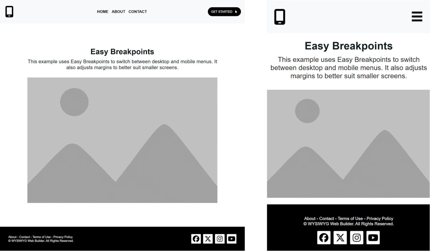
In the example below, we did not use any page breakpoints, but instead use Easy Breakpoint to set the responsive behavior for specific objects only.
Some objects also support additional, specialized options:
Photo Gallery: Set a different number of columns for the selected breakpoint.
Flex containers and Flex Grid: Stack content at the selected breakpoint and adjust column alignment (for example, centering content on mobile).
Demo
https://www.wysiwygwebbuilder.com/support/wb21tryouts/wb21_easybreakpoints.html
Online tutorial
https://www.wysiwygwebbuilder.com/easybreakpoints.html
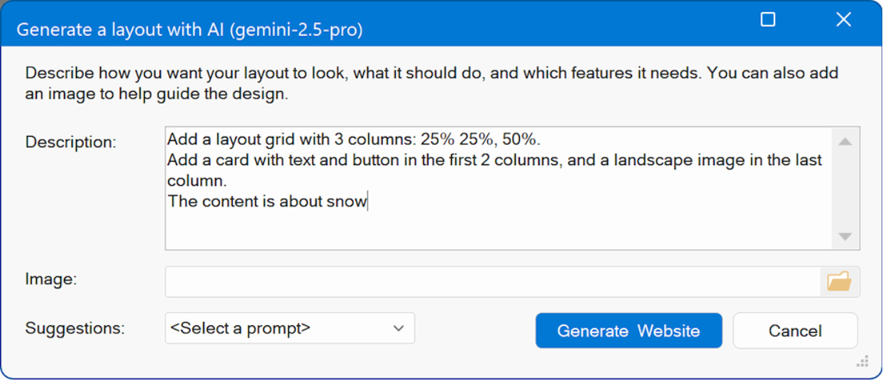
Text-to-Website / Image-to-Website with AI
- New feature: Added the ability to create a new website via text-to-website or image-to-website.
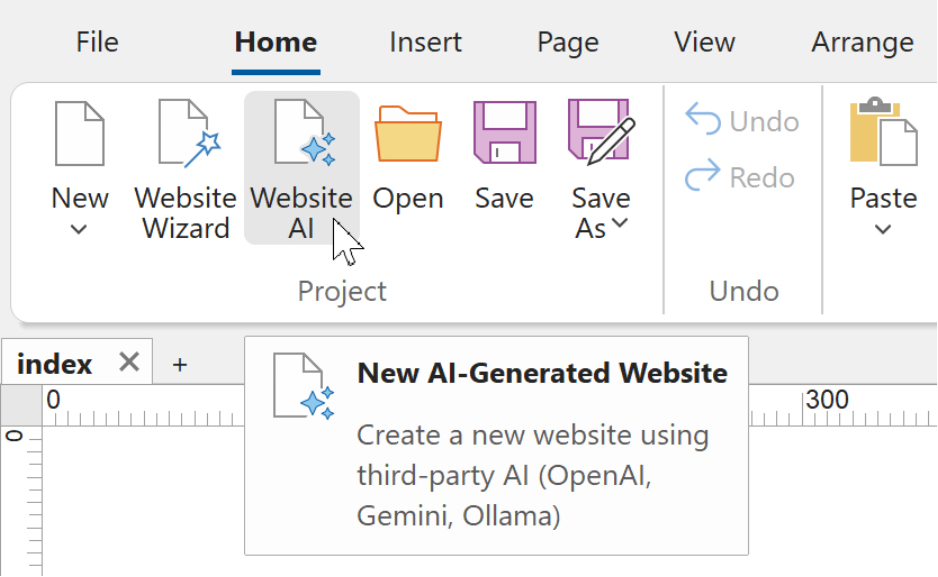
WYSIWYG Web Builder already offered several quick ways to start a new project, such as using Blocks, selecting a Template, or using the Website Wizard.
With this update, we are introducing an entirely new workflow: Website AI.
The new Website AI feature allows you to create a fully structured website using only natural-language instructions, powered by third-party AI providers such as OpenAI, Google Gemini, or Ollama (local, free).
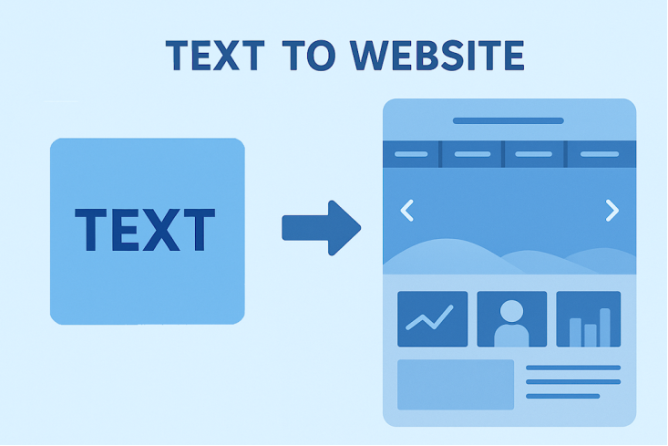
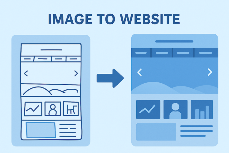
Simply describe the layout, content, colors, components, or overall design style you want. You can even upload an optional reference image, such as a sketch, wireframe, or mood board to guide the visual direction.
Once submitted, your description is sent to the selected AI model. The AI generates detailed layout instructions, which Web Builder uses to automatically construct a complete website based on your specifications.
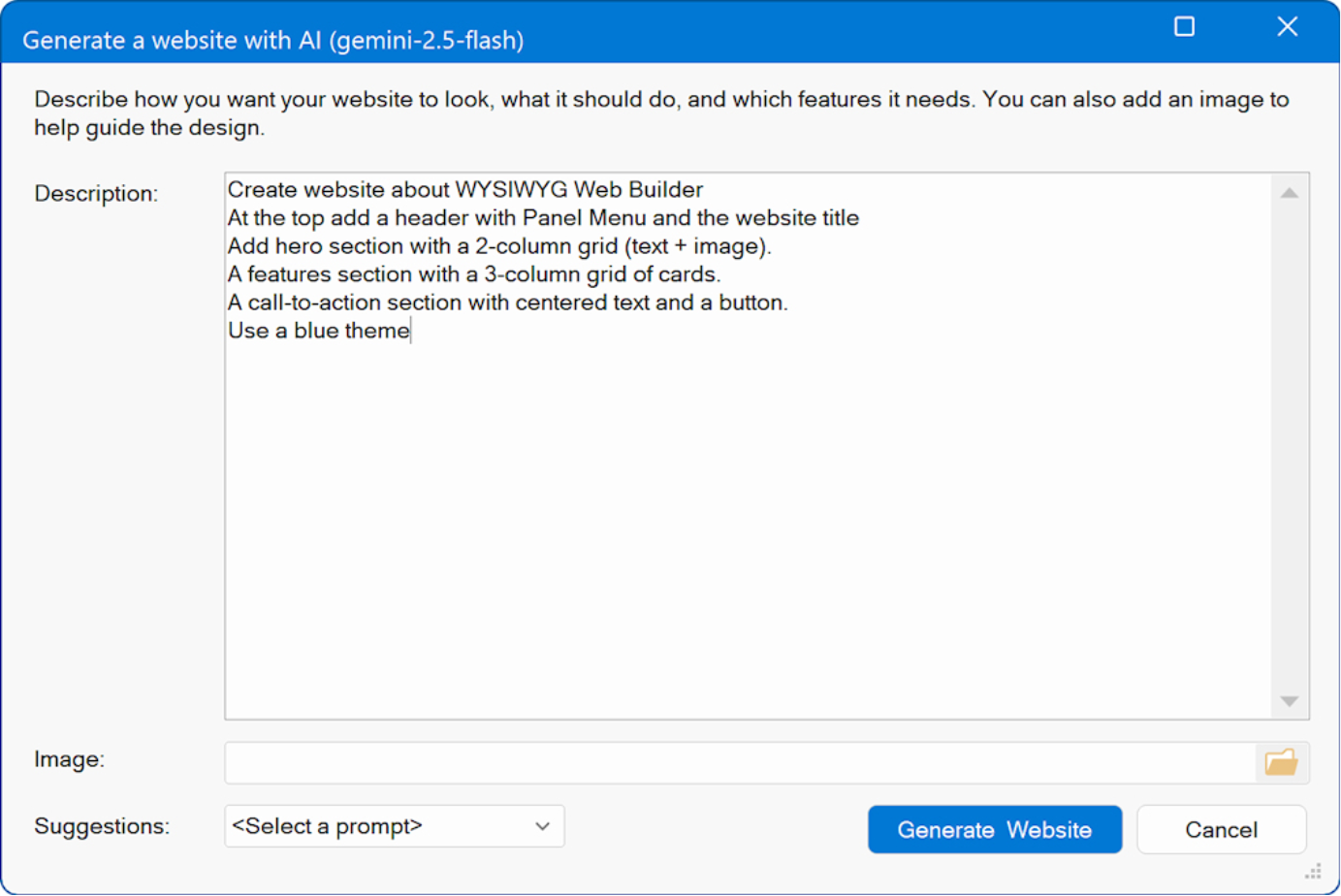
The generated website may include one or multiple pages, and supports a wide range of elements, such as:
Text blocks and headings
Image placeholders with different aspect ratios (16:9, 4:3, 3:2, 1:1 etc)
Layout grids
Cards and content sections
Buttons and interactive components
Navigation menus (single or multi-level) and links
Styling like font size, colors, backgrounds and borders
Forms with customizable fields
Custom scripts, JavaScript or PHP
More features will be supported in upcoming updates
This new tool enables designers, developers, and beginners alike to prototype full websites quickly, creatively, and without manual layout work all from a simple text description.
Online tutorial
https://www.wysiwygwebbuilder.com/aiwebsite.html
AI Layout
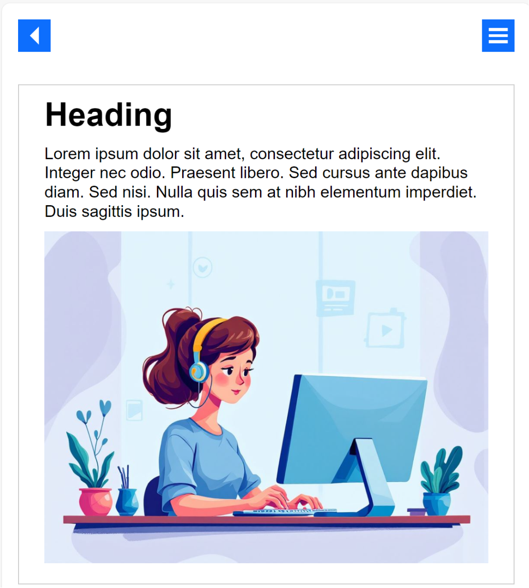
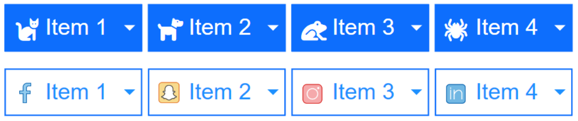
- New feature: A new AI Layout tool has been added, allowing you to generate AI-powered content directly inside an existing page.
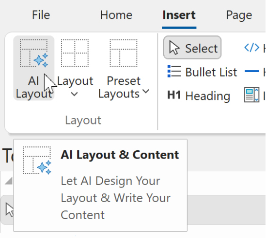
This feature works similarly to Text-to-Website and Image-to-Website, but instead of creating an entirely new site, it inserts the generated layout into the current page.
To use it, open any page and select Insert → AI Layout from the menu. The AI can create new sections, components, or layout blocks and seamlessly merge them into your existing design. This offers a fast and flexible way to expand your website with fresh content, such as hero areas, galleries, info sections, or forms.
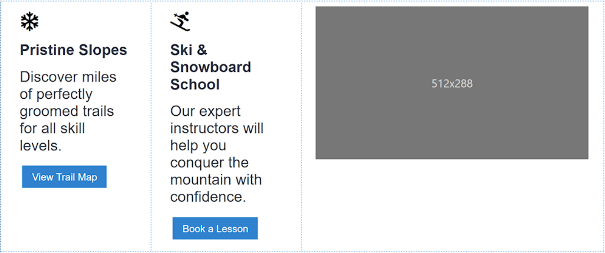
Prompt:
Create a button menu with an icon for each item, use the following menu items:
Programs,
Courses, Resources, About, Contact
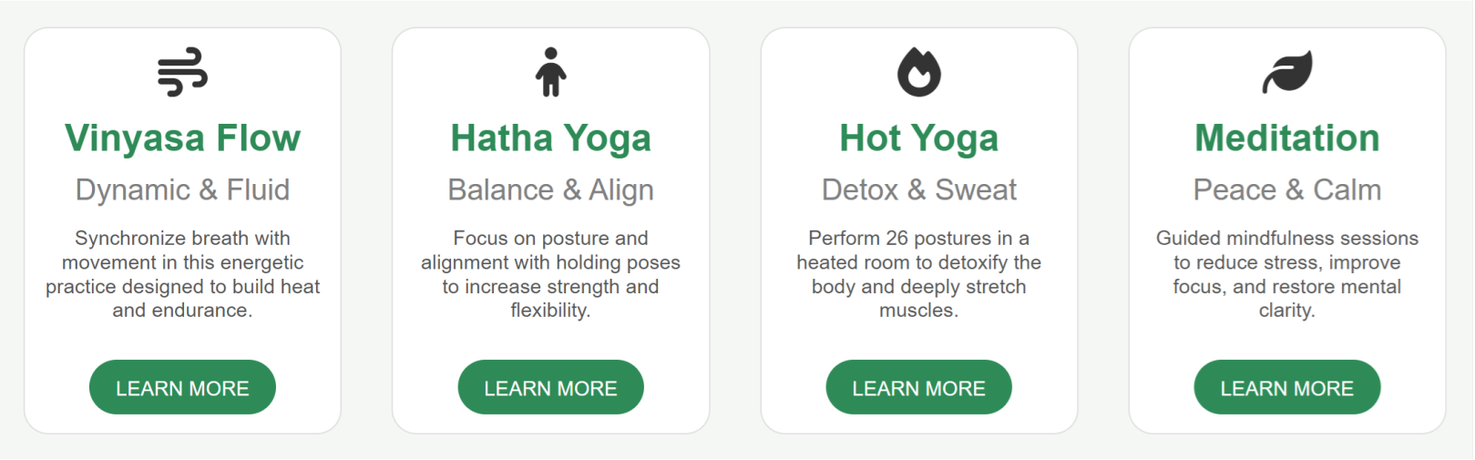
Prompt:
Create a layout grid with 4 columns for a Yoga website. Each column has a services card with title, subtitle, icon, description and a "LEARN MORE" button.
Prompt:
Create a contact form for a Yoga website. The form should have input fields for name, email, message, birthday and gender selection.
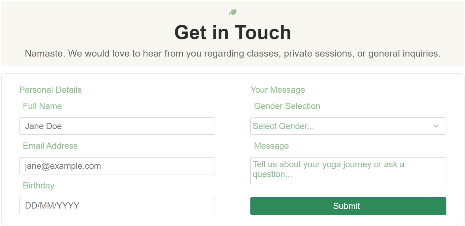
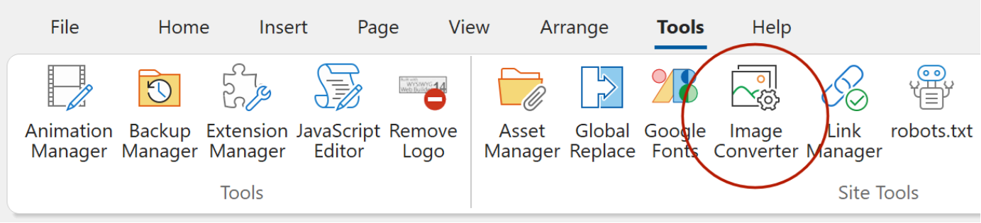
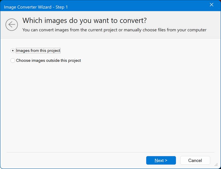
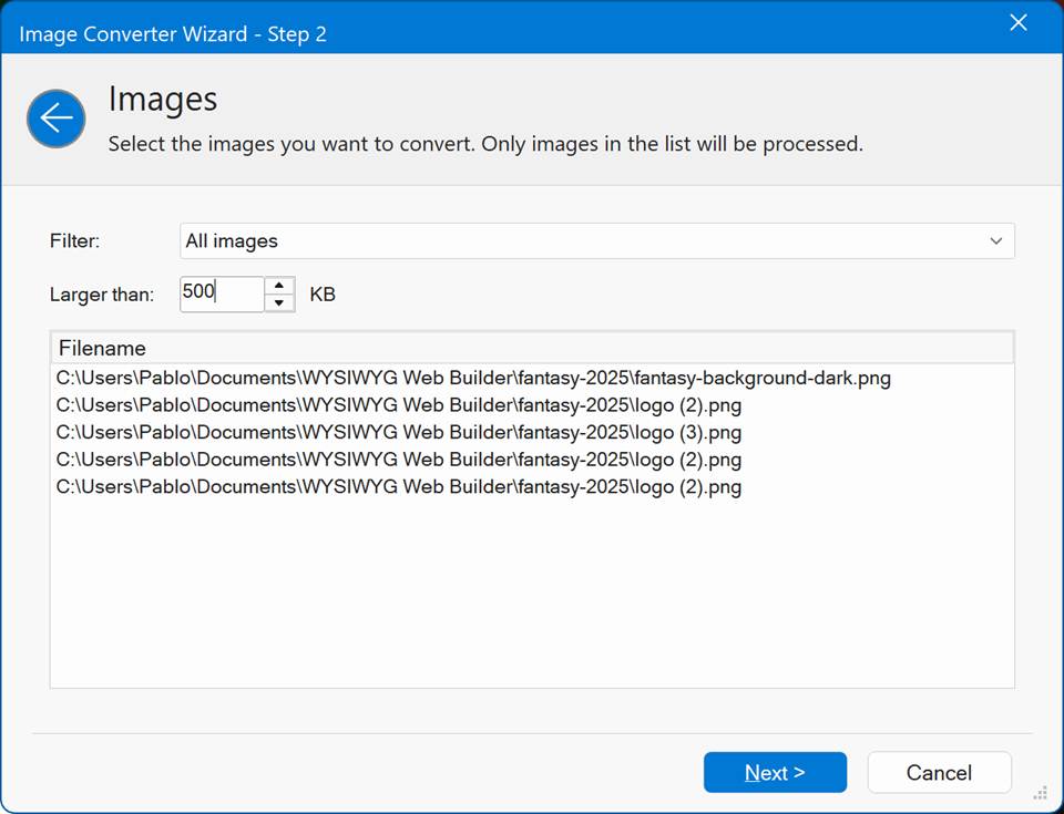
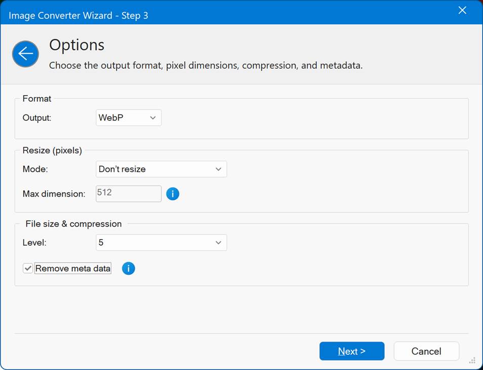
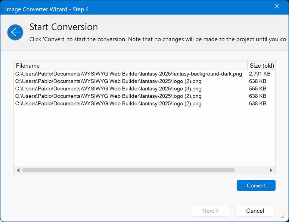
Image Converter
- New feature: Added 'Image Converter' tool. The Image Converter is a new wizard that can be used to convert or compress images used by the project, but it also be used for external images!
Convert to jpg, png or webp format, set the maximum image dimensions and / or use compression to shrink the size of the images. It is also possible to remove meta data. When the tool is used for images used by the project, you can first preview the result before applying the new images to the project (automatically).
Online tutorial
https://www.wysiwygwebbuilder.com/imageconverter.html
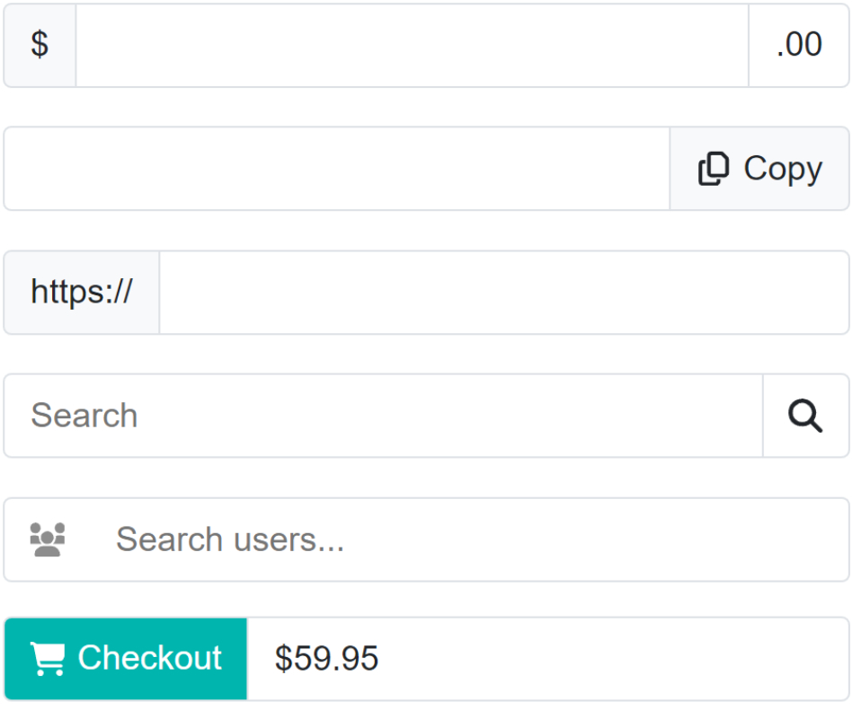
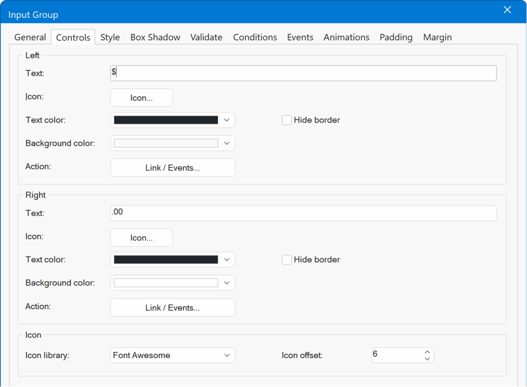
Input Group
- New feature: Added 'Input Group' object. An Input Group functions like a standard input/edit box but provides additional flexibility. It allows you to place text, icons, or buttons on either side or both sides of the input field. This is useful for:
Adding contextual labels such as $, https://, or kg
Displaying icons to provide visual cues
Adding buttons that act as links or trigger actions ( copy, paste, search, etc.)
Demo
https://www.wysiwygwebbuilder.com/support/wb21tryouts/wb21_inputgroup.html
Online tutorial
https://www.wysiwygwebbuilder.com/inputgroup.html
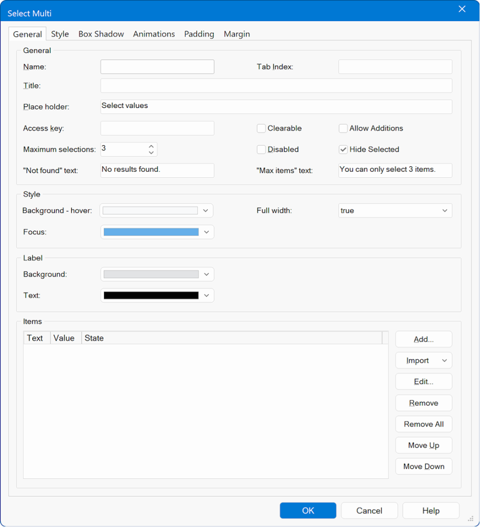
Select Multi
- New feature: Added 'Select Multi' object. A searchable multi-select combobox with removable labels ( chips ), keyboard support, and an optional clear action.
Choose multiple values from a searchable dropdown. Selected items appear as removable labels. Supports keyboard navigation (↑/↓, Enter), Esc to close, and Tab to commit/close.
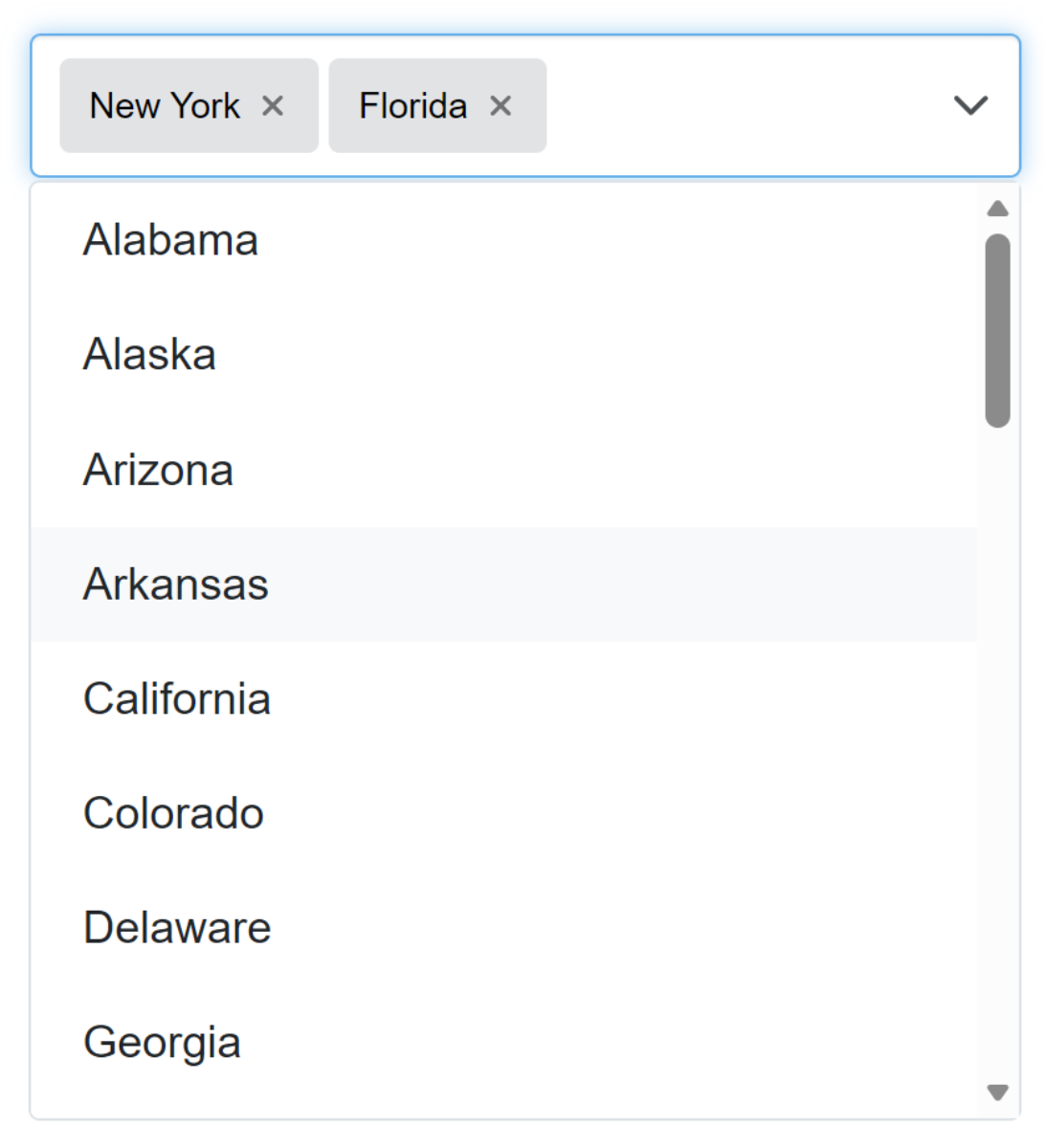
Optional features include a clear button, max selection limits, hide selected in the menu and user additions.
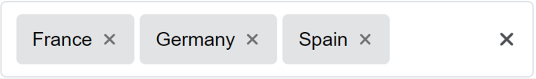
The Select Multi component provides all the standard features of a regular Select control, such as setting the name, title, tab index, placeholder, access key, and managing the list of items (add, edit, remove, import, but also includes enhanced options specifically designed for multi-selection behavior.
Demo
https://www.wysiwygwebbuilder.com/support/wb21tryouts/wb21_selectmulti.html
In addition to basic selection features, Select Multi allows you to customize how selected items ( chips ) behave and how the dropdown list responds. These extended options include:
Clearable
Allows users to remove all selected values with a single clear action.
Allow Additions
Enables users to enter and add custom values that are not already in the list.
Hide Selected
Removes already selected items from the dropdown list so users only see unselected options.
Maximum Selections
Limits the number of items a user can select; once the limit is reached, selection is restricted and a custom Max items message can be displayed.
Custom Messages
Define the text shown when no results are found or when the selection limit is exceeded.
Online tutorial
https://www.wysiwygwebbuilder.com/selectmulti.html
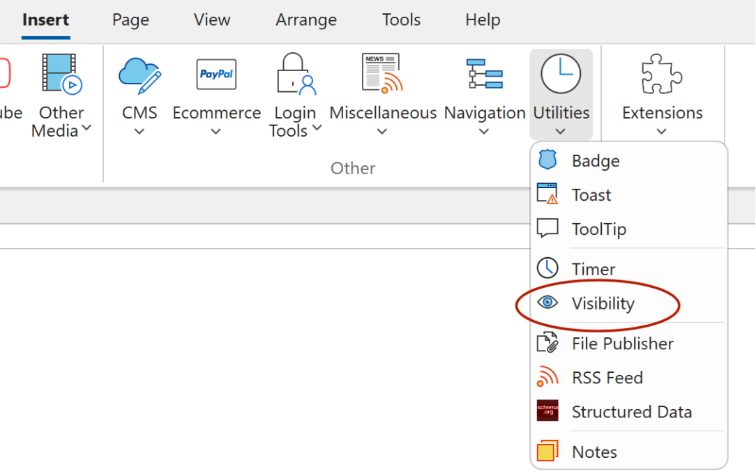
Visibility
- New feature: A powerful utility for monitoring an element s position within the viewport. The Visibility object provides a set of events that make it easy to trigger actions based on how an element enters or leaves the visible area of the screen.

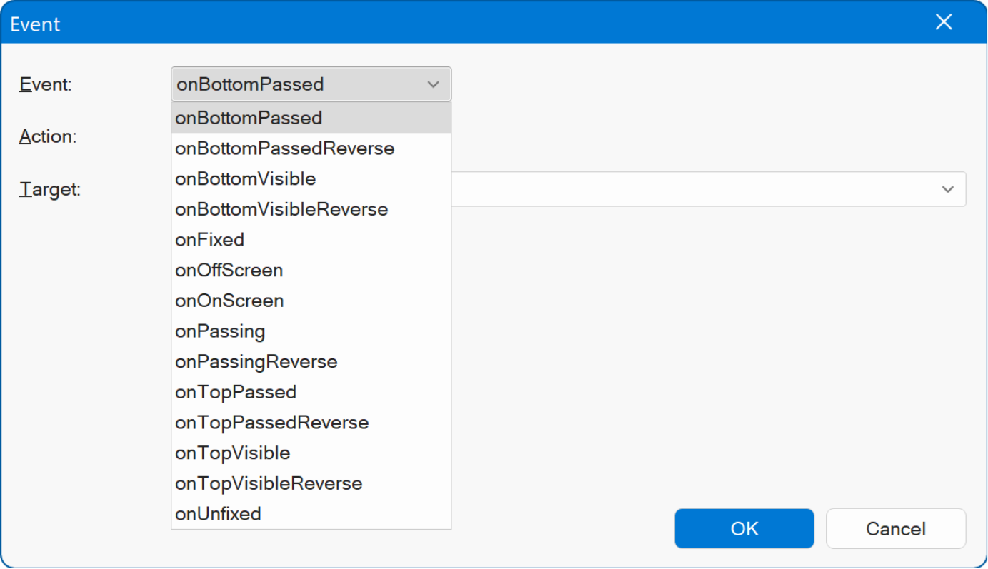
onOnScreen Triggered when any part of the element is within the current scroll viewport.
onOffScreen Triggered when no part of the element is visible in the viewport.
onTopVisible Triggered when the top edge of the element passes the bottom edge of the viewport.
onBottomVisible Triggered when the bottom edge of the element passes the bottom edge of the viewport.
(and more...)
These events can be used to build interactive experiences, such as showing or
hiding elements, starting or stopping media playback, or applying dynamic style
changes.
Additionally, the Visibility object includes an option to fix an element s position, so it remains visible in the viewport when it is about to scroll out of view.
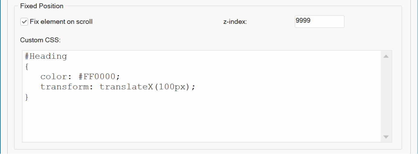
You can apply custom CSS to define how the element should appear in its fixed state, for example, repositioning it or applying alternative styles.
Demos
https://www.wysiwygwebbuilder.com/support/wb21tryouts/wb21_sticky.html
https://www.wysiwygwebbuilder.com/support/wb21tryouts/wb21_visibility.html
Online tutorial
https://www.wysiwygwebbuilder.com/visibility.html
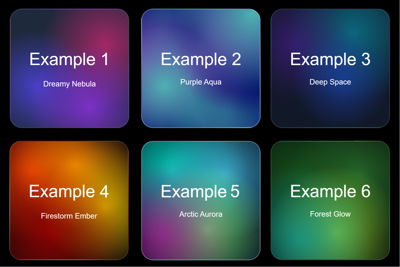
Mesh Gradients
- New feature: Added a new background type: Mesh Gradients. A mesh gradient is a soft, colorful background where several colors melt into each other not just in a straight line or perfect circle, but organically across the whole area.
Looks modern and organic compared to plain linear or radial gradients. Great for hero sections, website backdrops or other backgrounds.
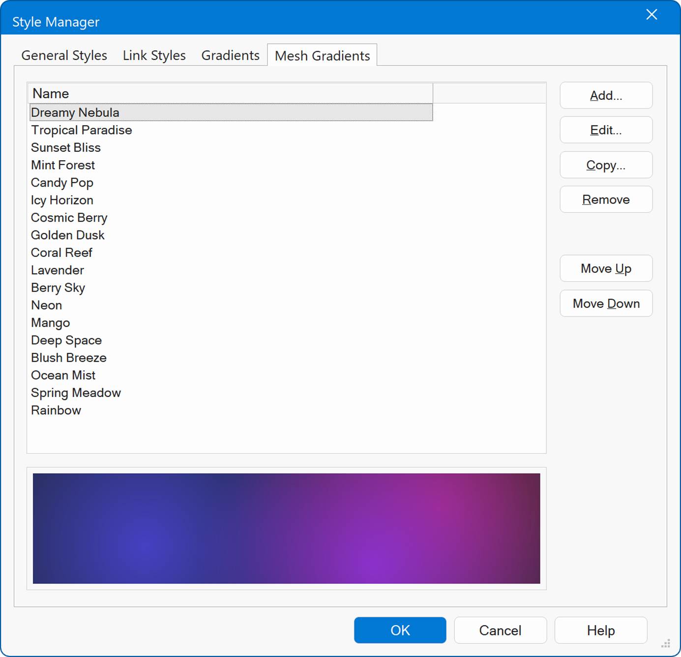
Each point has a color, size/strength, and opacity. Move the points around and the blend changes colors pull toward their points like soft lights.
Demo
https://www.wysiwygwebbuilder.com/support/wb21tryouts/wb21_meshgradients.html
Online tutorial
https://www.wysiwygwebbuilder.com/gradients.html
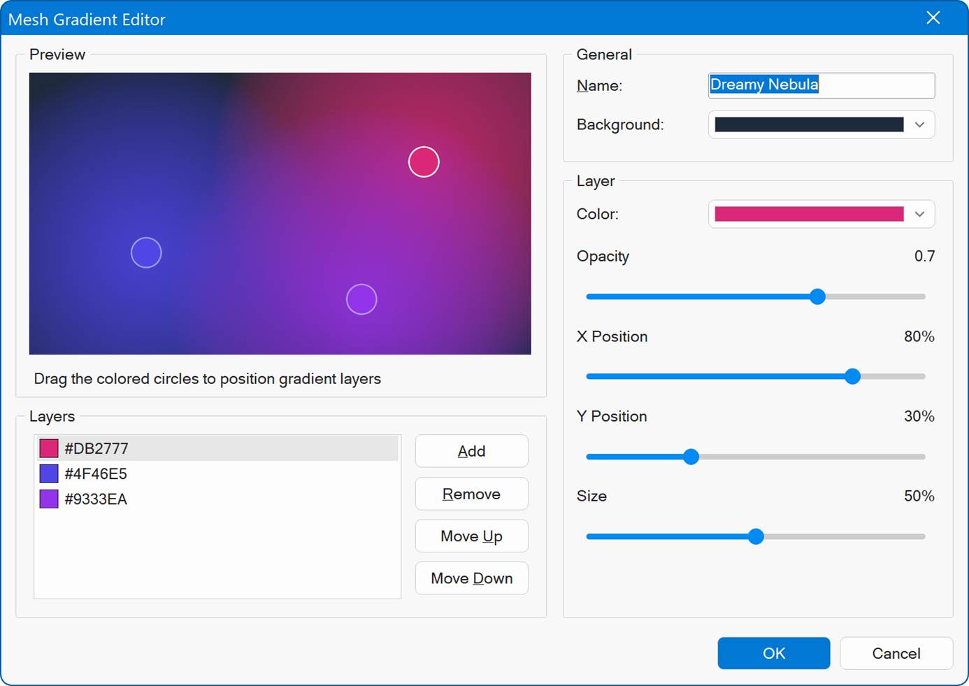
There are 25 predefined mesh gradient, but you can also create your own variants with the new Mesh gradient editor.
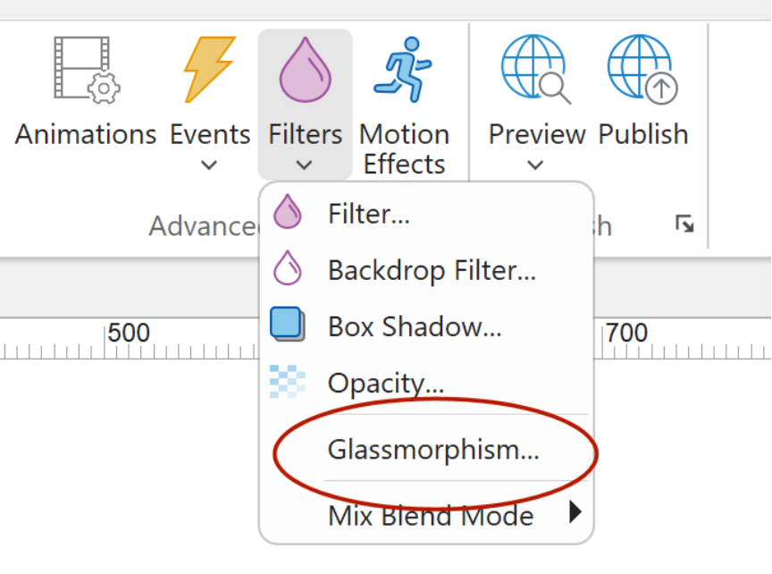
Glass morphism
- New feature: Glass morphism. Added an easy way to add Glass Effects to objects. Although it was already possible to create this effect, previously you had to adjust the settings in different parts of the properties. Now the properties that control the glass effect are grouped in one place. Glass morphism options control: background color, transparency, outline and backdrop blur.
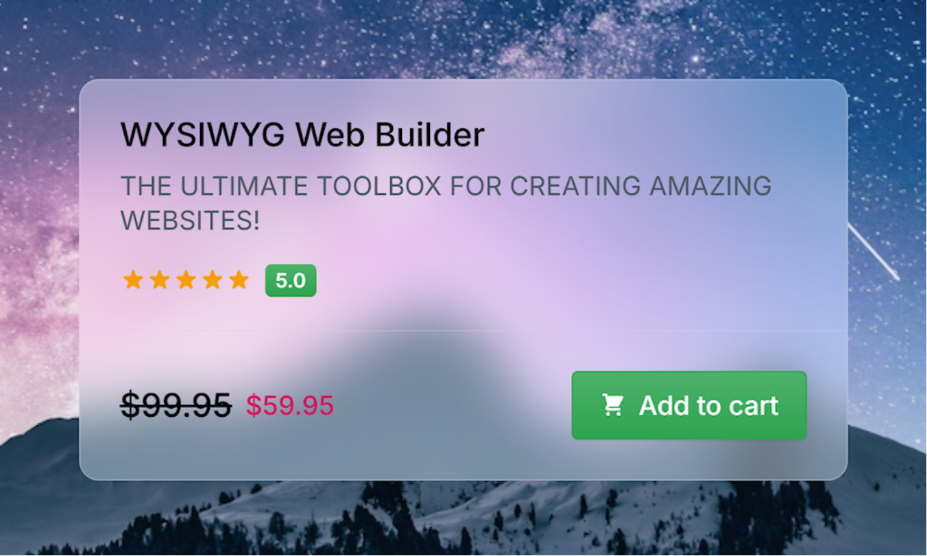
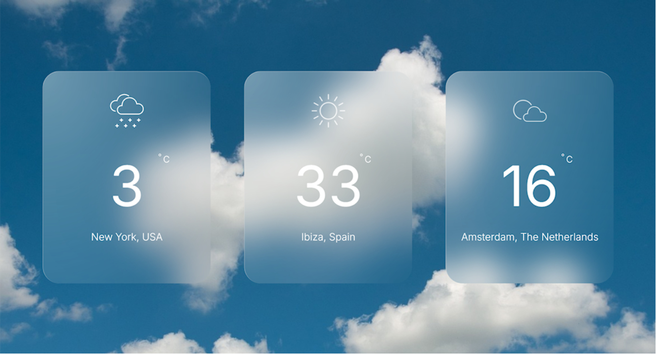
Demos
https://www.wysiwygwebbuilder.com/support/wb21tryouts/wb21_glasscard.html
https://www.wysiwygwebbuilder.com/support/wb21tryouts/wb21_weather.html
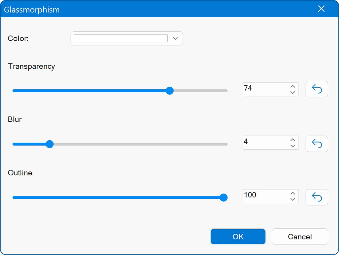
Color
Choose the base background color for the glass effect.
Transparency
Controls how transparent the glass surface is.
Blur
Defines the intensity of the backdrop blur, the amount of frosted glass effect applied to whatever is behind the element.
Outline
Controls the strength of the outline or border around the glass element.
Online tutorial
https://www.wysiwygwebbuilder.com/glassmorphism.html
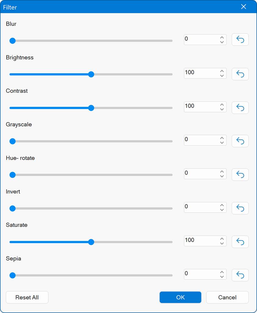
Filters
- New feature: Added filter and backdrop-filter properties. These properties were previously tucked away under the transition settings, making them harder to access. They are now also available as standalone, easily adjustable settings for more direct control.
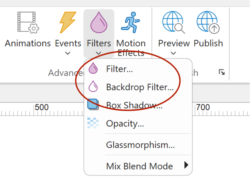
Demo
https://www.wysiwygwebbuilder.com/support/wb21tryouts/wb21_filters.html
Online tutorial
https://www.wysiwygwebbuilder.com/filters.html
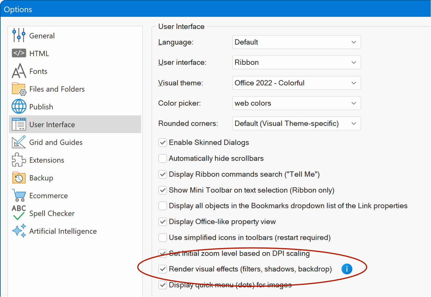
- New feature: The workspace now renders visual effects like back drop filters and filters in the workspace.
- New feature: Added 'Render visual effects' (filters, shadows, backdrop) in Tools -> Options -> User Interface. This can help to improve performance on slower computers.
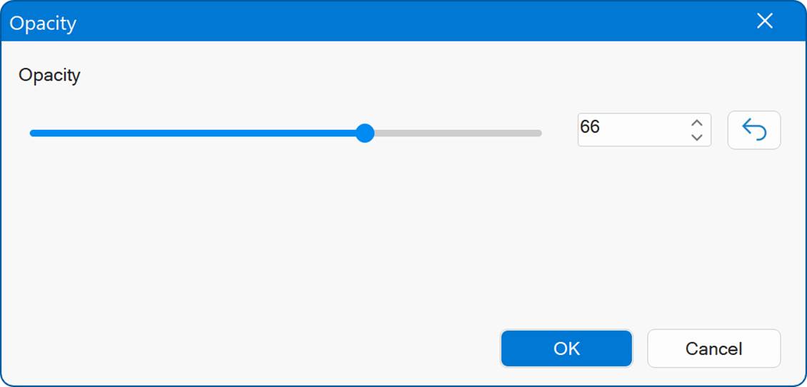
- New feature: Added 'Opacity' properties to Filter menu. This is a quick way to set the opacity / transparency of the selected object.

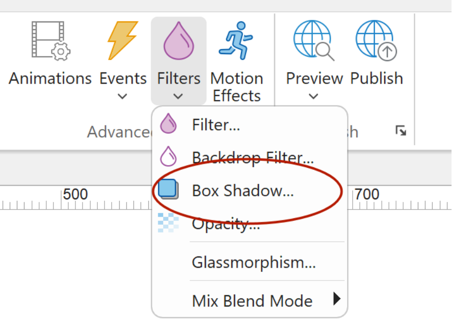
Box Shadow
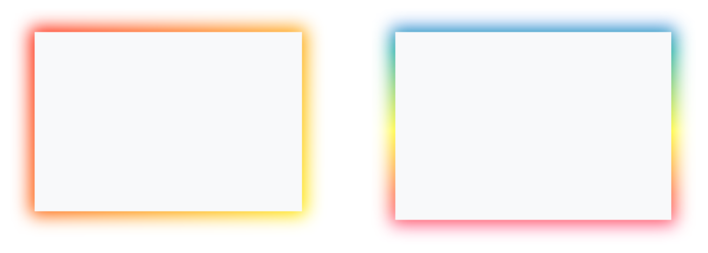
- New feature: Added 2 new box shadow types: Gradient and Multi-color Gradients. Add more color to your layout with fancy gradient shadows. Gradient shadows can also be animated: rotate, pulse, flash, heartbeat and vanish.
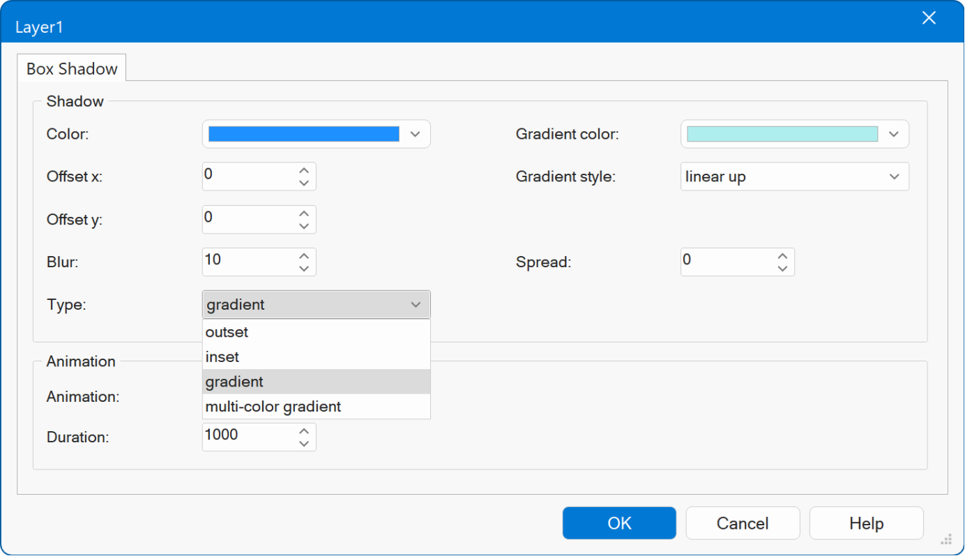
Note that some HTML elements do not support this. For example: Inline frames, and objects with a scrollbar because in that case the content is clipped so the shadow cannot be rendered outside the container.
Demo
https://www.wysiwygwebbuilder.com/support/wb21tryouts/wb21_boxshadow.html
- New feature: Added 'spread' option to box shadow properties. This option specifies how much the shadow expands or contracts.
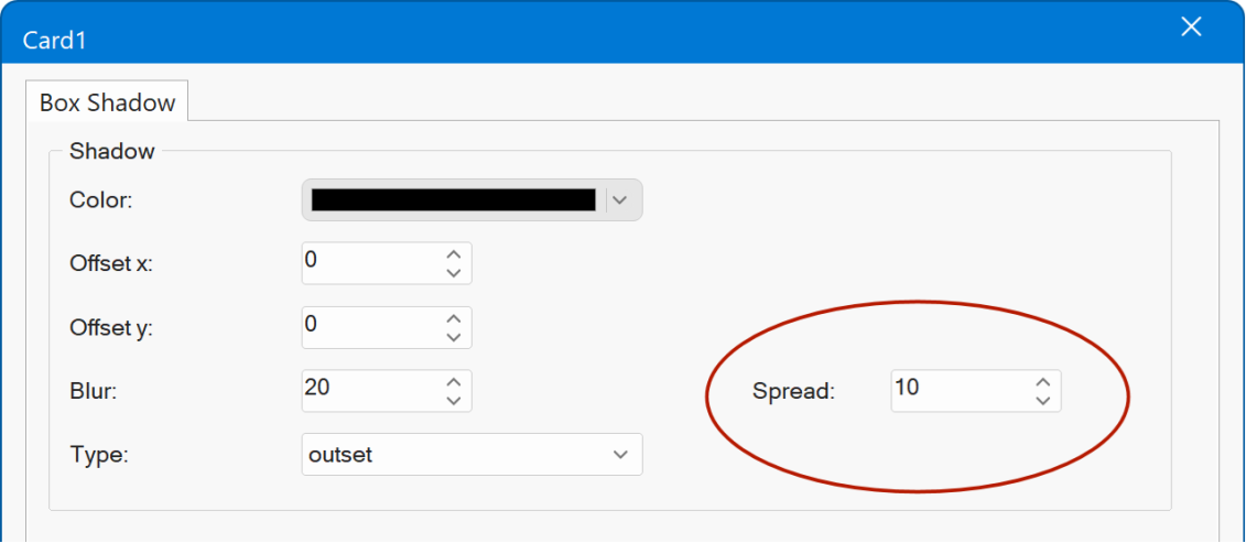
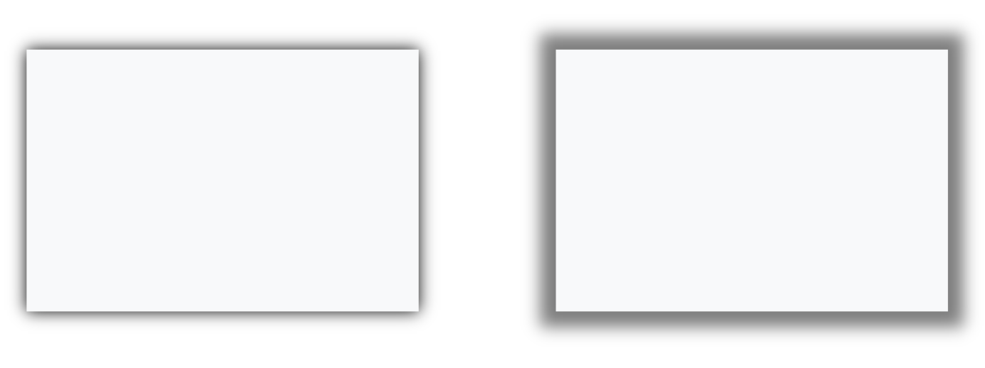
This can also be useful to add an extra border around an object.
Example: an object with an inner and outer border, created using a standard border and box shadow s spread (blur = 0)
- New feature: Added 'Box Shadow' option to Filter menu. This is a quick way to set the box shadow of the selected object.
- New feature: Added support for box shadow to File Input, Radio Button, Checkbox, Login/Signup/Change Password/Password Recovery, Rollover Image, Rollover text, Date Picker (inline), RichText Area, Accordion, Tabs, Breadcrumb, Dropdown Menu, Go Menu, Navigation Bar, Pagination, Responsive menu, Site Tree, Table of Contents , Slide Menu, PayPal buttons, CMS label, CMS view
Online tutorial
https://www.wysiwygwebbuilder.com/boxshadow.html
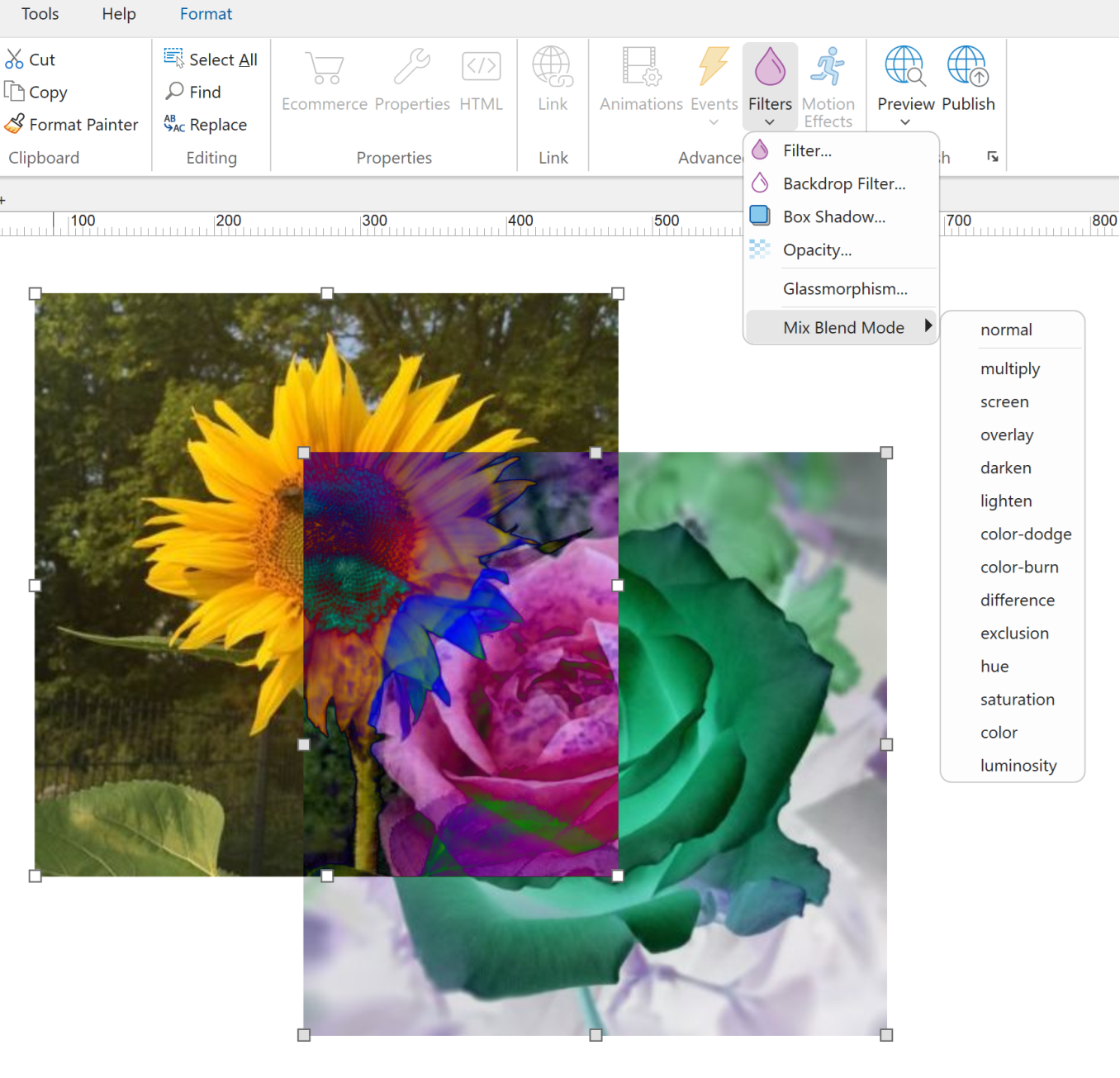
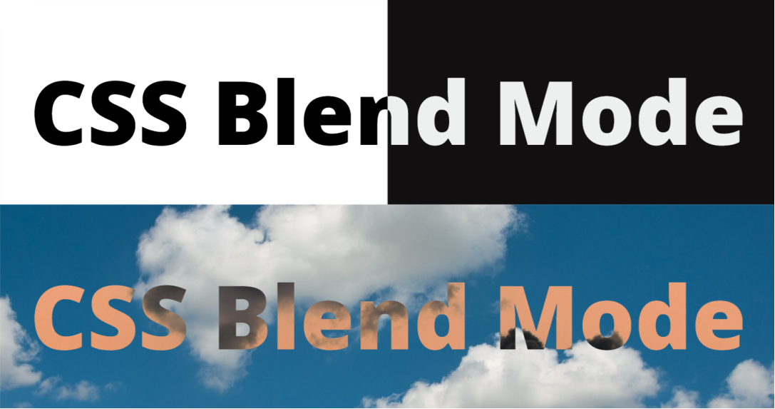
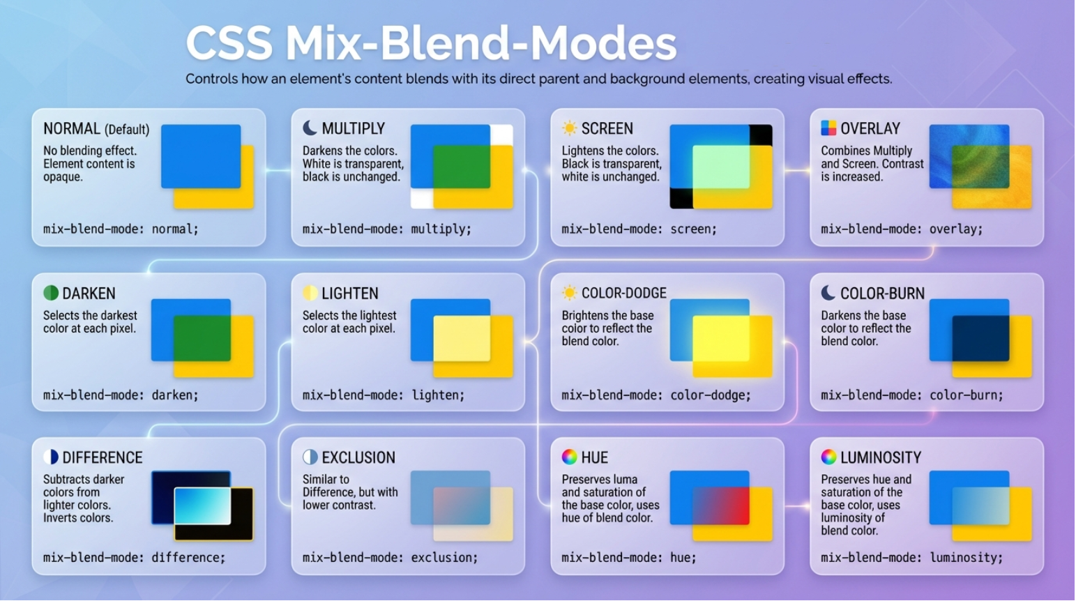
Creative blending effects with mix-blend-mode
- New feature: Added support for mix-blend-mode. You can now choose how objects visually blend with their background. This makes it easy to create striking effects such as Multiply, Overlay, Difference, or Exclusion giving your designs a more polished, professional look with just a few clicks. For example, you can use mix-blend-mode to create cutout/knockout text.
Demo
https://www.wysiwygwebbuilder.com/support/wb21tryouts/wb21_mixblend_marquee.html
Online tutorial
https://www.wysiwygwebbuilder.com/mixblendmode.html
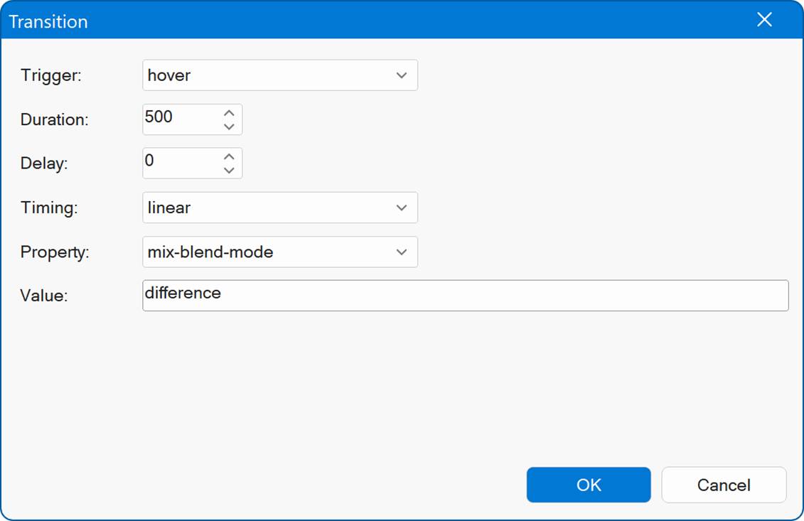
- New feature: Added 'mix-blend-mode' support to transitions and animations. This can be useful, for example, to change the mix-blend-mode on hover.
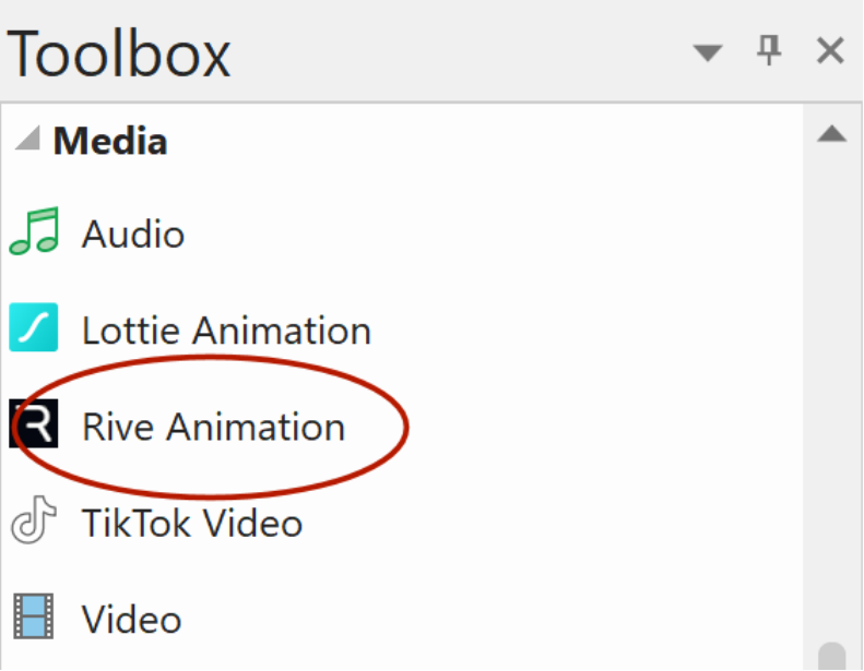
Rive Animations
- New feature: Added a new Rive Animations object that lets you easily integrate real-time, interactive Rive animations into your projects.
A Rive animation is an interactive, vector-based animation created with the Rive design tool. Unlike traditional animations, Rive lets designers build real-time, responsive animations that can react to user input (like clicks, taps, or game logic). They re lightweight, can run in apps, games, or on the web, and are often used for UI animations, icons, characters, and interactive effects.
Rive is seen as Flash's spiritual successor, but with a more dynamic approach.
Rive is similar to Lottie in purpose but different in power while Lottie plays pre-rendered motion graphics, Rive runs a real-time animation engine that supports dynamic interaction and state-driven animation logic.
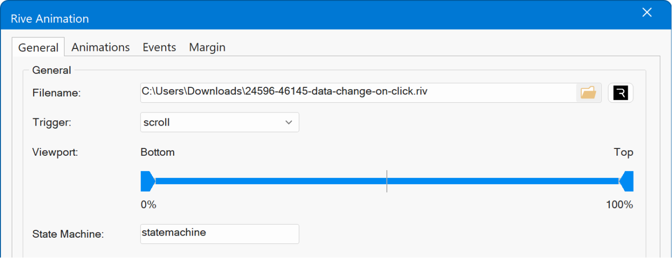
Animations can be triggered on page load, hover, click, scroll, or through events.
Online tutorial
https://www.wysiwygwebbuilder.com/riveanimation.html
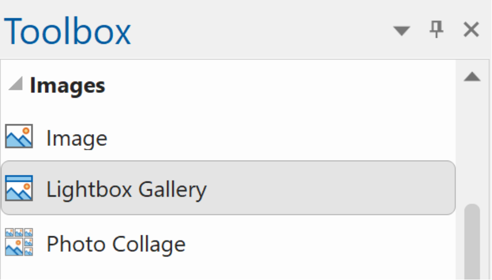
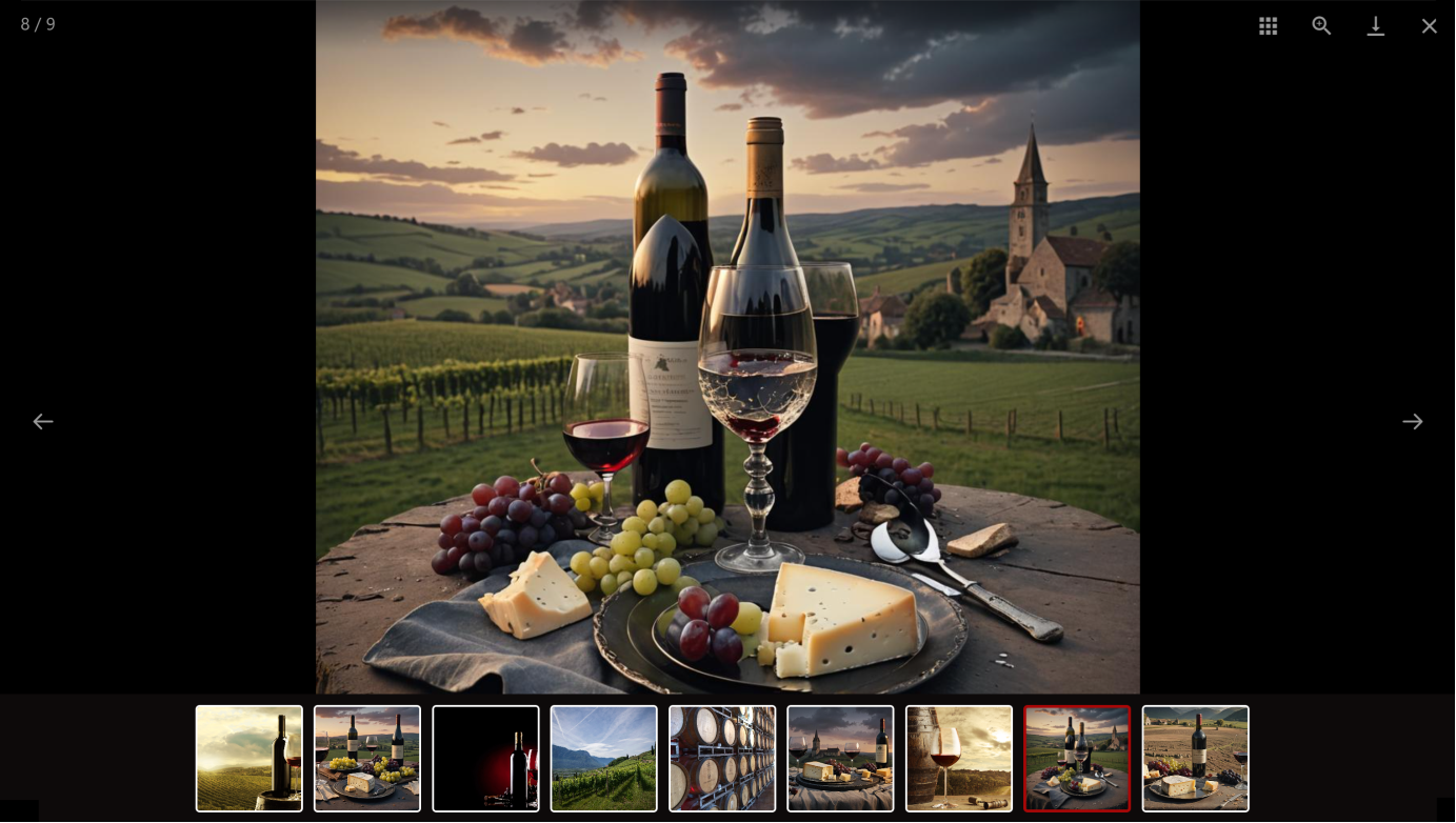
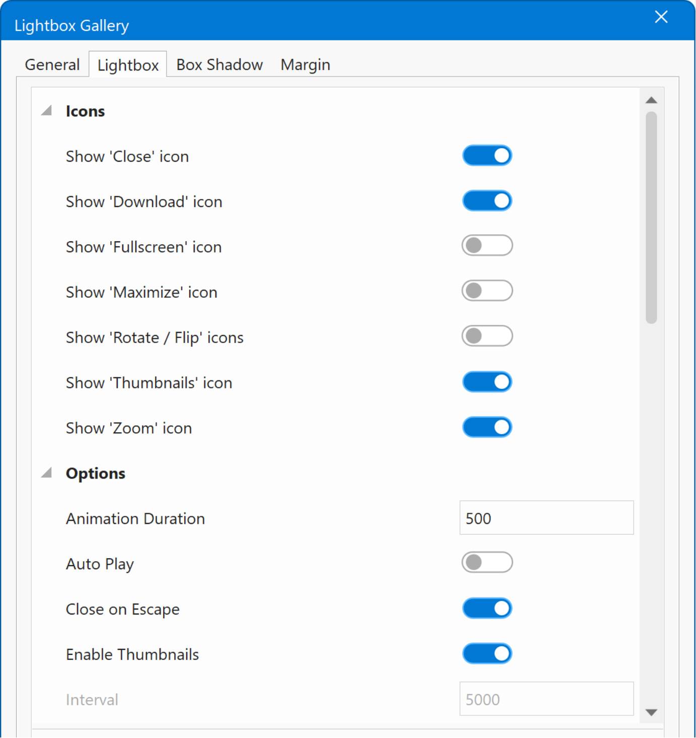
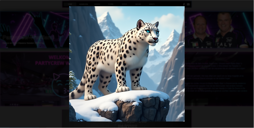
Lightbox Gallery
- New feature: Added new 'Lightbox Gallery'. This provides an easy way to implement a fully features lightbox gallery with (optional) thumbnails, download, rotate, auto play, zoom and much more. It also supports video (YouTube, Vimeo, MP4). Lightbox Gallery support 3 modes: thumbnails, justified and carousel (inline). This specifies how the gallery will initially be displayed on the page. Clicking an image will open the lightbox. Lightbox Gallery is based on a third-party script 'LightGallery'.
Demo
https://www.wysiwygwebbuilder.com/support/wb21tryouts/wb21_lightboxgallery.html
Online tutorial
https://www.wysiwygwebbuilder.com/lightboxgallery.html
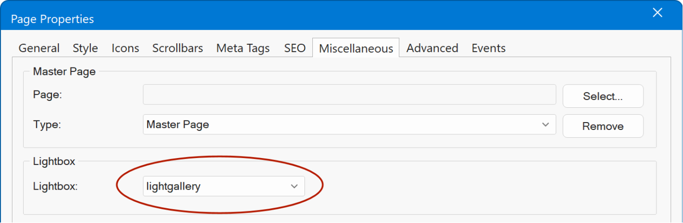
- New feature: Added support for Lightbox gallery in Slideshow. Photo Gallery and Page Properties. Unlike other lightboxes, when clicking the Settings button it will show the built-in properties instead of the text only input.
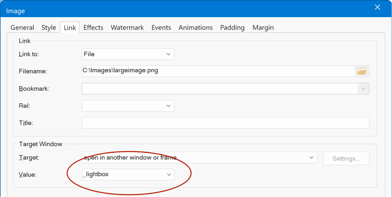
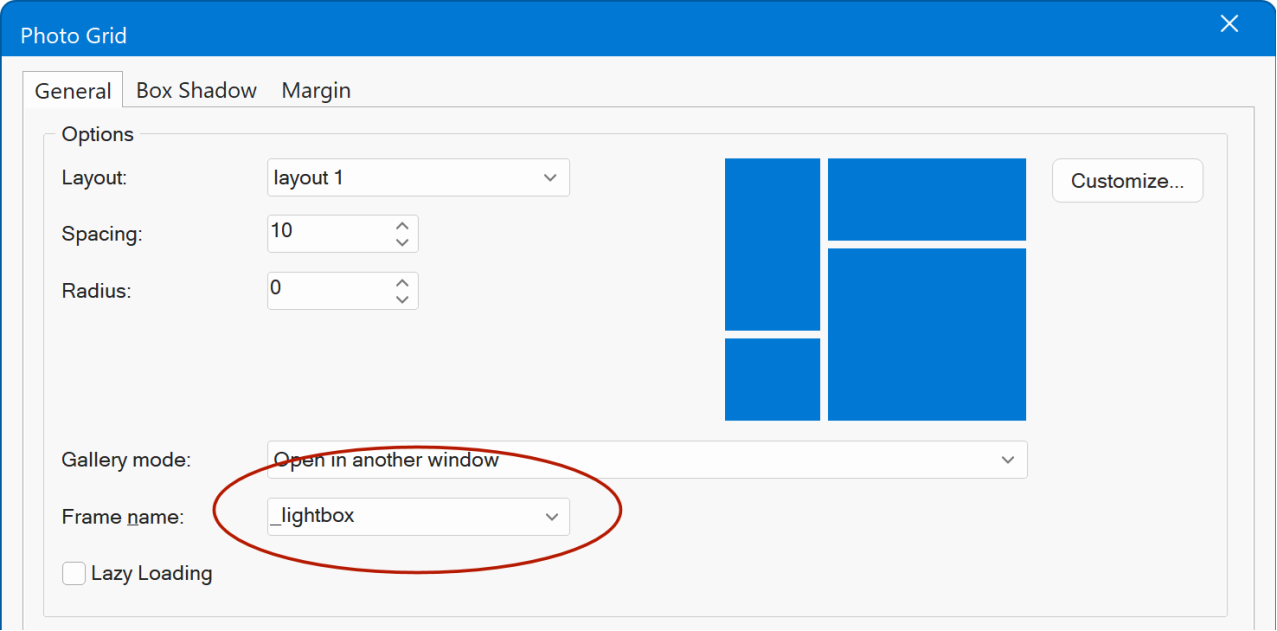
CSS Lightbox
- New feature: Added a new Responsive, pure CSS (no JavaScript) and minimal lightbox. This feature is available for Image, Picture, Photo Collage, Photo Gallery and Photo Grid and it can be set via link target '_lightbox'.
Demo
https://www.wysiwygwebbuilder.com/support/wb21tryouts/wb21_css_lightbox.html
Image
- New feature: Added 'blend mode' to Image Watermark. This controls how the text visually blends with the image. This may be useful for example to create cutout/knockout text or other special effects.
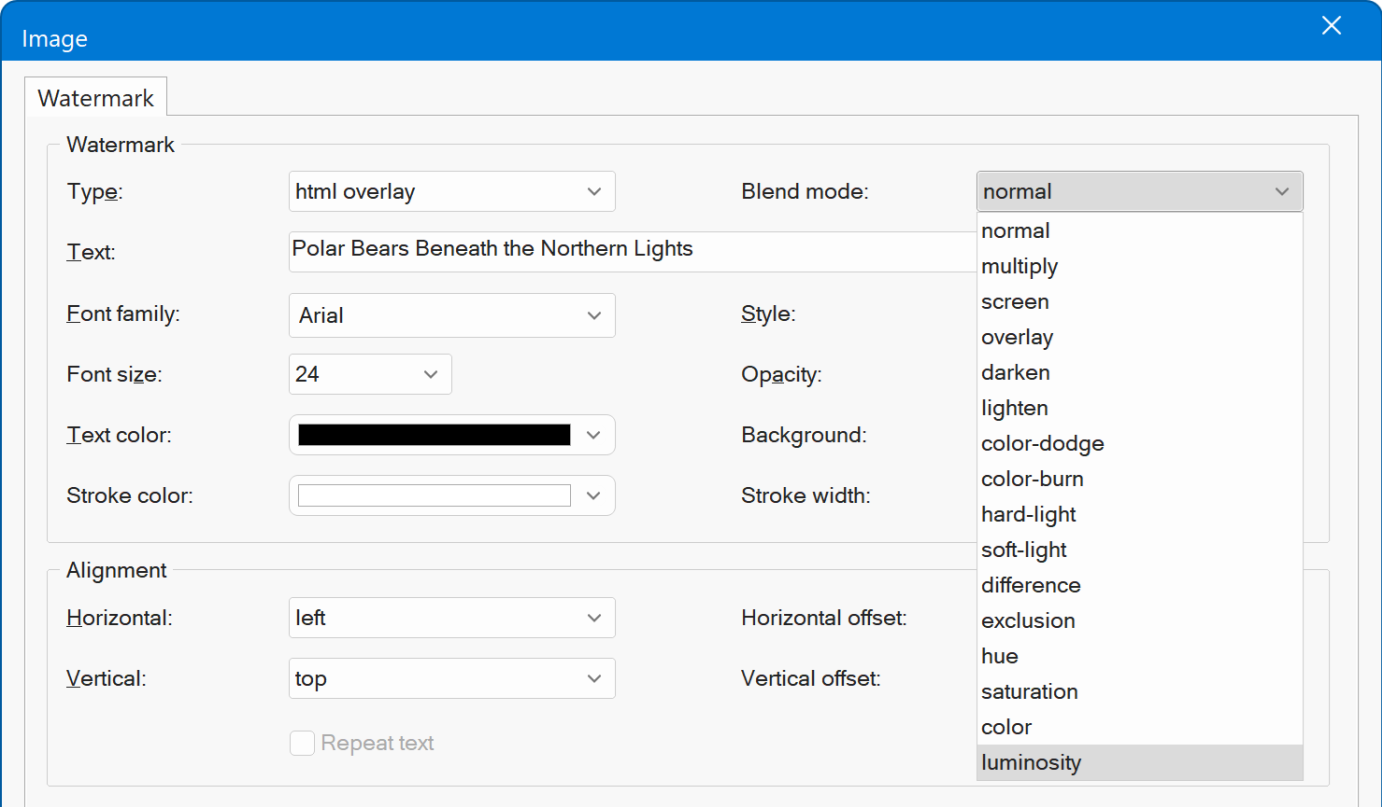
Blend mode: multiply
Text: white
Background: black
Produces a cutout/knockout effect with a black background.

blend mode: difference
text: black
background white
Creates a cutout effect with the background colors inverted.

Demo
https://www.wysiwygwebbuilder.com/support/wb21tryouts/wb21_watermark.html
- New feature: You can now drag and drop image from Windows File Explorer on an Image in the workspace to quickly replace it.
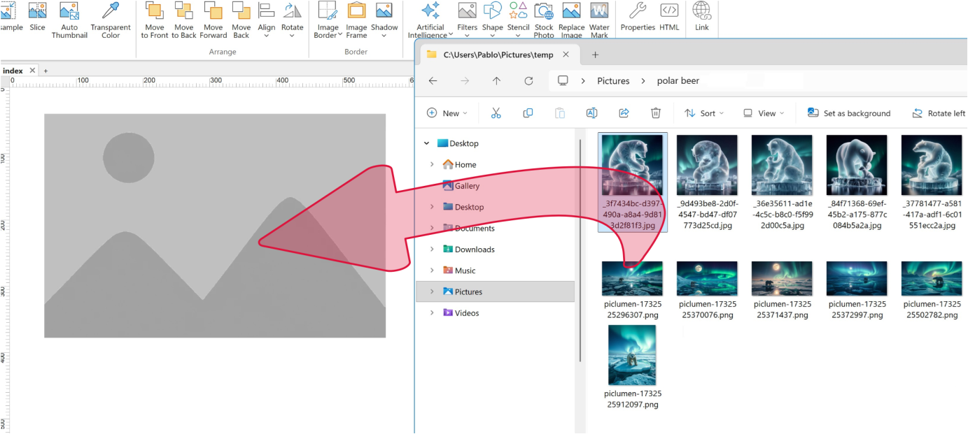
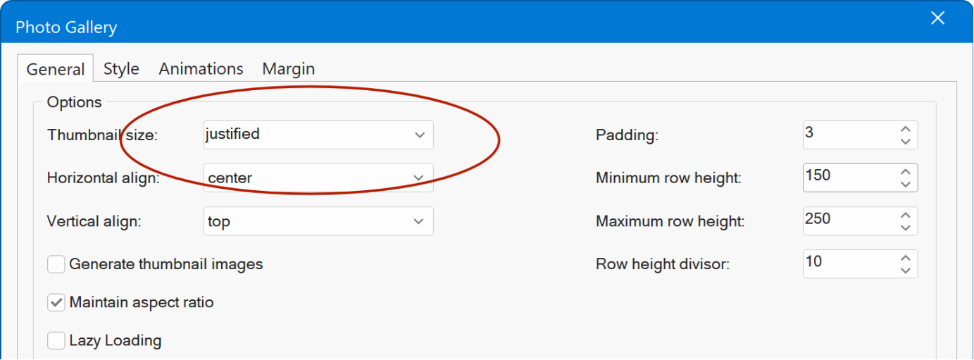
Photo Gallery
- New feature: Added 'Justified' thumbnail mode. Thumbnails are automatically arranged in rows of equal height, adjusting their widths to create a clean, balanced gallery layout.
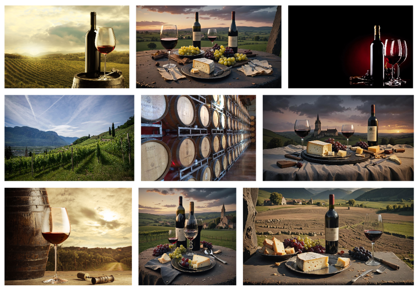
Demo
https://www.wysiwygwebbuilder.com/support/wb21tryouts/wb21_justified.html
- New feature: You can now drag and drop images from Windows File Explorer directly on a Photo Gallery on the workspace to add images
- New feature: You can also drag and drop images into the Photo Gallery properties dialog as an alternative to using the 'Add' button.
Photo Grid
- New feature: Added 6 new special layouts: Die Cut, Pizza, Pie, Grid Circle, Grid Diamond, Grid Rect. This adds even more creative ways to display images.
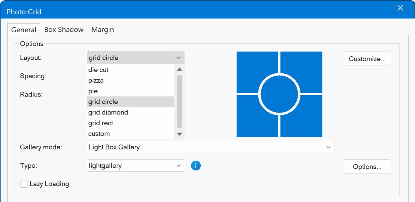
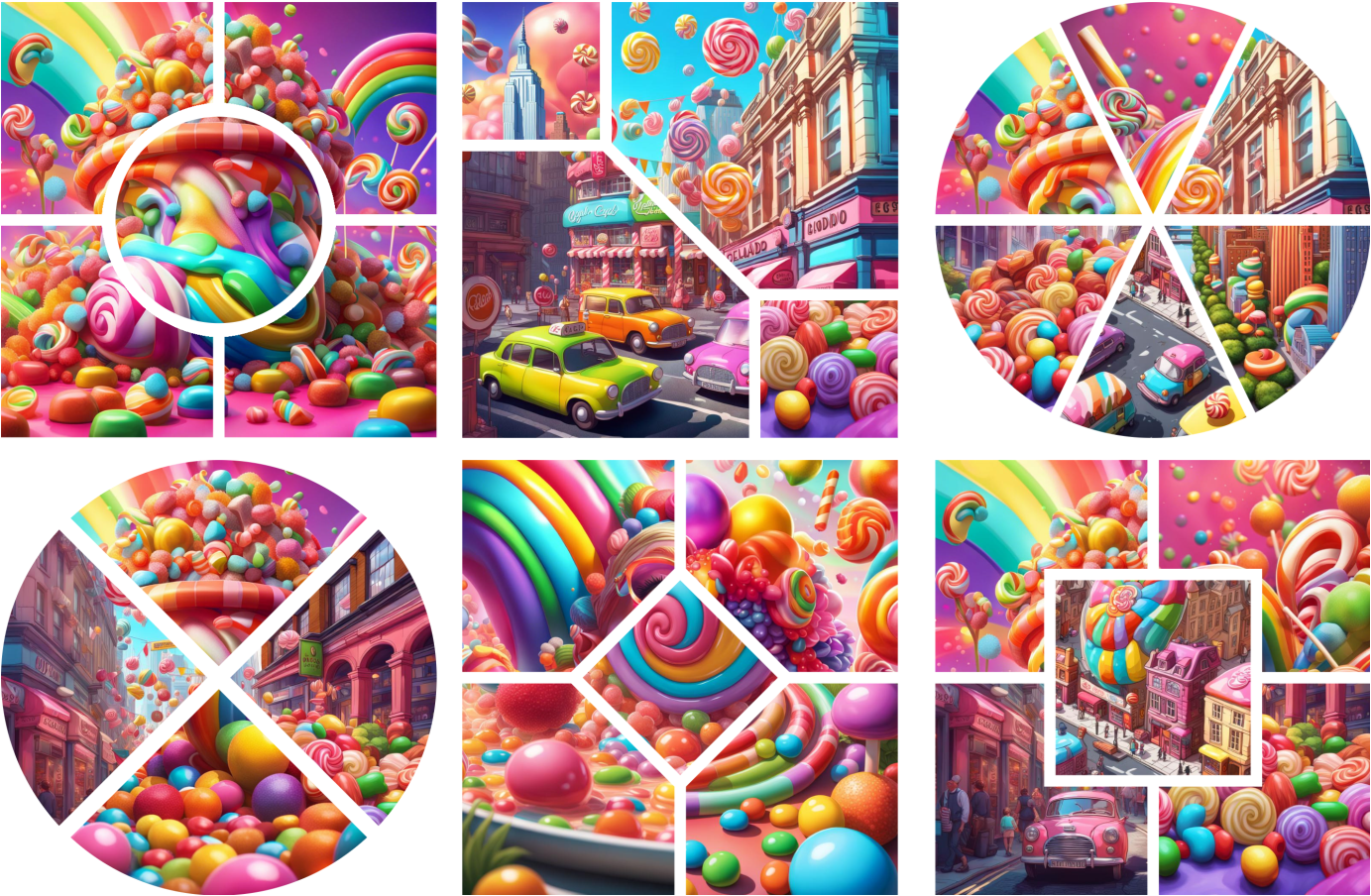
Demo
https://www.wysiwygwebbuilder.com/support/wb21tryouts/wb21_photogrid.html
Slide Show
- New feature: Added Scroll Marquee slideshow type. The Scroll Marquee creates a horizontal, continuously moving row of images that moves in response to page scrolling instead of playing on a timer. As the user scrolls down the page, the marquee slides left or right, creating a smooth parallax-style effect.
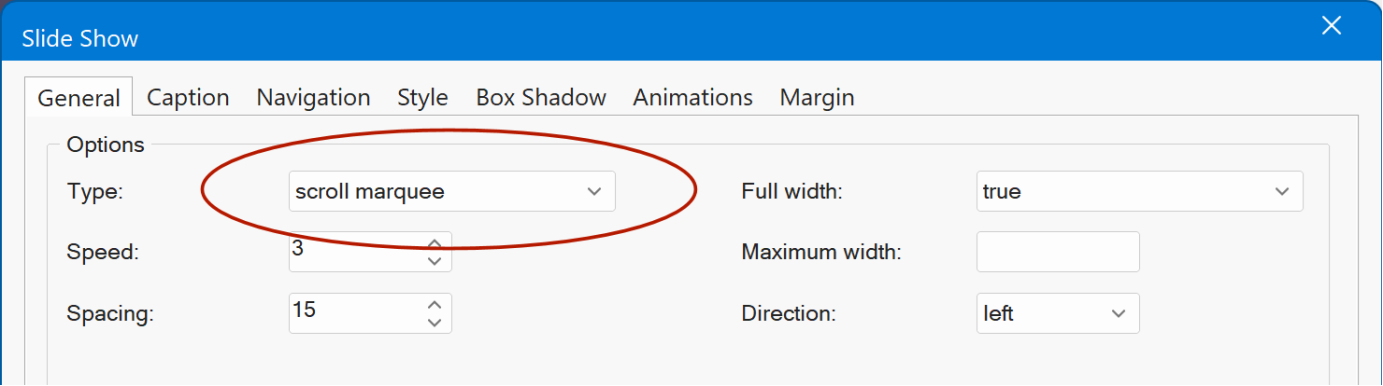
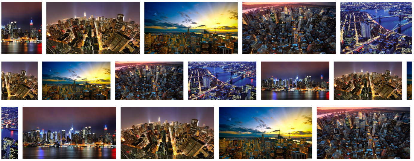
Demo
https://www.wysiwygwebbuilder.com/support/wb21tryouts/wb21_scrollmarquee.html
- New feature: You can now drag and drop images from Windows File Explorer directly on a Slideshow on the workspace to add images
- New feature: You can also drag and drop images into the Slideshow Gallery properties dialog as an alternative to using the 'Add' button.
Flex Grid Management Tools
- New feature: When you select a Flex Grid in the workspace, the Ribbon will now display a dedicated 'Format' context tab to quickly modify properties of the Flex Grid, like background, border and arrange tools (move up, move down, move to top, move to bottom)
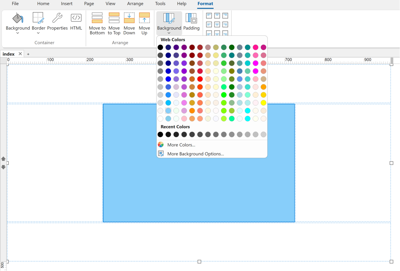
- New feature: These options are also available via the menubar.
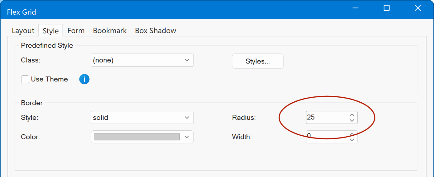
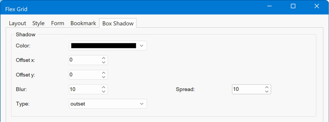
Flex Grid
- New feature: Added support for border radius.
- New feature: Added support for box shadow.
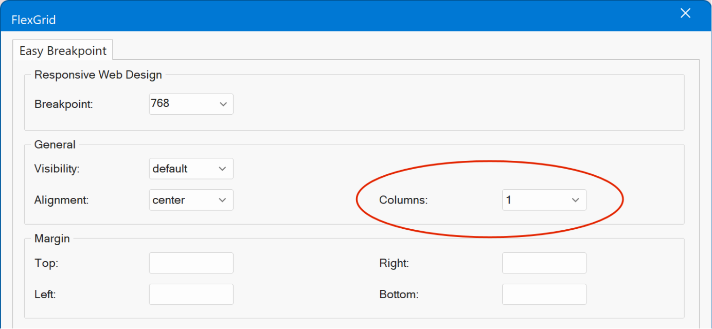
- New feature: With Easy Breakpoints you can now stack the grid items on smaller (mobile) screens without the need to add a page breakpoint.
Flex Grid / Flex Container / Card Container
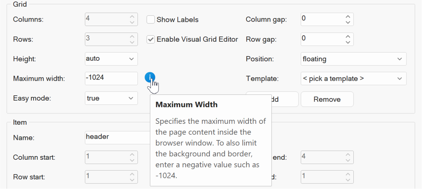
- New feature: Added the ability to limit the background, border and shadow by using a negative maximum width (for example: -1024). Note: this was already possible with the Layout grid.
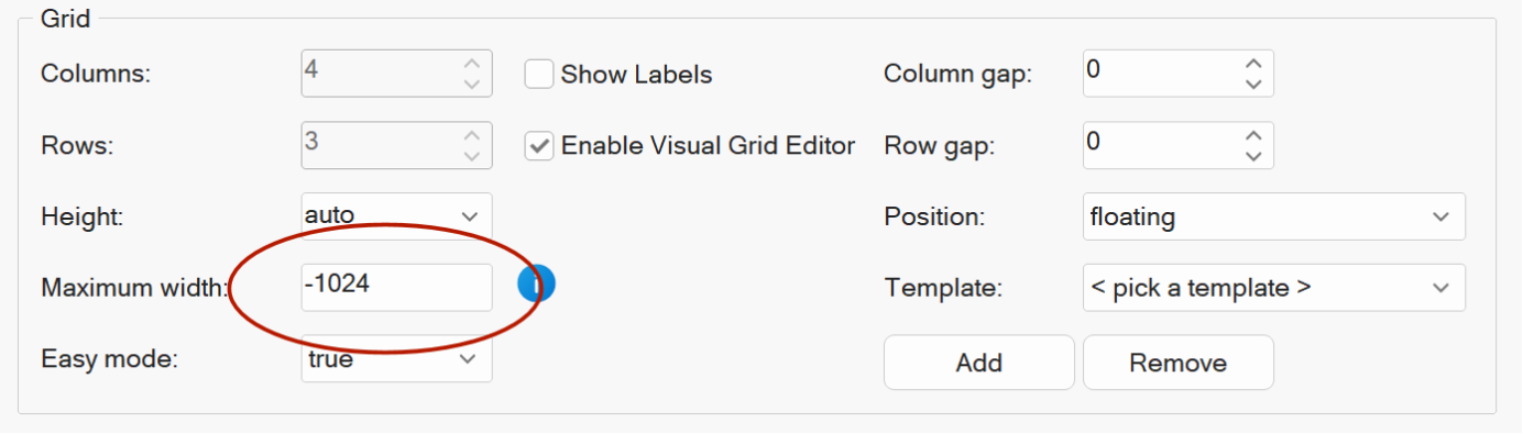
- Improved: Added info tip next to the maximum width property.
- New feature: With Easy Breakpoints you can now stack the flex items on smaller (mobile) screens without the need to add a page breakpoint.
Desktop:
Mobile:

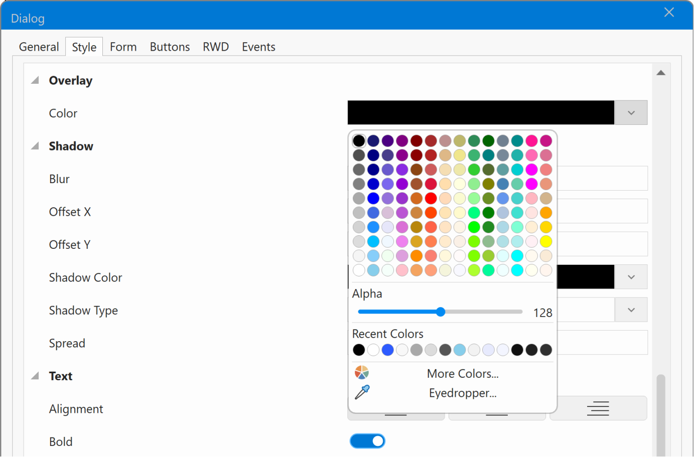
Dialog
- New feature: Added the ability to set the color and transparency of the overlay background.
Previously this was fixed to black / 50%.
Cards
- New feature: Added a dedicated Card Tools context tab to the Ribbon. Here you can quickly access properties of the card or individual card items.
There are also shortcuts to add new card items, edit, delete or move items up and down. if the card is part of a Card Repeater then all edits are applied to all card at once.
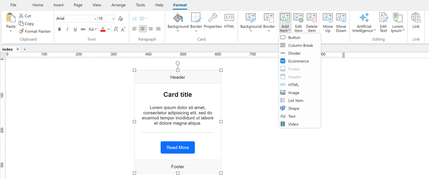
Note: the new shortcuts are also available in the classic menu under "Edit -> Card'
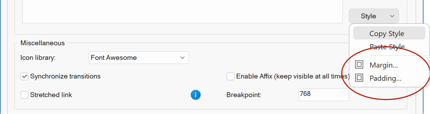
- New feature: Added Copy Style / Paste Style options to card properties to easily copy style properties between card items. The styles can also be copied to and from standard objects.
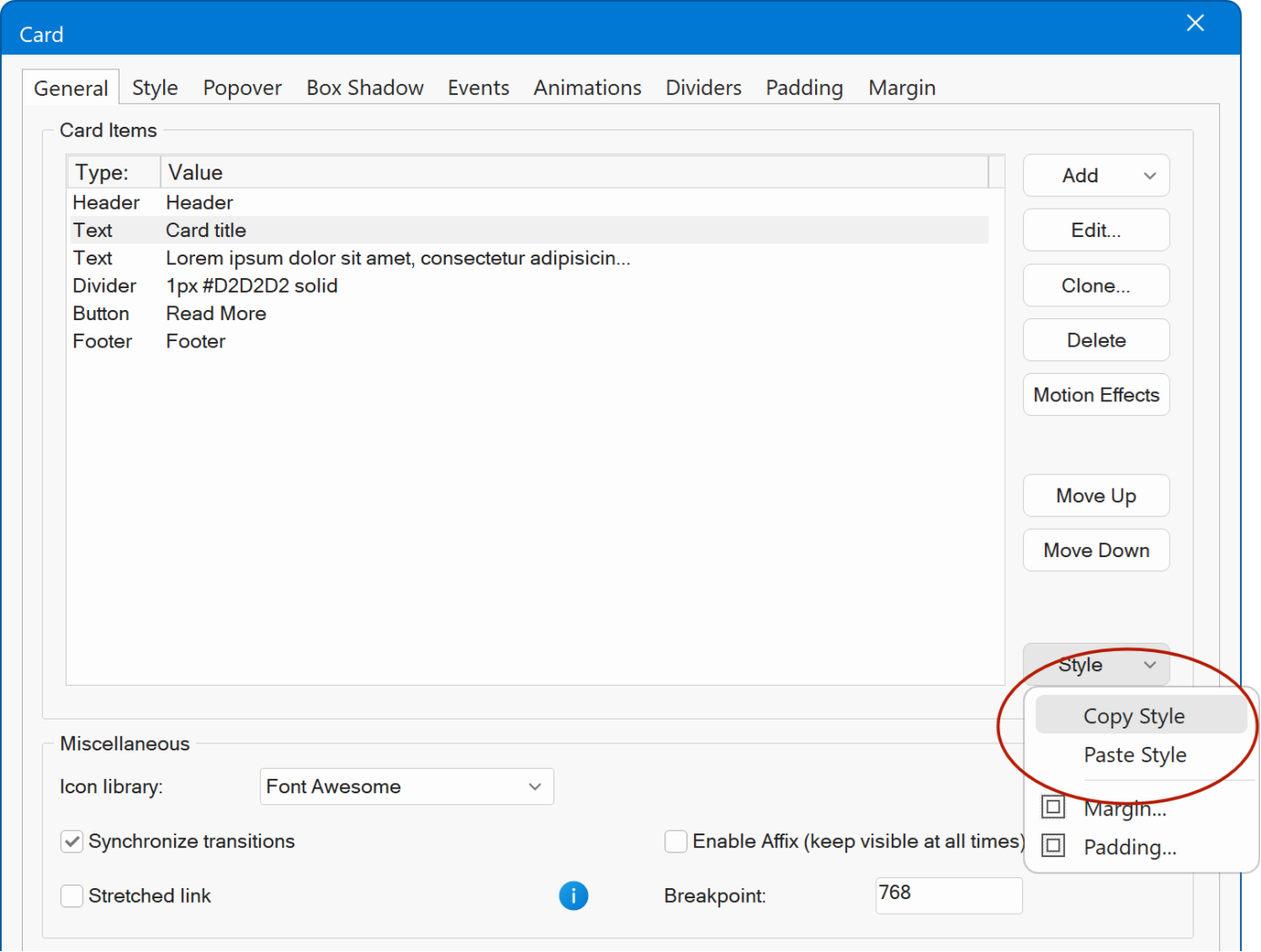
- New feature: Added Margin and Padding shortcuts for Card items, so you can directly jump to these properties without having to open the item properties.
- New feature: You can now drag and drop images from Windows File Explorer on a Card in the workspace to quickly add the image to the card. If you drop on an existing image, then it will be replaced.
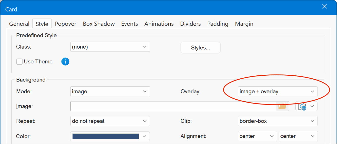
- New feature: Added support for background overlays, useful to dim the background image.

Overpaste Links
- New feature: Added support for overpaste links, making it faster and easier to create clickable links without opening the Link dialog.
With this feature, you can turn selected text, images, shapes, and other linkable objects into links simply by pasting a URL over them. Instead of replacing the selected content, the pasted link is applied to it.
How it works
1. Copy a link
Copy a URL from your browser or any other application to the clipboard
(for example: https://www.wysiwygwebbuilder.com)
2. Switch to your Web Builder page
3. Select an object
Highlight text, or select an image, shape, heading, banner, or any other
linkable object.
4. Paste the link
Paste the URL over the selected content.
For text, the
text remains unchanged but becomes a clickable link.
For other objects, the link is applied directly to the selection.
Note
If nothing is selected, pasting a link behaves as before: the URL is inserted as plain text.
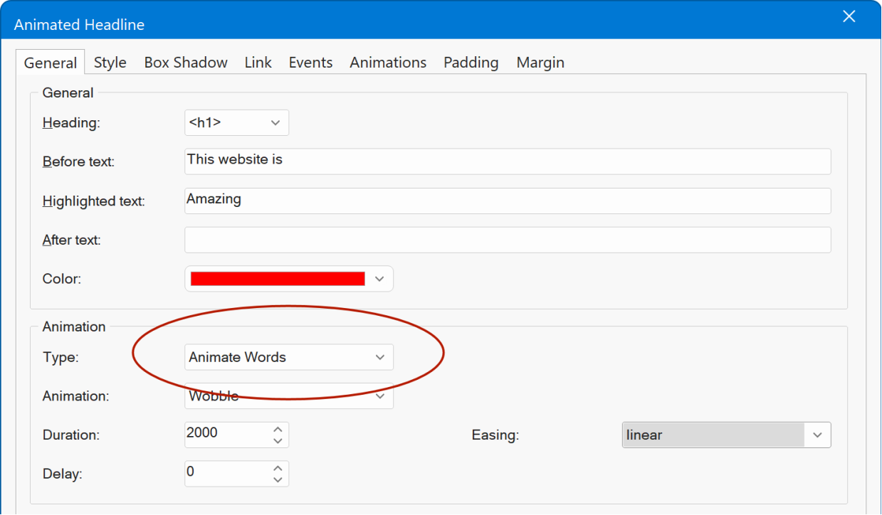
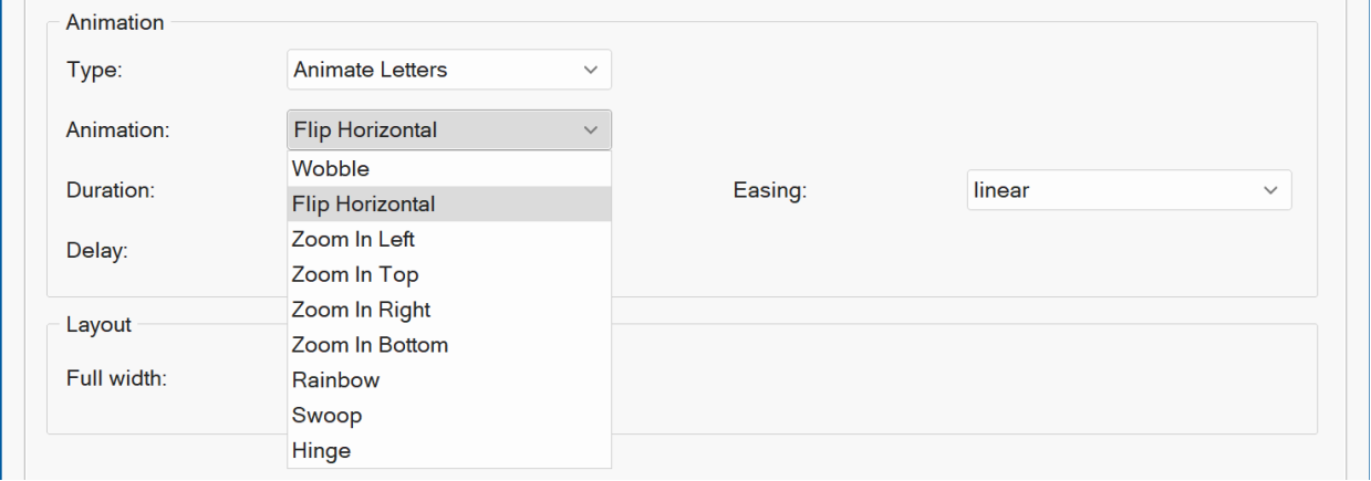
Animated Headline
- New feature: Added an option to animate complete words in addition to single letters. Word animations work great for headlines, taglines, and phrases where you want each word to appear or move together.

Demo
https://www.wysiwygwebbuilder.com/support/wb21tryouts/wb21_animate.html
- New feature: Added new text animations: Flip Horizontal, Zoom In Left, Zoom In Top, Zoom In Right, Zoom In Bottom, Rainbow, Swoop, Hinge
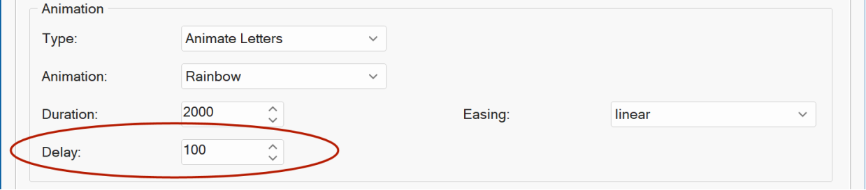
- New feature: Added 'Delay' property to Animate Letters/Words. This specifies the pause between animation cycles.
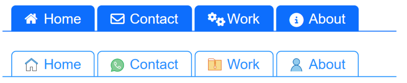
Navigation
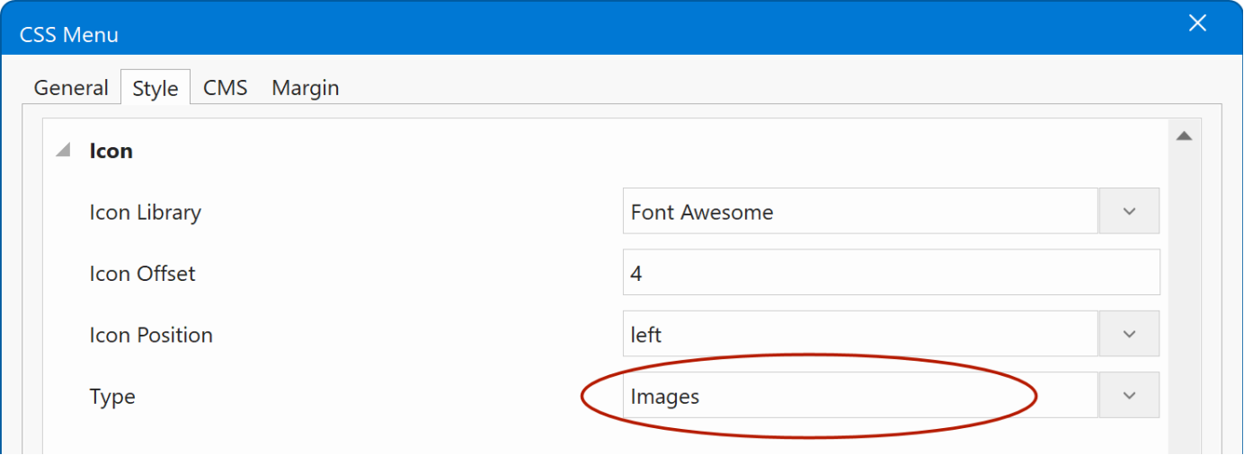
- New feature: Added support for images to many navigation widgets. You can now use custom images alongside icons for menu items in navigation widgets. This gives you more flexibility to create visually rich and colorful pages that better reflect your brand or design style.
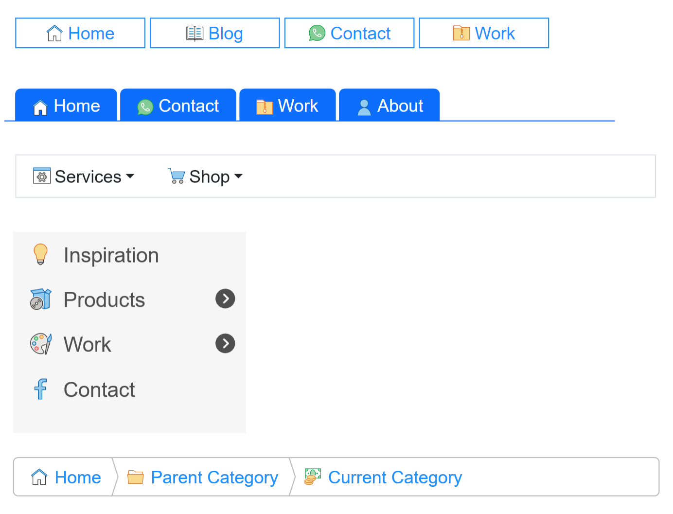
Demo
https://www.wysiwygwebbuilder.com/support/wb21tryouts/wb21_navicons.html
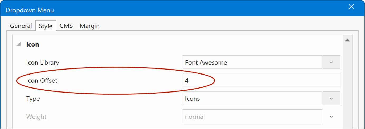
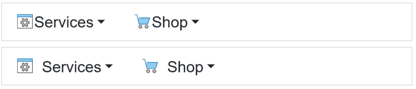
Dropdown Menu, Breadcrumb, Overlay Menu
- New feature: Added 'Icon offset' property. This controls the spacing between the icon and text of a menu item.
Tab Menu
- New feature: Added the ability to add icons or images to tab items.
- New feature: Added support for responsive padding for tab items. Also, the padding can now be set via the generic Padding properties.
Demo
https://www.wysiwygwebbuilder.com/support/wb21tryouts/wb21_tabmenu.html
Layer Menu
We ve added many new options to the Layer Menu, giving you the flexibility to create mobile-friendly, mixed-content menus. With these improvements, the Layer Menu is now even more powerful for building custom mega menus.
- New feature: You can now add floating and flexible content to layers of the menu, with support for padding and alignment options.
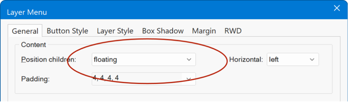
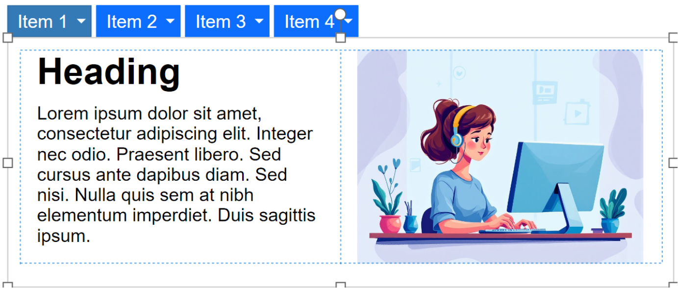
Additionally, you can place a layout grid on the menu layers making it easy to create clean, multi-column designs.
Online tutorial
https://www.wysiwygwebbuilder.com/layermenu.html
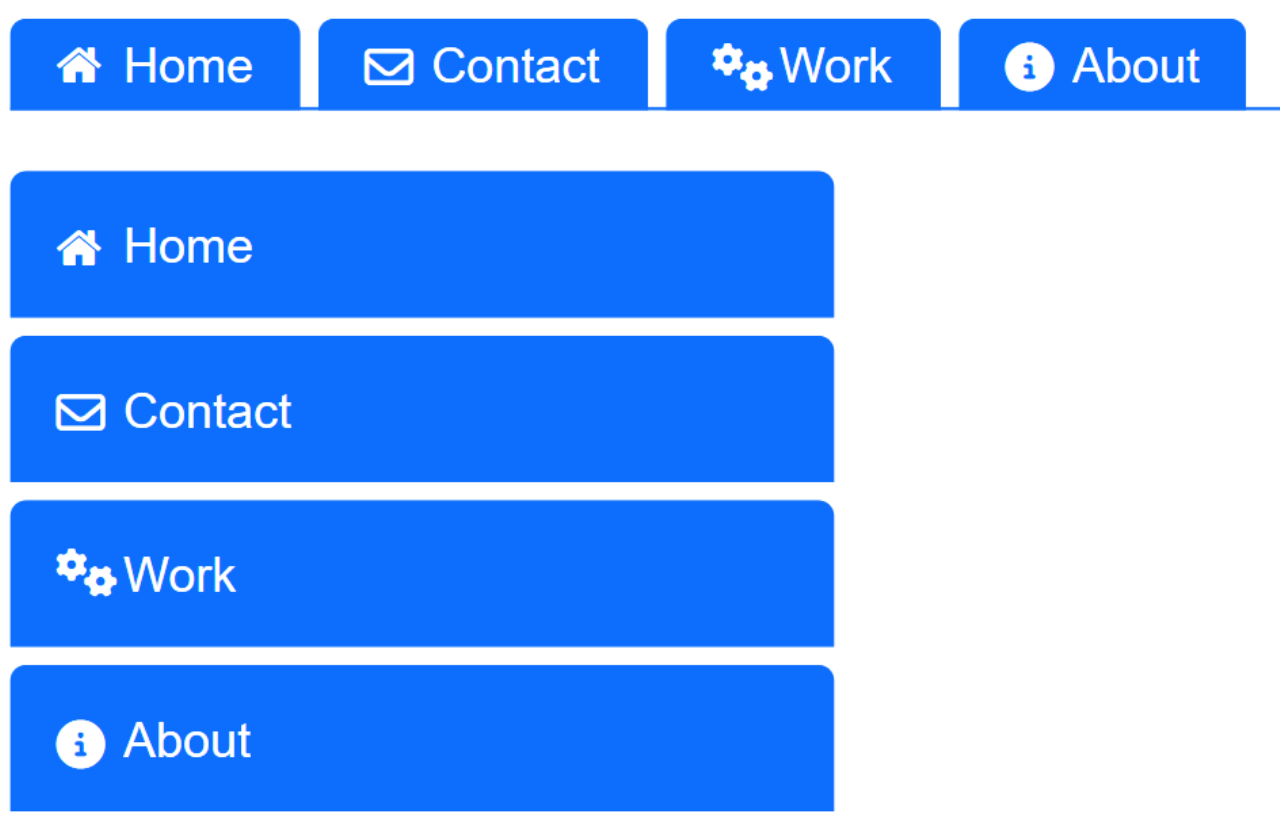
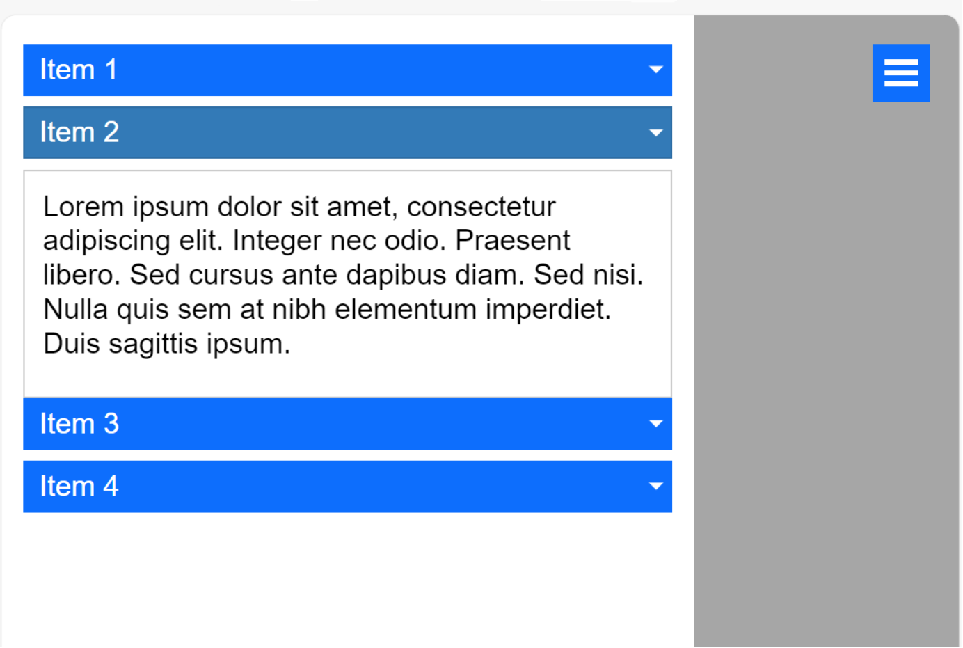
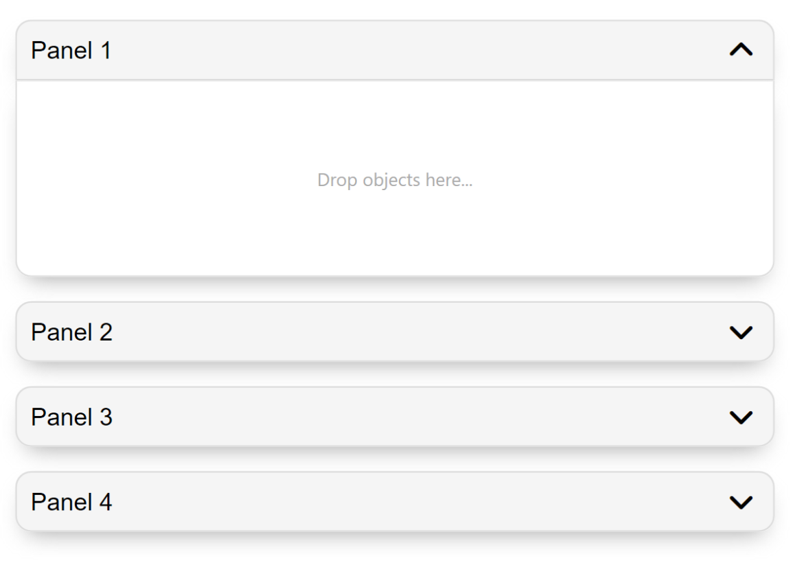
- New feature: Added the new option to make the layer menu responsive. The new 'breakpoint' property controls how the menu will be displayed on mobile devices: Accordion, Panel or Overlay.
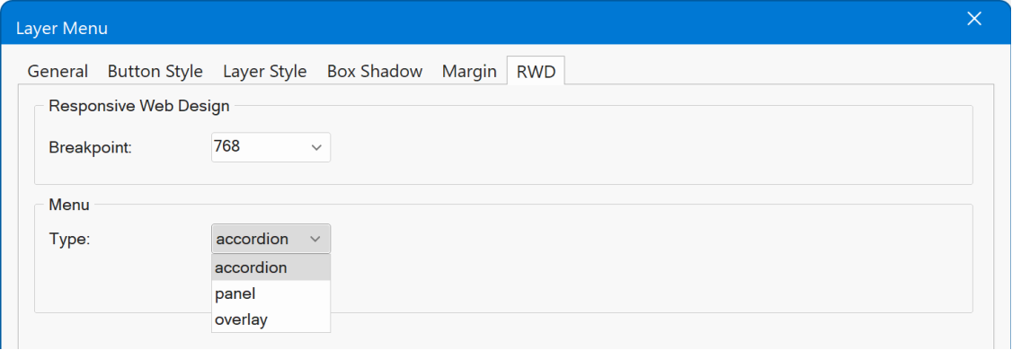
Accordion, displays the layers in a stacked,
accordion like layout.
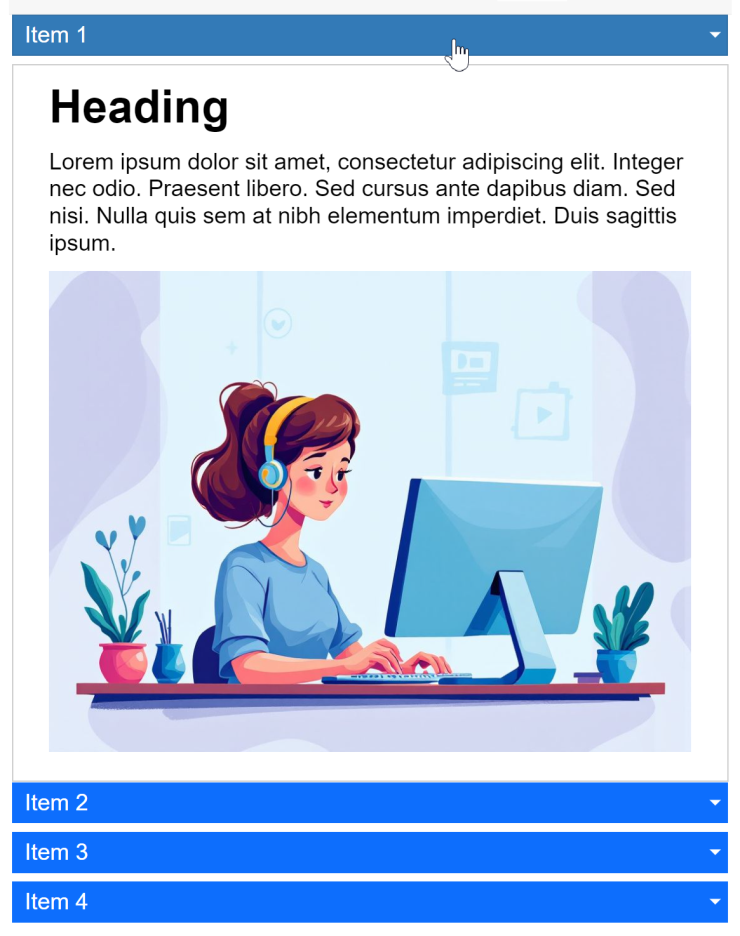
Demo
https://www.wysiwygwebbuilder.com/support/wb21tryouts/wb21_layermenu_accordion.html
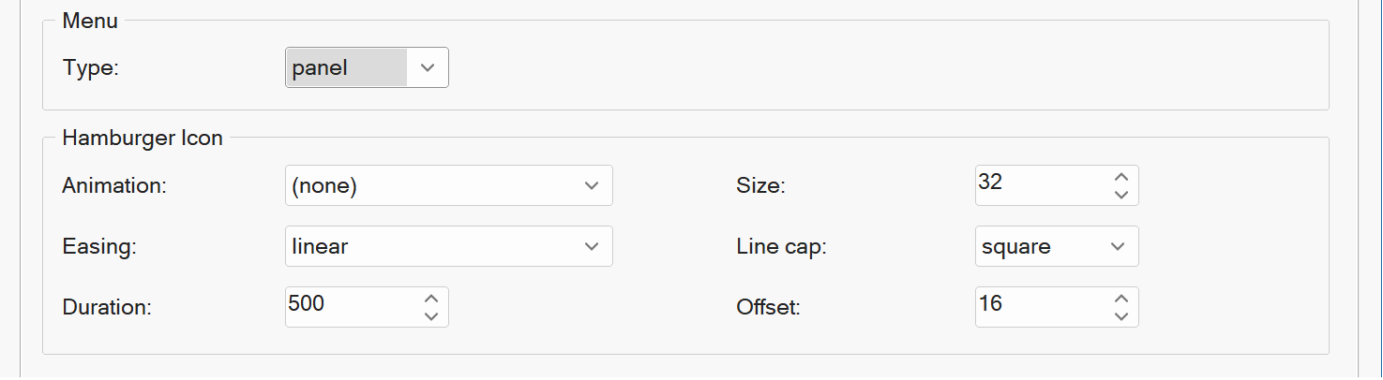
Panel, display a slide out panel at the left side of the browser window.
The hamburger icon supports animations and you can set icon size and offset.
Overlay, displays an overlay menu covering the full page with drill down layers
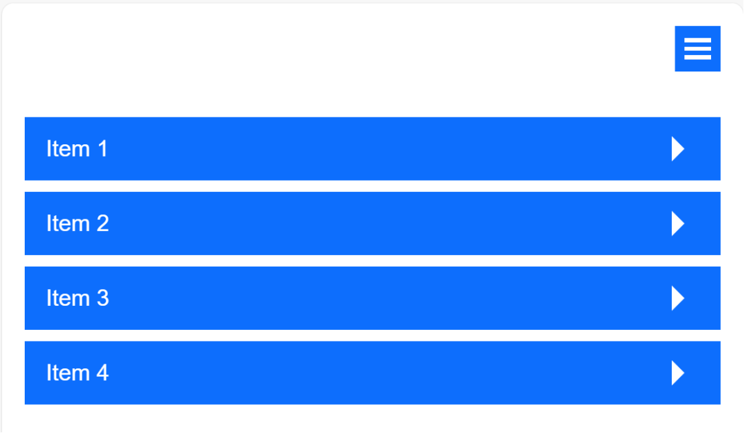
When expanded, the layer will display an arrow icon to go back to the menu list.
- New feature: Added the ability to add icons or custom images to menu items. With icon libraries and icon offset options.
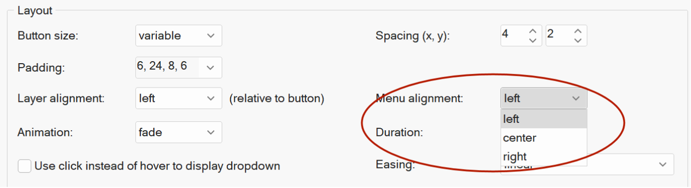
- New feature: Added the ability to set the vertical spacing between the button and drop-down layer.
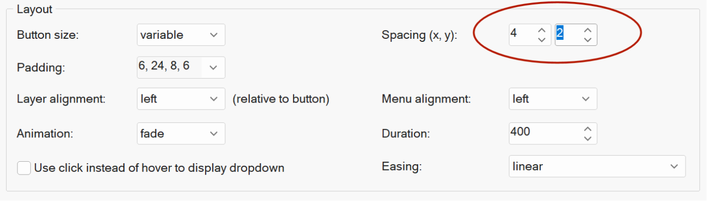
- New feature: Added 'Animation duration' and 'Animation easing' properties to give you more control over the animation.
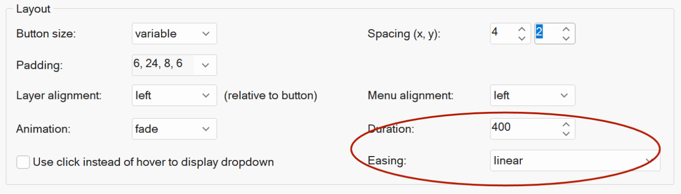
- New feature: You can now control how the menu is positioned inside its container. The new Menu Alignment setting lets you choose from: Left, Center and Right.
- Improved: Removed jQuery dependency from generated scripts; output is now pure vanilla JavaScript.
Dropdown Menu, Layer Menu, Overlay Menu
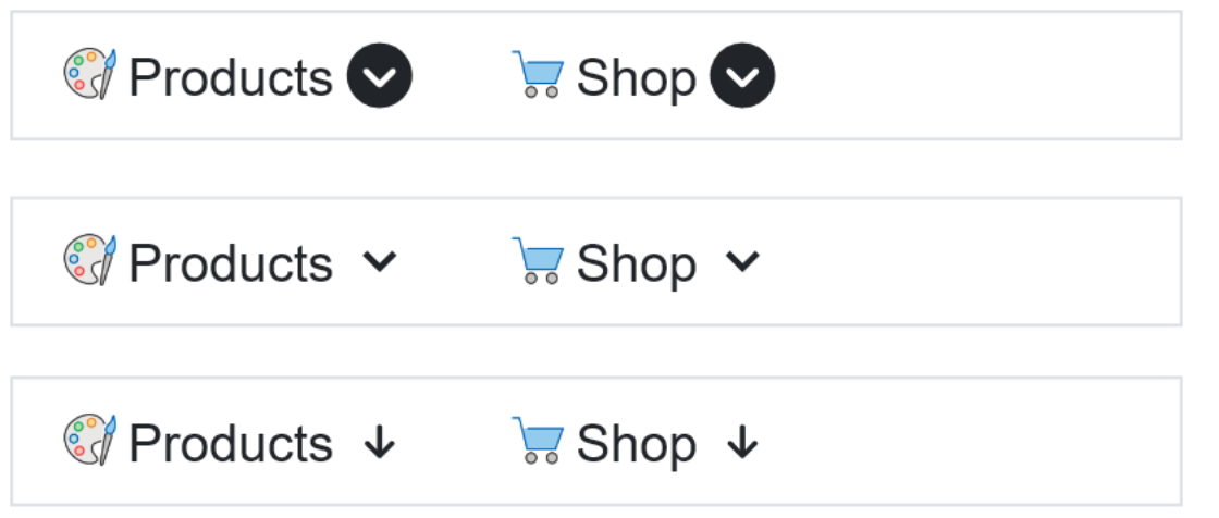
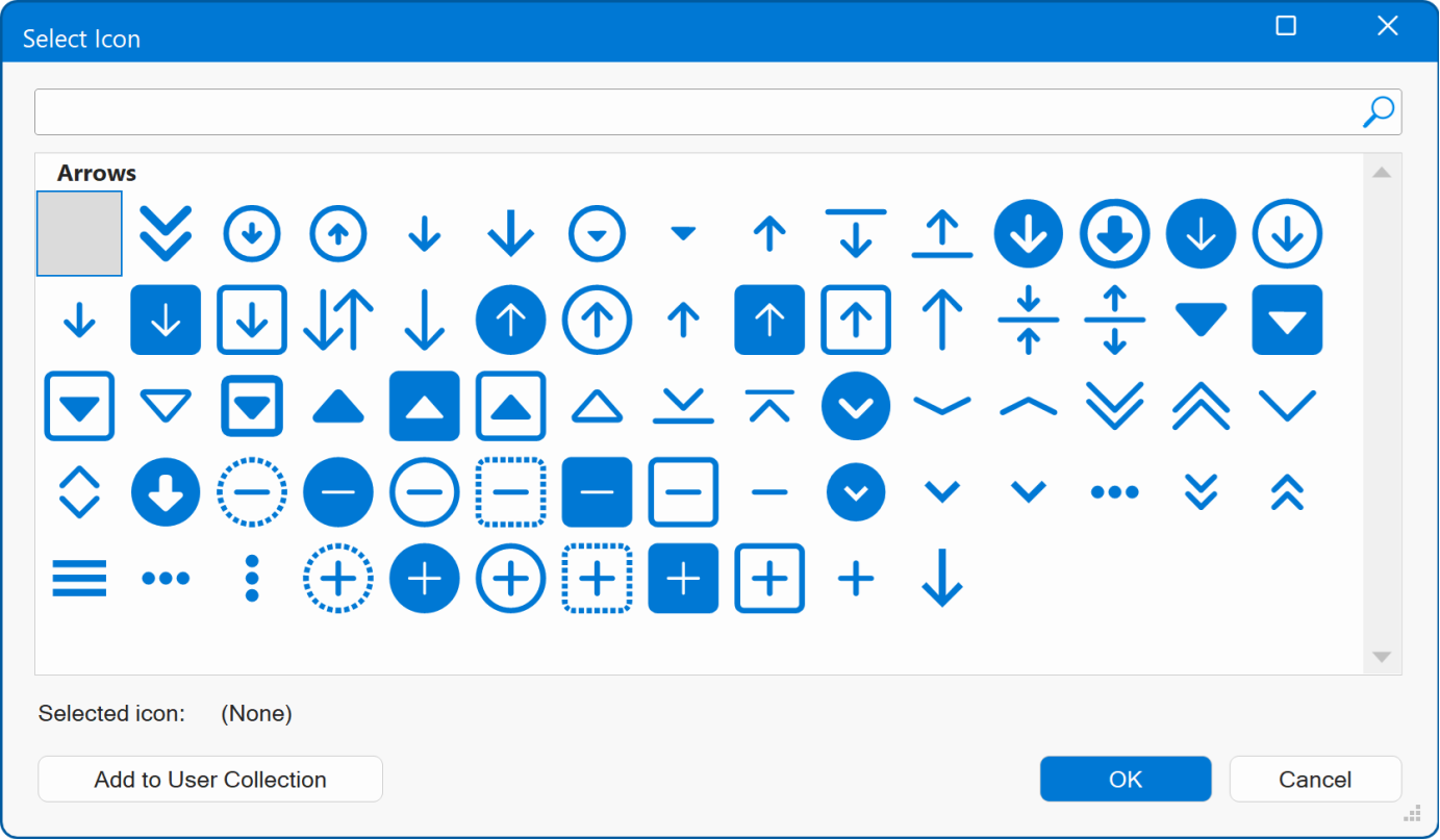
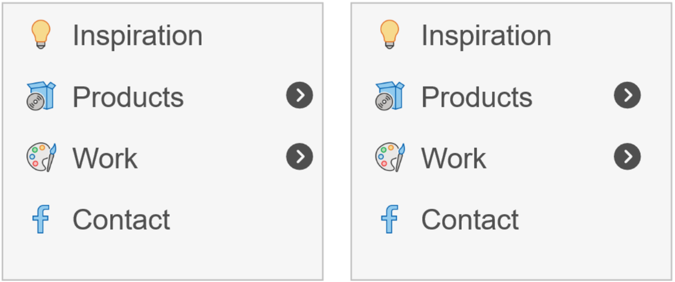
- New feature: Added the ability to change the style of the drop-down arrow. You can now select from 60 different arrow types!
Demo
https://www.wysiwygwebbuilder.com/support/wb21tryouts/wb21_dropdown_arrow.html
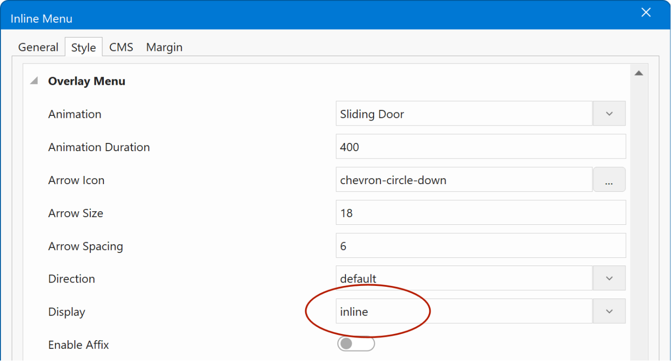
- New feature: Added the ability to change the size of the drop-down arrow.
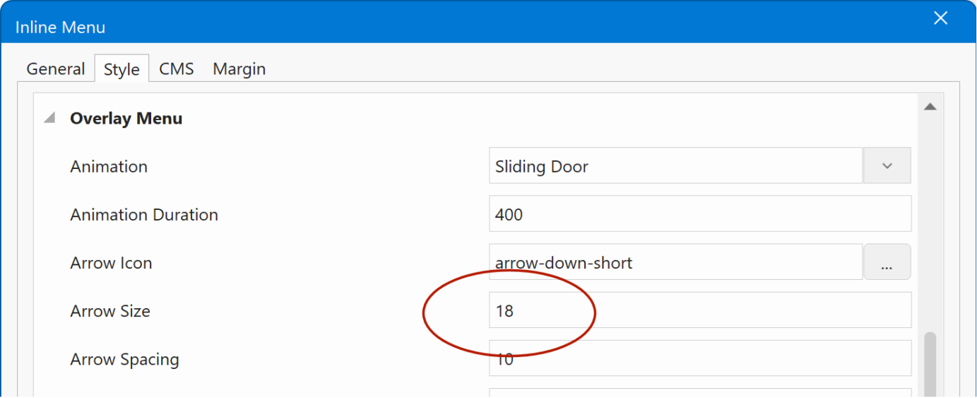
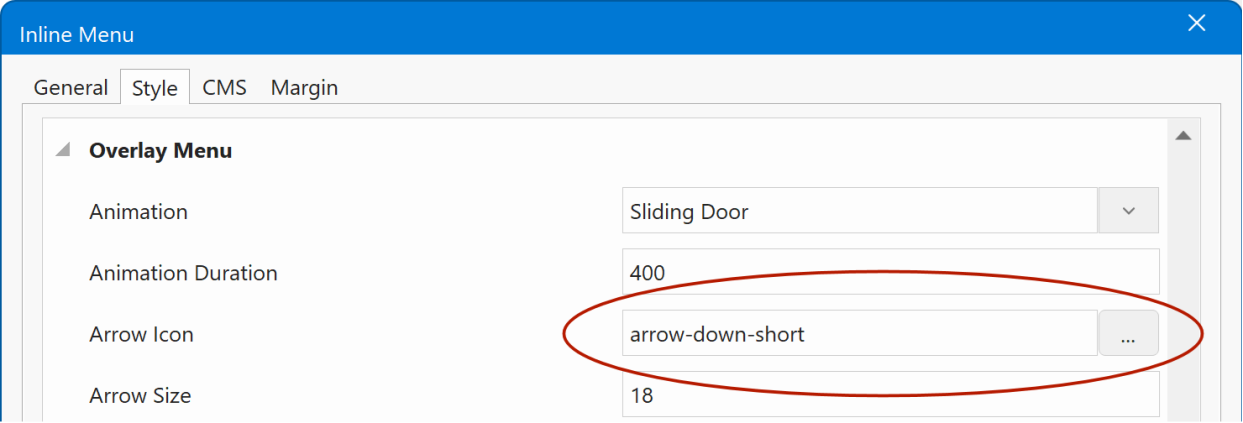
Overlay Menu
- New feature: Added 'arrow offset' property to set the offset from edge. Previously this was a fixed value, so now you have more control.
Demo
https://www.wysiwygwebbuilder.com/support/wb21tryouts/wb21_nav_iconoffset.html
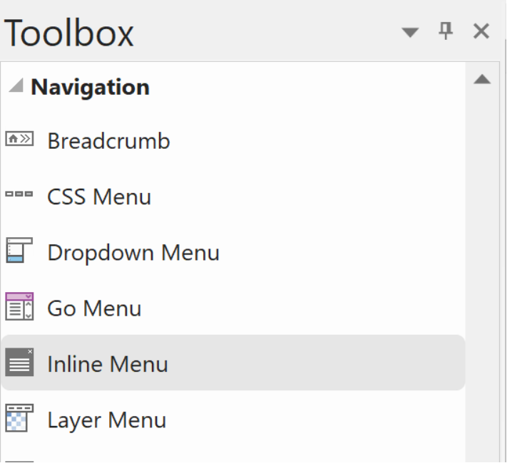
Inline Menu
- New feature: The Overlay Menu s Inline mode now has its own dedicated icon in the Toolbox and Insert menu. You can find it under Inline Menu , making this feature easier to discover and use, especially since it was often overlooked before.
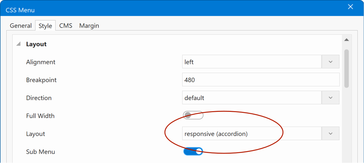
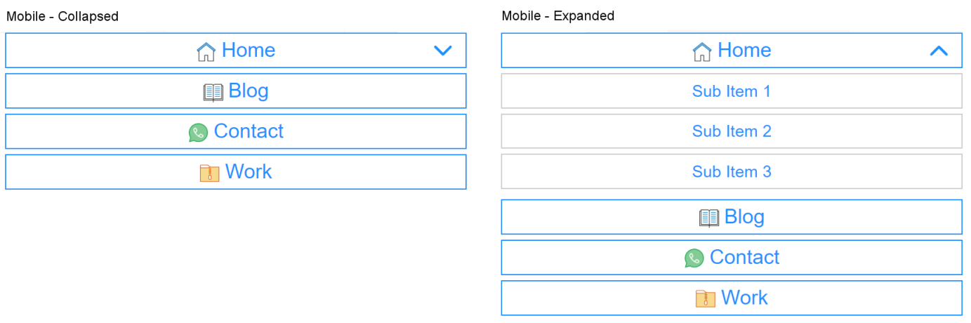
CSS Menu
- New feature: Added responsive-accordion mode: the menu is horizontal on desktop and becomes a vertical, expandable (accordion) list on mobile, switching at the screen size you set with the breakpoint property.
Demo
https://www.wysiwygwebbuilder.com/support/wb21tryouts/wb21_cssmenu_accordion.html
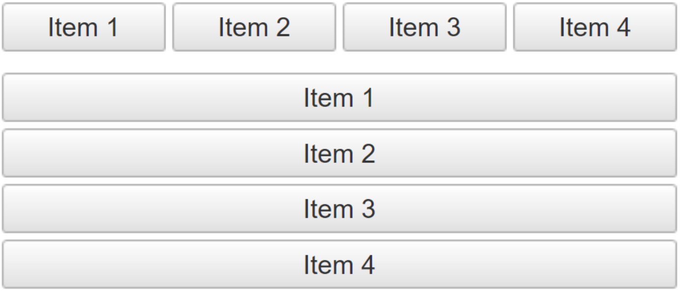
Navigation Bar
- New feature: Added responsive button mode. The menu now adapts automatically: it displays horizontally on desktop and switches to a vertical list on mobile, using the breakpoint you set.
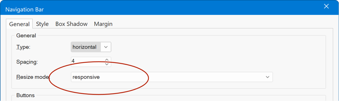
In responsive mode, the menu is rendered as a single image instead of individual button images. This reduces page load size and produces cleaner markups.
Also, in that case all transitions are now powered by CSS, with no JavaScript required.
Demo
https://www.wysiwygwebbuilder.com/support/wb21tryouts/wb21_navbar_responsive.html
- New feature: Added 'full width' property. The menu can now stretch to fill the full width of its container. Buttons automatically resize to fit evenly across the available space.
Tabs
- New feature: Added transition properties for tab items. Customize transition duration and easing for graceful, natural transitions.
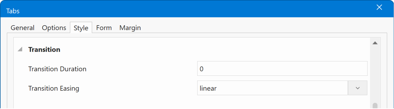
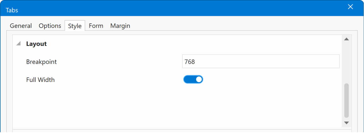
- New feature: Added responsive mode. Tabs now automatically switch to a stacked (vertical) layout on smaller screens for improved mobile usability.
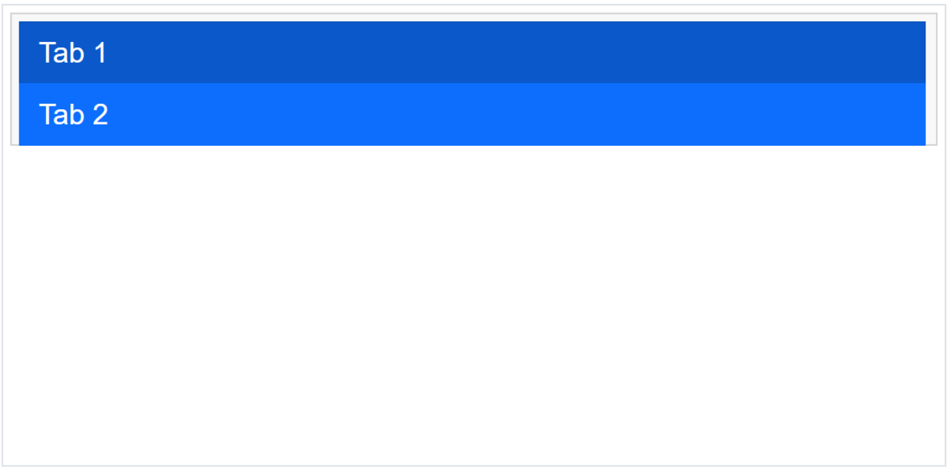
A new breakpoint property controls the screen width at which tabs change from horizontal to vertical.
Accordion
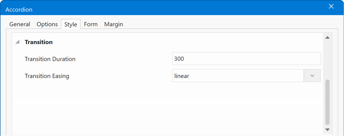
- New feature: Added transition properties for accordion header items. Customize transition duration and easing for graceful, natural transitions.
- New feature: When spacing is applied between accordion header items, the box shadow is now rendered on each individual panel instead of the entire accordion container.
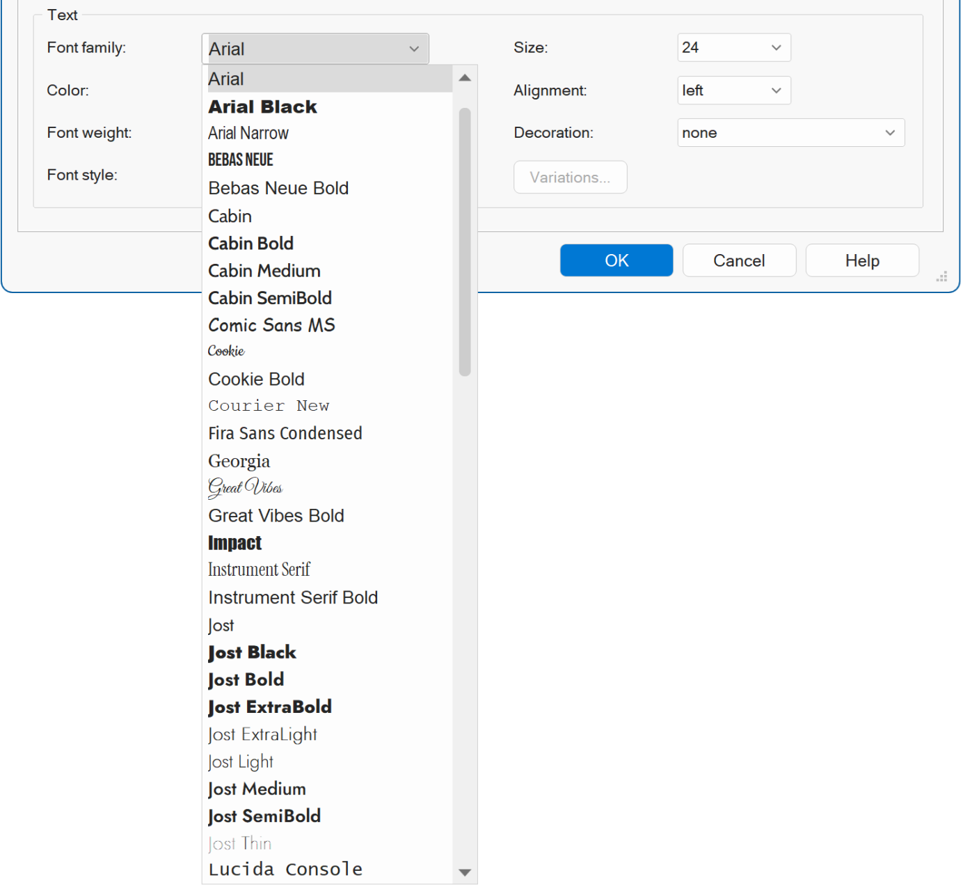
UI
- New feature: The font combo box items are now drawn using their respective fonts. For example, if the combo box lists "Arial," "Times New Roman," etc., each item will be displayed in its corresponding font style.
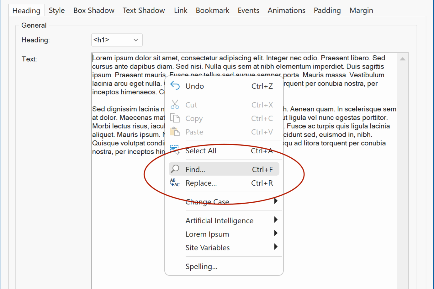
- New feature: Many text input fields now have 'Find' and 'Replace' support via the context menu. To quickly find or replace text.
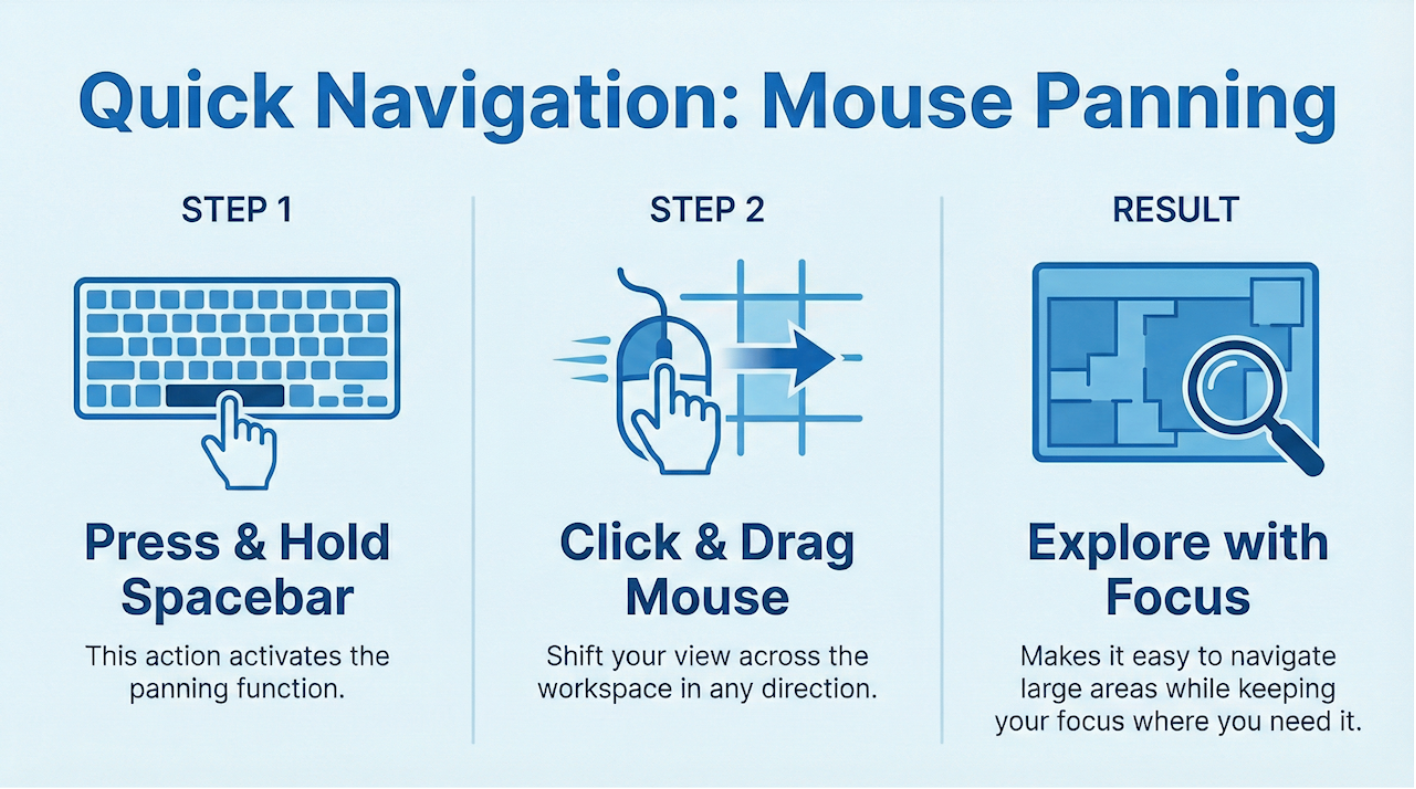
Mouse Panning
- New feature: Added support for mouse panning. Mouse Panning lets you quickly move around the workspace without changing tools or zooming in and out. By holding the Spacebar and dragging with the mouse, you can shift your view in any direction, making it easy to explore large or detailed areas and keep your focus where you need it.
Mobile View
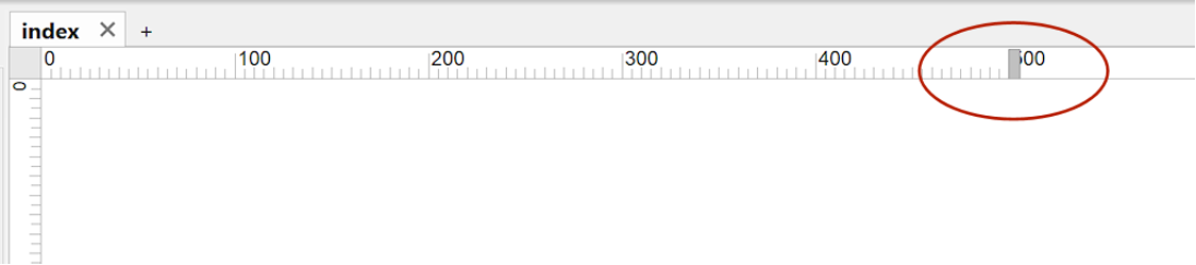
- New feature: Added a 'Mobile view' button to the Ribbon / Menu. This is a simple toggle between desktop and mobile view. Basically, this simply adjusts the page width in the works space to a user definable mobile width, so you can quickly see what the layout looks like on a smaller screen without having to change the page width (and later restore it manually)
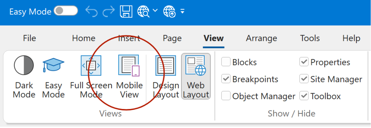
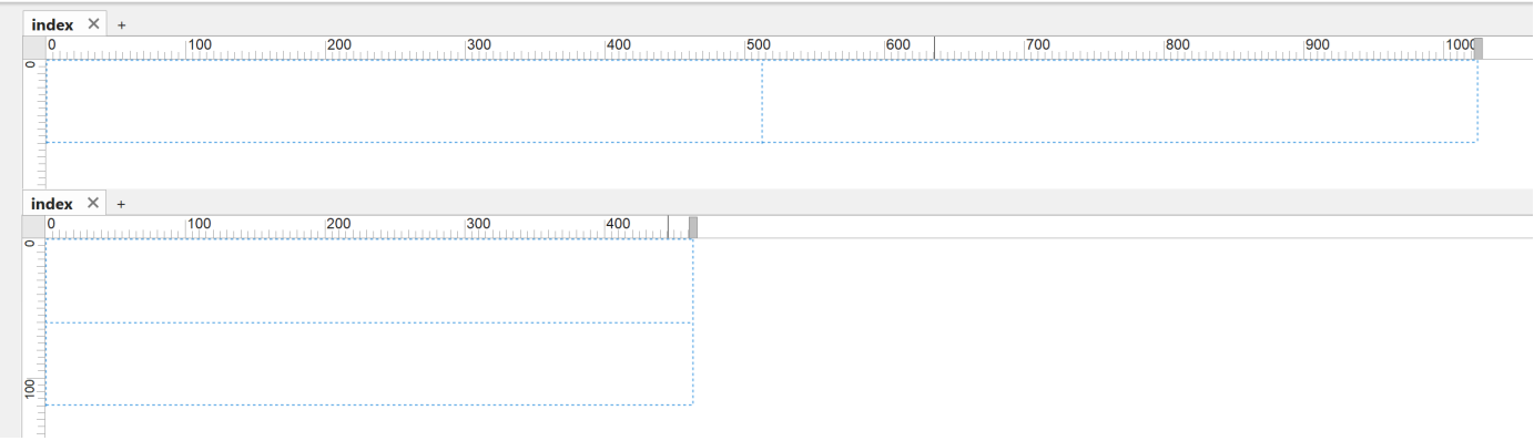
Note: You can change the mobile width via the size handle on the horizontal ruler (at the top of the workspace).
CMS
- New feature: Added support for content scheduling. You can now set optional start and end dates/times for each article or page. This allows you to automatically publish content at a future date and unpublish it when it expires, without manual intervention.
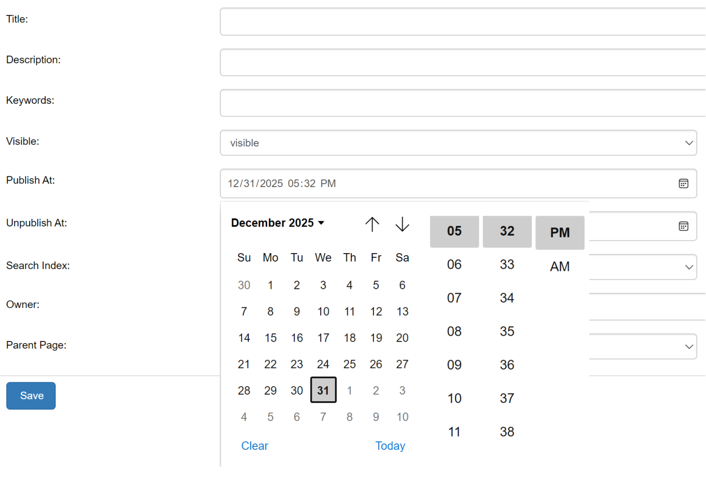
Note: you can leave these fields empty then it will work just like before.
Events
- New feature: Added clipboard event actions: Copy Text and Paste Text. This can be used to copy/paste text to/from text and form input elements.
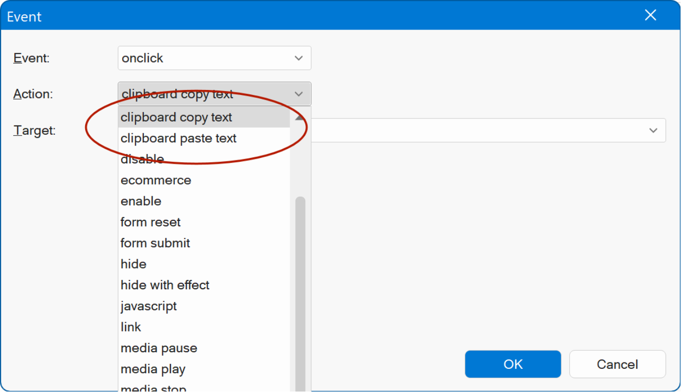
Demo
https://www.wysiwygwebbuilder.com/support/wb21tryouts/wb21_clipboardevents.html
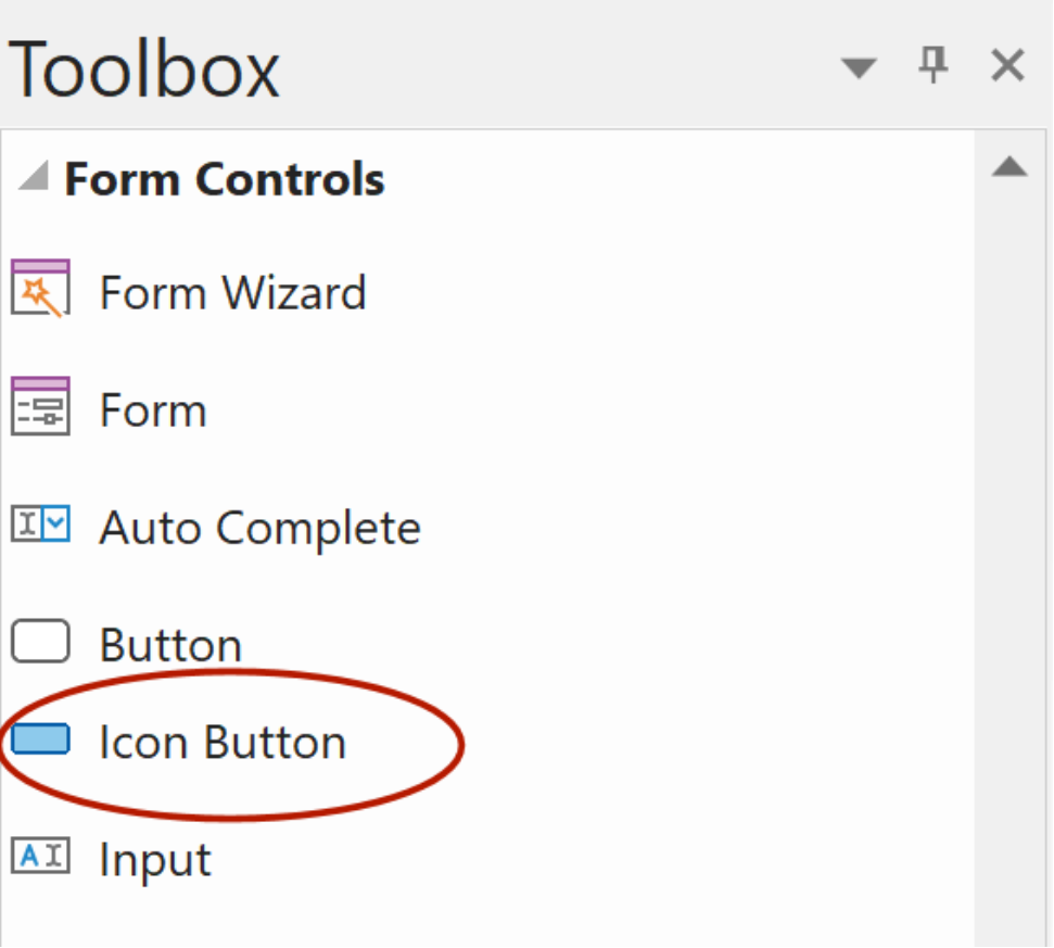
Icon Button
- Renamed: 'Themeable Button' is now called 'Icon Button' to better reflect its purpose and functionality.
Input
- Renamed: The object previously called 'Editbox' is now 'Input'. This aligns with the official HTML element name, improving consistency with other tools and standard documentation.
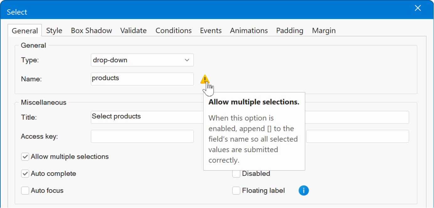
Select
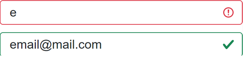
- Improved: The dropdown arrow style is now standardized across browsers, aligning with the default appearance in Bootstrap 5.x. This improvement also ensures better alignment and behavior when used together with Bootstrap validation icons.
- Improved: When the "Allow multiple selections' option is enabled, an info tip is now displayed to remind the user to append [] to the field s name so all selected values are submitted correctly.
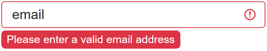
Form Validation
- New feature: Added new validation mode called Bootstrap Tooltips . Instead of displaying standard inline Bootstrap validation messages, this mode shows tooltips positioned beneath the input fields. These tooltips are absolutely positioned, ensuring they don t disrupt or shift the surrounding layout.
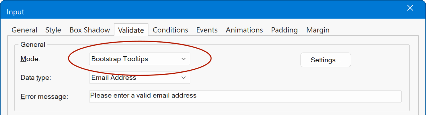
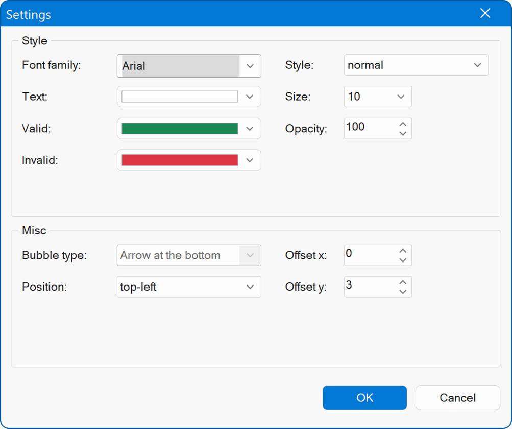
- New feature: Added the ability to configure the style of Bootstrap validation like font-size, colors, offset. Previously this style could not be changed.
Demo
https://www.wysiwygwebbuilder.com/support/wb21tryouts/wb21_formvalidation.html
- Improved: The Bootstrap validation has been updated to the latest version with updated icons. Also, unlike previous versions it can now be used in combination with different background modes (image, gradients, etc.).
Badge
- New feature: Added new Badge type 'Tag'. A price-tag style badge for highlighting prices, categories, or statuses.
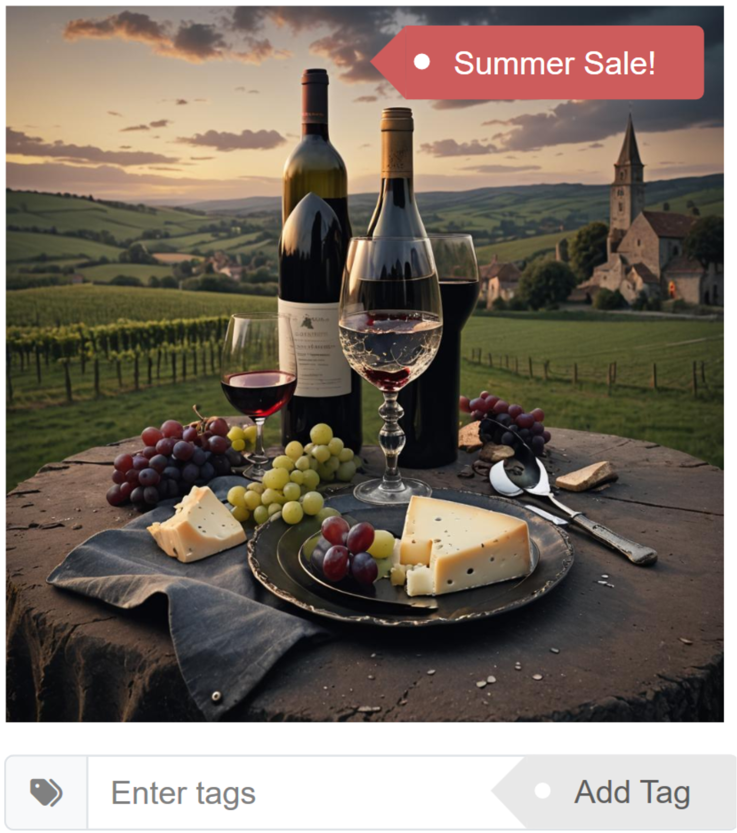
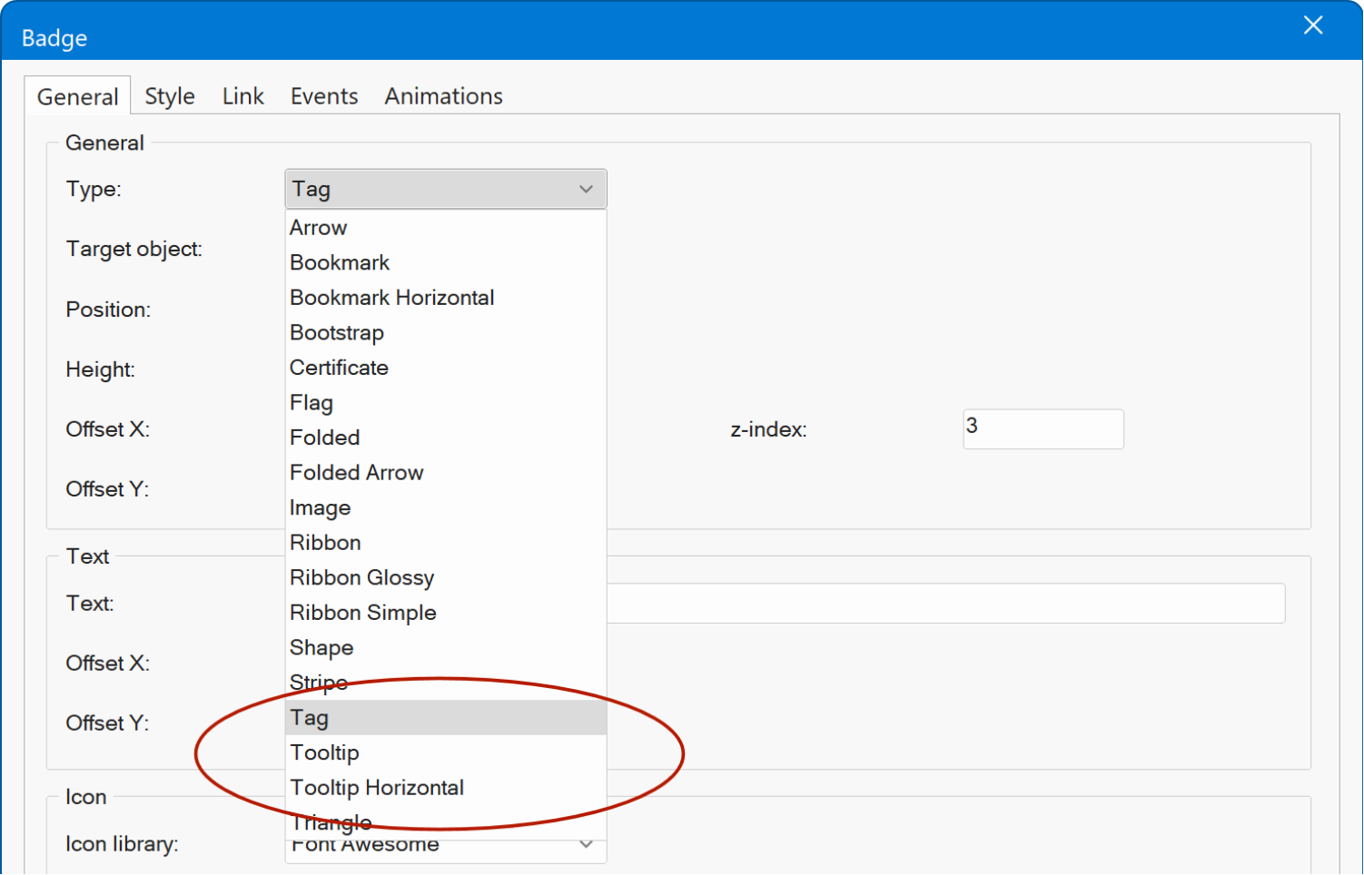
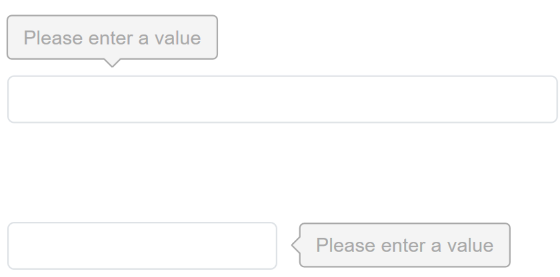
- New feature: Added new Badge type 'Tooltip'. a tooltip-style badge with an arrow and border for clear, inline callouts.
Demo
https://www.wysiwygwebbuilder.com/support/wb21tryouts/wb21_badges.html
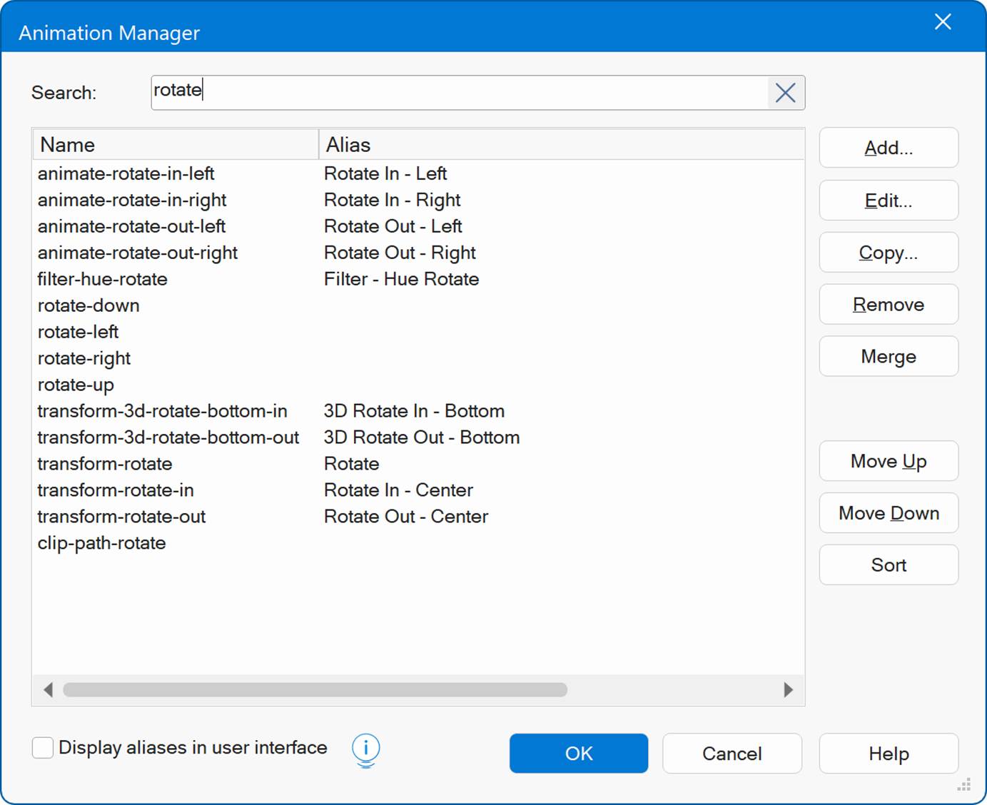
Animation Manager
- New feature: Added a Search option. If you have many animations, you can now quickly find the one you're looking for by searching by name.
Style Manager
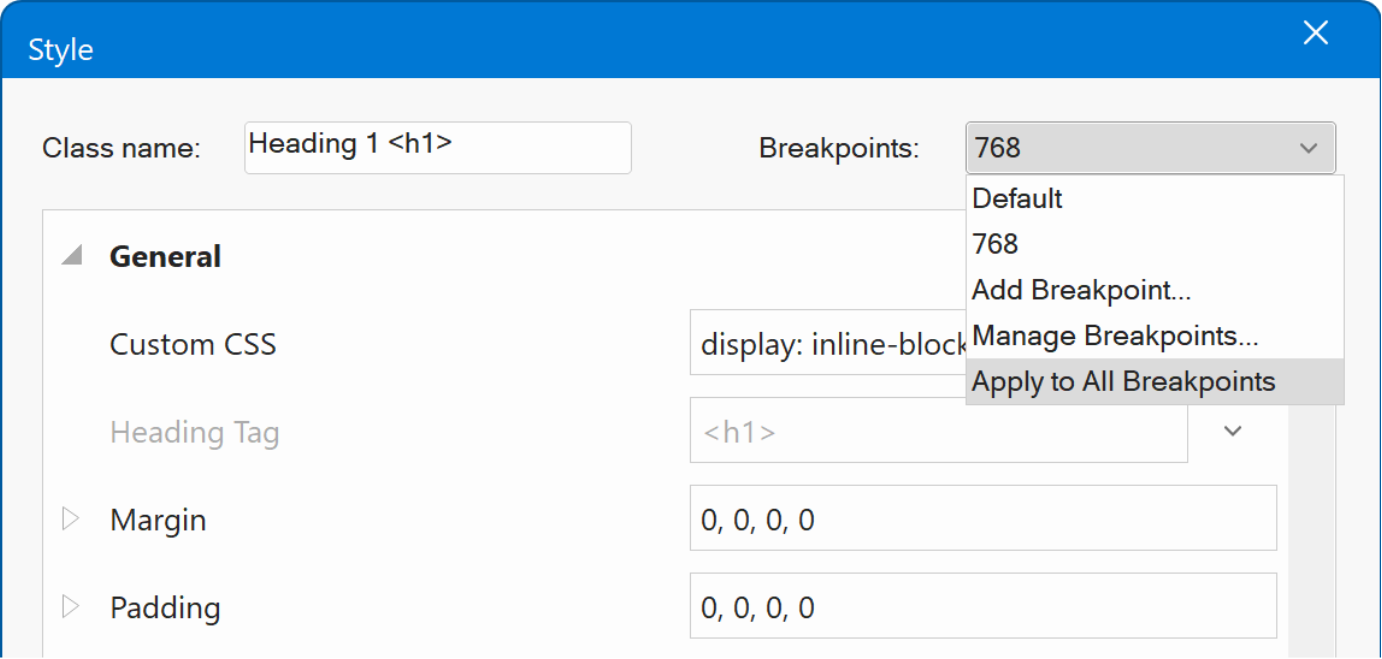
- New feature: Added 'Apply to all breakpoints' option. When you choose this option all values of the current style will be applied to all breakpoints of the style.
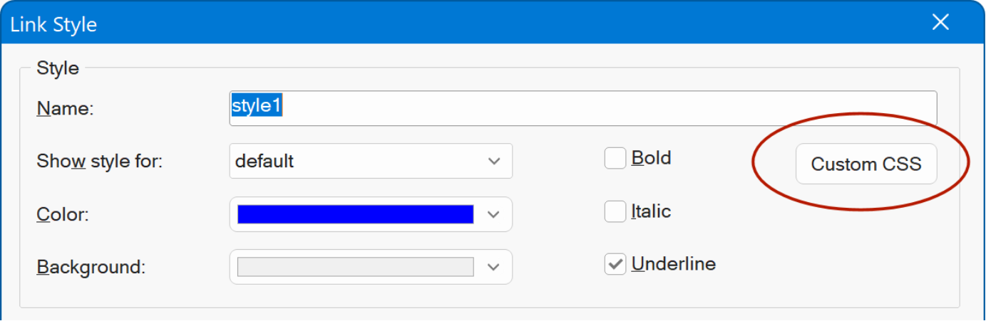
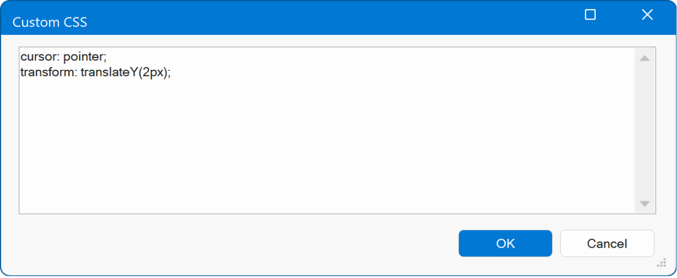
- New feature: Added 'Custom CSS' option to Link Styles. This adds the ability to add custom CSS to link styles. You can add different CSS for each state: default, active, visited and hover.
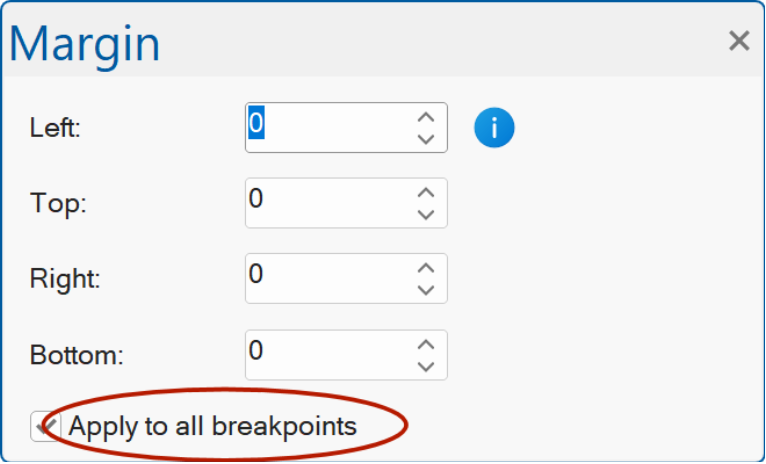
Margin / Padding
- New feature: You can now keep the Margin and Padding panels open all the time. This lets you adjust margins and padding quickly without reopening the dialog each time. The panels can either float freely or be docked to any side of your screen for easy access.
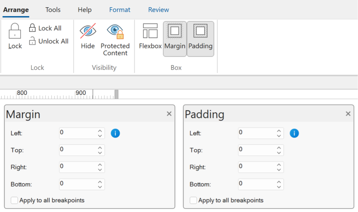
When used in combination with Cards or Layout Grids, then the padding properties show / update the values of the current active item.
- New feature: A new Apply to all breakpoints option has been added. When this option is turned on, any margin or padding changes you make will be applied to all breakpoints. When it s turned off, the changes will only affect the current breakpoint.
Language Modules
- New feature: Added 'Install Language' in Tools -> User Interface. This can be used to install a new display language.
So, you no longer have to manually download and unzip the files to the program files folder.
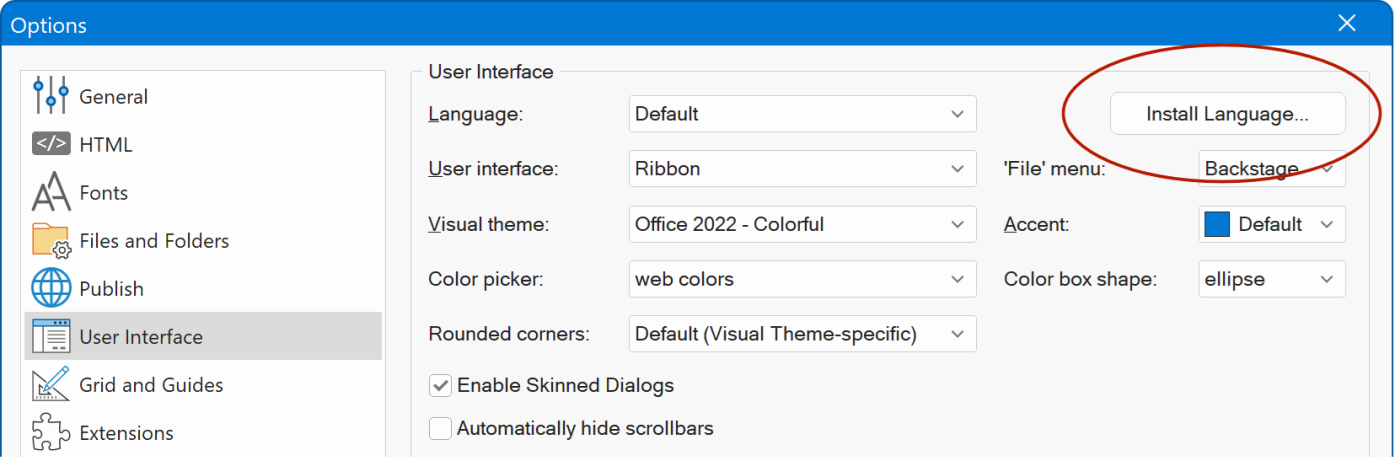
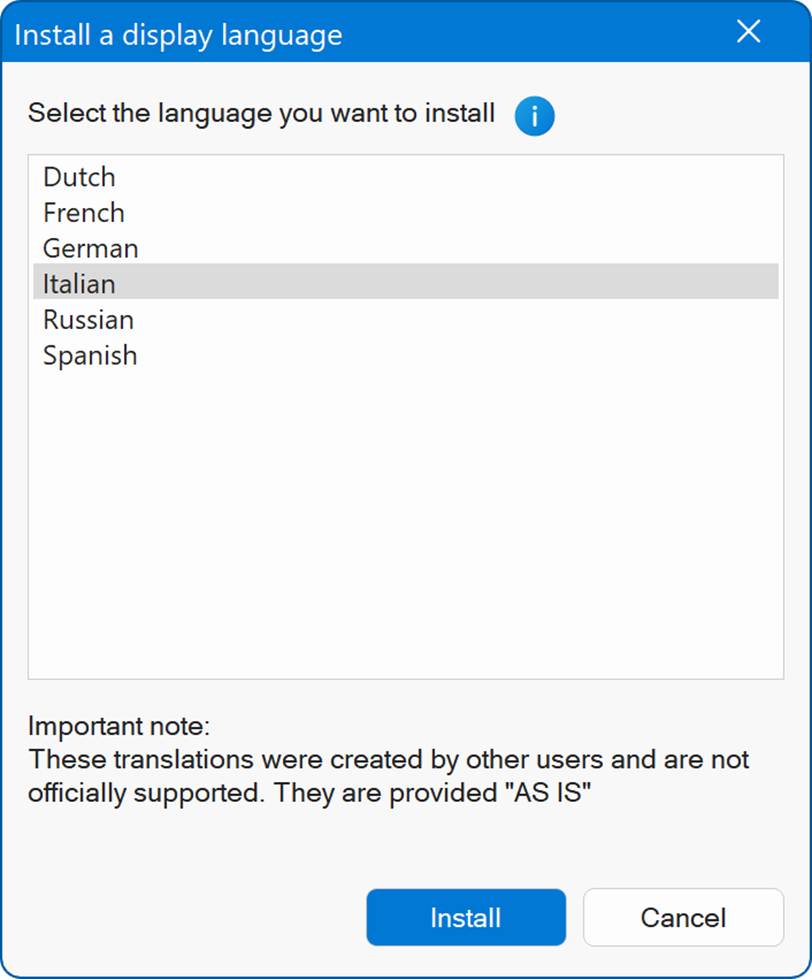
Notes: This list only includes languages that are actively maintained. Other languages which are not frequently updated are available on the website.
These translations were created by other users and are not officially supported. They are provided "AS IS".
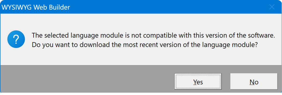
- New feature: During startup, the software verifies whether the installed language module matches the required version. If it does not, the software will prompt the user to automatically download and install the latest version.
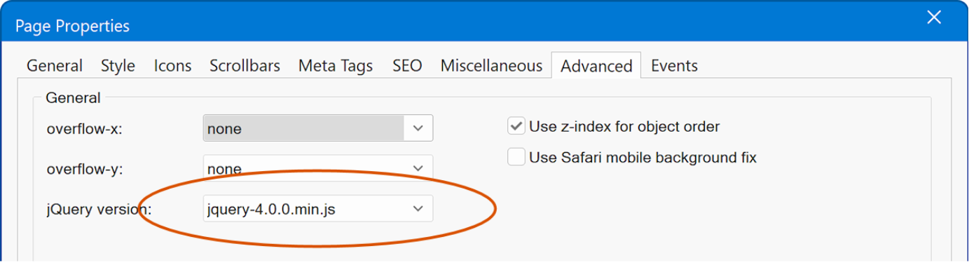
jQuery 4
- New feature: Added support for jQuery 4.
jQuery 4.0.0 introduces a wide range of improvements and modernizations, marking the first major release in nearly a decade. Since this version has only just been released, it is not enabled by default yet. However, support is now available so you can begin upgrading your pages and preparing for the latest enhancements when you re ready.
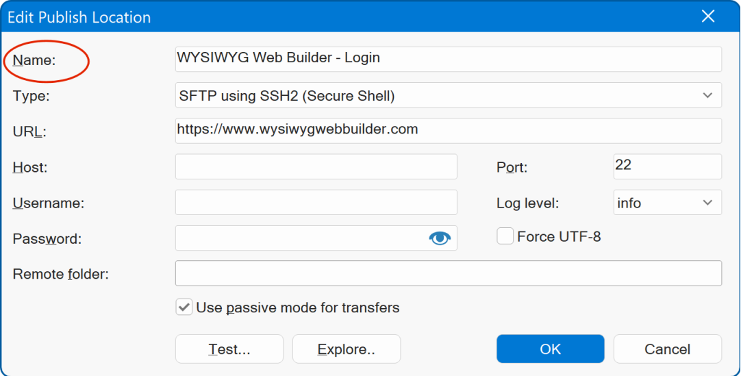
Publish
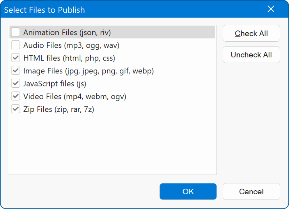
- New feature: Added 'Publish only specific files' option to publish window. This option can be used to publish only specific file types, like images, video, zip files etc. You can select one of more files type via the 'Filter' button.
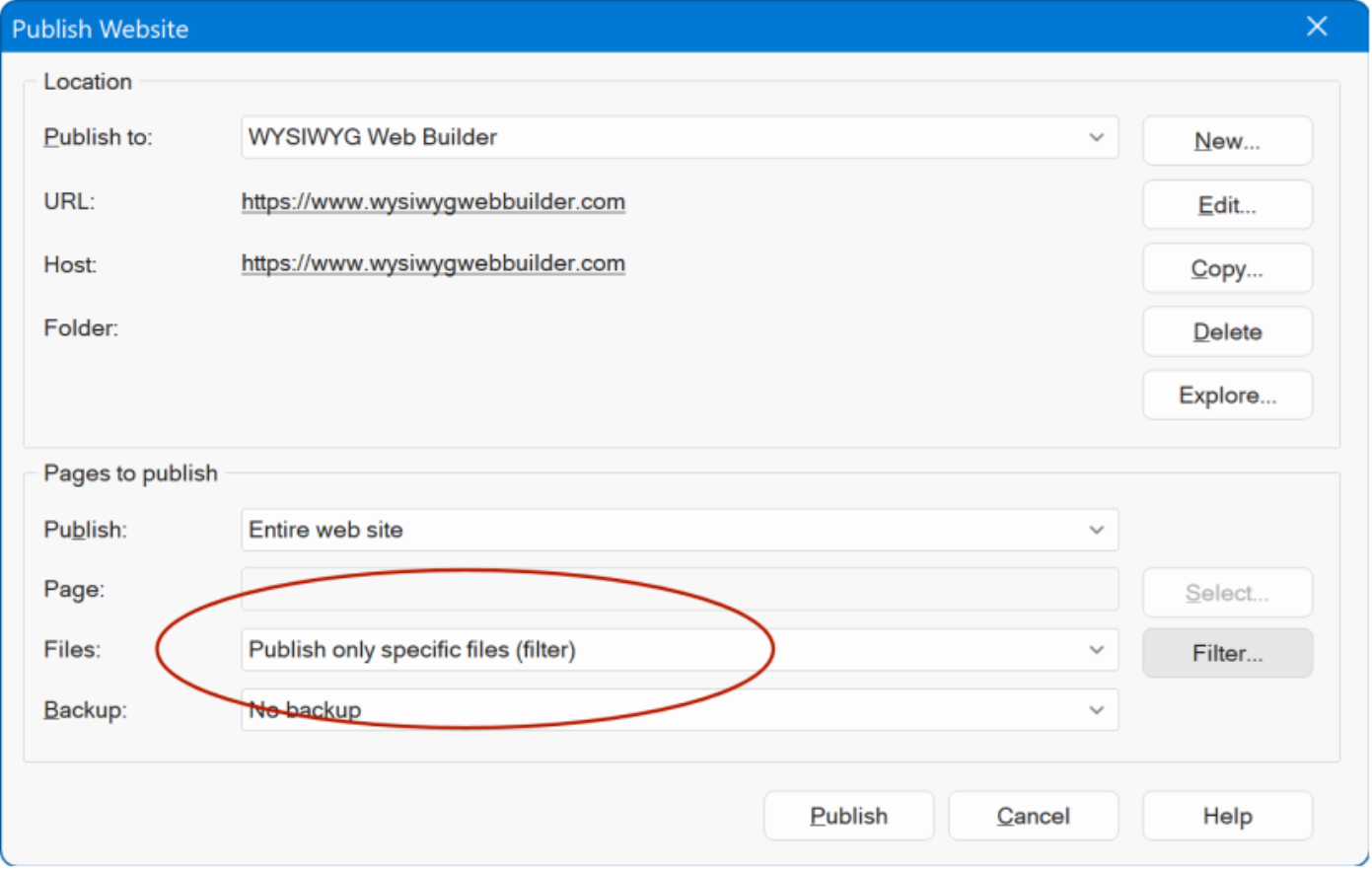
- Improved: Added a tip in Publish Settings explaining that users can create different publish locations per project.
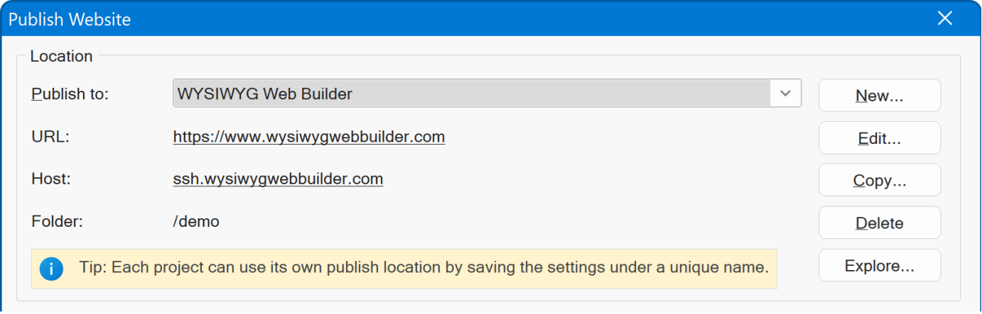
- Improved: In Edit Publish Location dialog, renamed Description to Name .
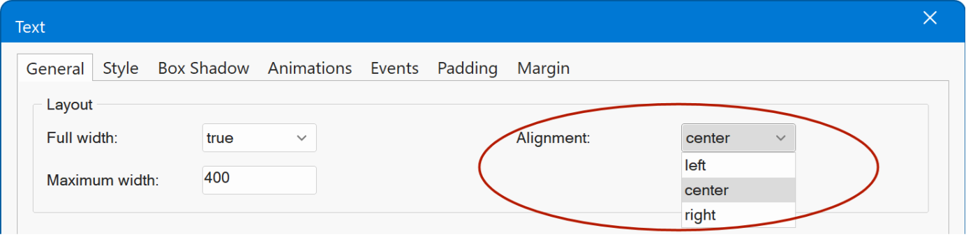
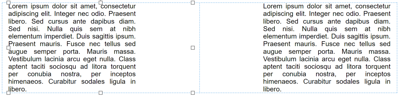
Text
- New feature: Added alignment for text in Flexible Layouts. Previously, text with max-width was always centered. Now, you can align it to the left, right, or keep it centered, giving you more control over how it behaves when the container is wider than the specified maximum width.
AI
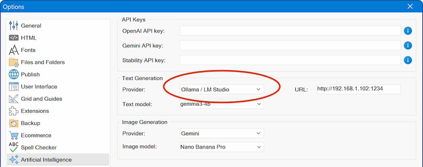
- New feature: Added support for LM Studio. LM Studio (https://lmstudio.ai/) is a popular desktop application that enables the local installation and use of large language models on laptops and desktop computers. By running models entirely on your own machine, LM Studio offers private, offline, and secure access to AI capabilities without relying on cloud services.
LM Studio is comparable to Ollama, which has already been supported by WYSIWYG Web Builder for some time. However, many users may find LM Studio easier to install, configure, and manage, thanks to its user-friendly interface and streamlined model handling.
The application supports a wide range of modern large language models, including DeepSeek, Llama, Qwen, Gemma, and gpt-oss (OpenAI s open-weight model).
Online tutorial
https://www.wysiwygwebbuilder.com/lmstudio.html
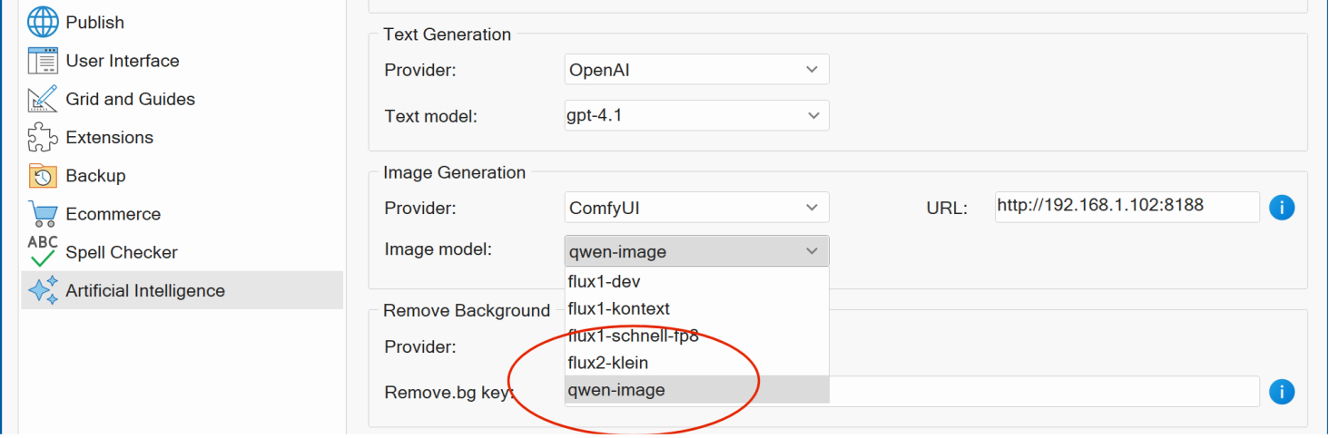
- New feature: Added support for Flux.2 [klein] and the Qwen Image models (2511 and 2512 Edit variants) for use with ComfyUI. These models are designed to deliver very high image quality while maintaining relatively fast generation speeds, making them well-suited for both iterative workflows and production use.
-
New feature: Added support
for Nano Banana 2 (gemini-3.1-flash-image-preview) and the latest models from
OpenAI: gpt-image-1-mini and gpt-image-1.5.
- New feature: A new Timeout option has been added to give you more control over AI-related network communication (including OpenAI, Google AI Studio, Ollama, and ComfyUI).
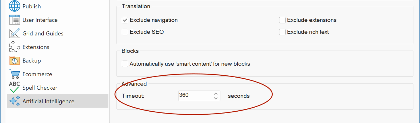
In some environments, the default network timeout may be too short, which can lead to premature timeout errors, especially when processing large requests, generating complex outputs, or working with slower or unstable network connections. This new option allows you to increase the timeout duration to better match your setup and workloads.
HTML object
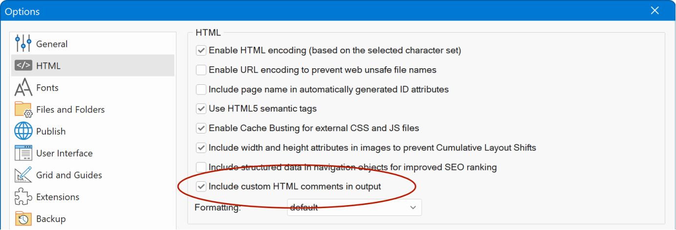
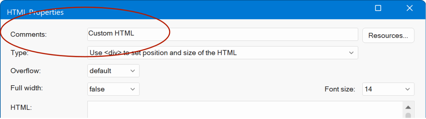
- New feature: You can now choose to exclude comments from custom HTML. Previously, comments were always included in the generated HTML. With this new option, you can disable comment inclusion, comments will remain visible in the workspace, but they will no longer appear in the final HTML output. Tools -> Options -> HTML
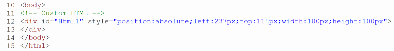
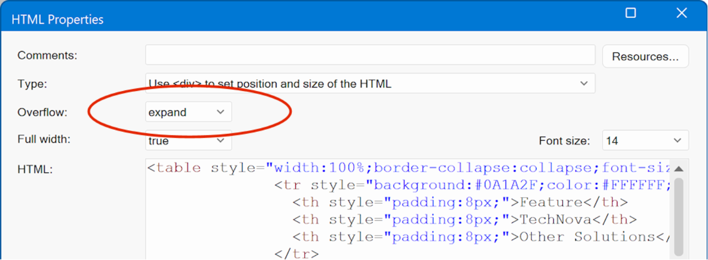
- New feature: Added a new overflow type, expand. When selected, the <div> height is set to auto , allowing the element to dynamically adjust its height so all content is displayed correctly without clipping.
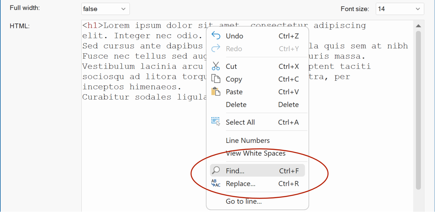
- New feature: Added 'Find' (Ctrl+F) and 'Replace' (Ctrl+R) commands to the context menu (right click). These commands are also available in Page HTML.
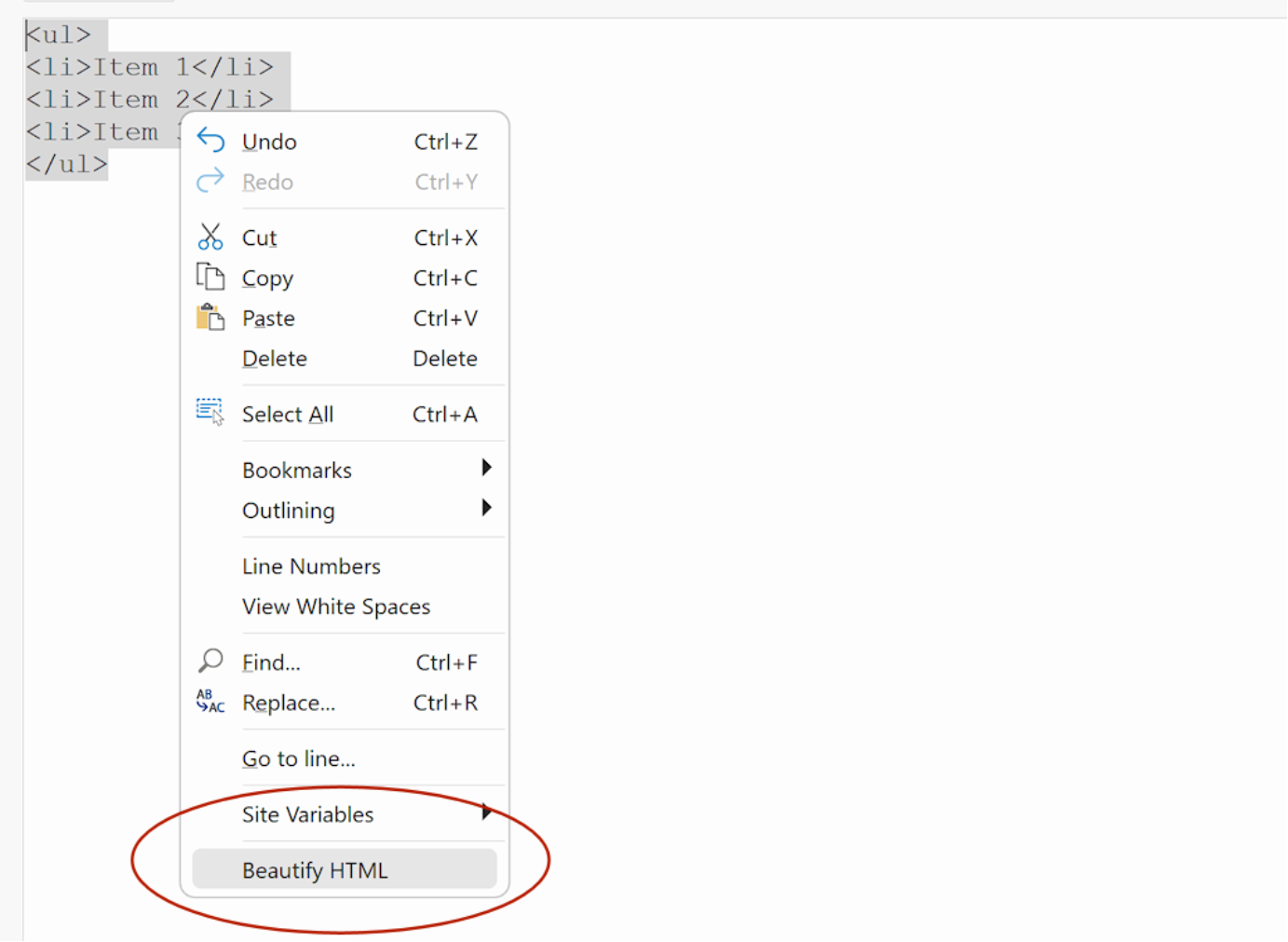
- New feature: Added Beautify HTML to the context menu. This option automatically reformats and properly indents the selected HTML code for improved readability.
Manage extensions per project
- New feature: Added new feature 'Manage extensions per project'. You can now maintain a separate set of extensions for each project instead of using a single global list. This option can be enabled via Tools → Options → Extensions.
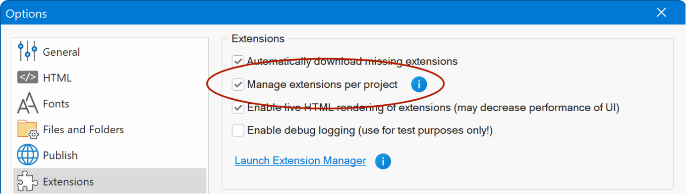
When enabled, the application creates a dedicated extensions folder inside each project directory:
Documents\WYSIWYG Web Builder\projectname\extensions
Any new extension you add while a project is active will be copied into that project s extensions folder rather than the global system folder. Likewise, removing an extension will only remove it for the current project.
If a project does not yet have its own extensions folder, one will be created automatically the next time the project is loaded, and all extensions from the global folder will be copied into it.
Note: If you choose not to enable this option, the application will continue to use the global extensions list as before.
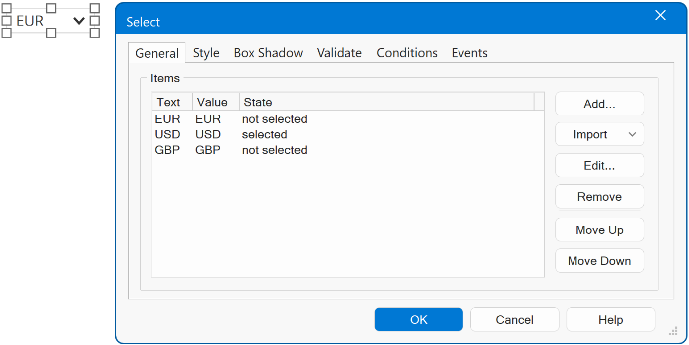
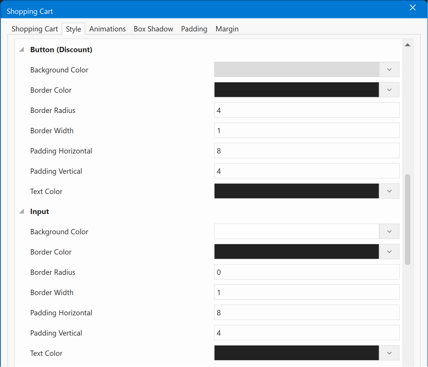
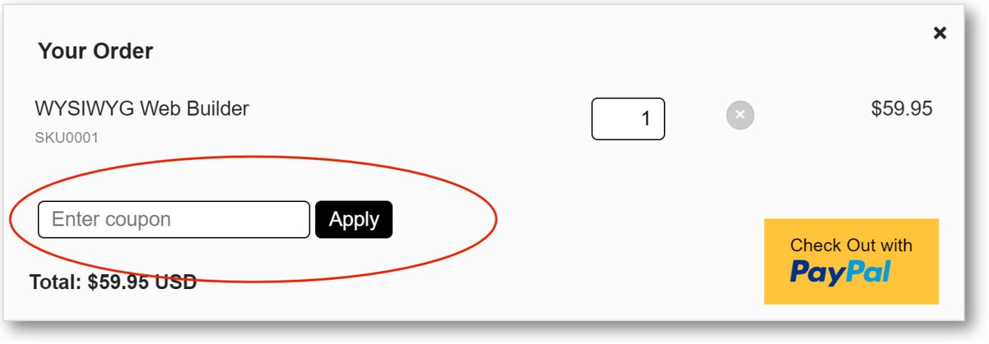
Shopping Cart
- New feature: Added a Currencies option that enables a currency selection menu for the shopping cart. Customers can choose from multiple currencies when viewing prices and completing checkout.
In the configuration, you can define the available currencies and specify their conversion rates.
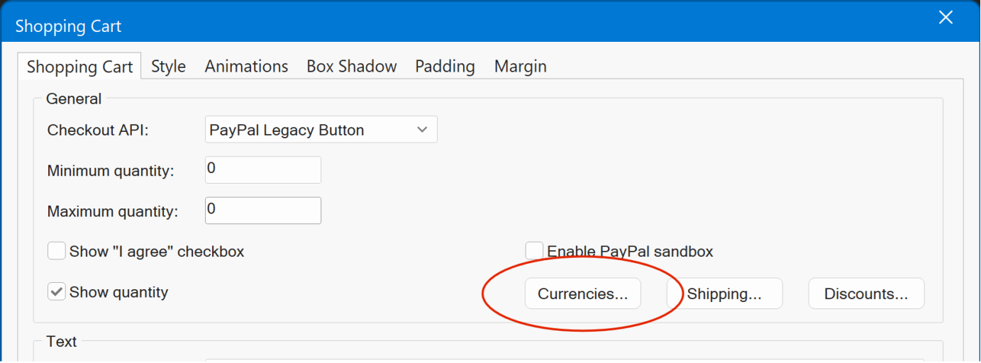
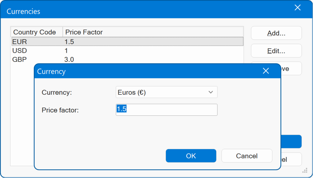
Next, add a select menu to the page with ID currency .
- New feature: Added styling options for the discount button and input
fields (coupon and quantity). You can now customize the background color, text
color, border, and padding to better match your design. Previously the cart
used the default browser style.
Site Variables
- New feature: Added the ability to insert site variables via the context menu of most text input fields. So, you can quickly insert pre-defined or user defined variables.
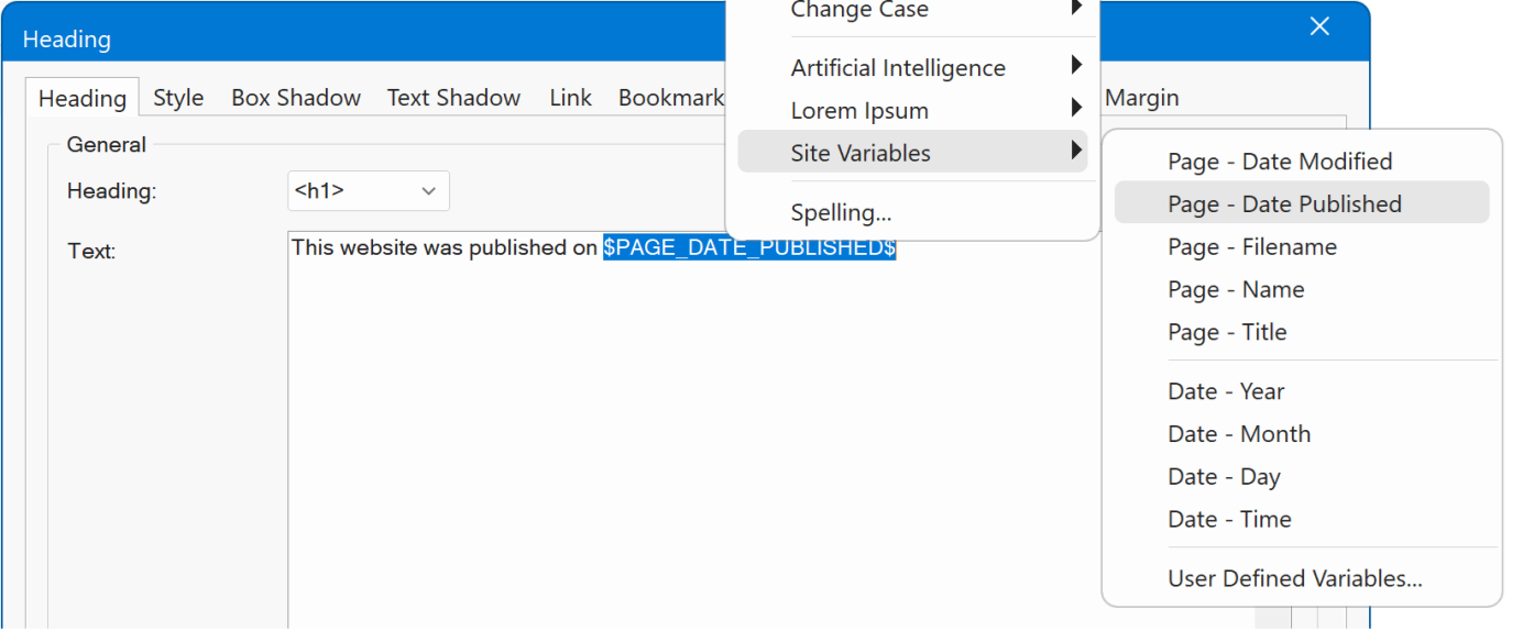
- New feature: Added new Site Variables:
$PAGE_DATE_MODIFIED$, inserts date of the last update.
$PAGE_DATE_PUBLISHED$, inserts publish date
$DATE_YEAR$, $DATE_MONTH$, $DATE_DAY$, insert year, months, day as numbers
$DATE_TIME$, inserts publish time HH:MM:SS
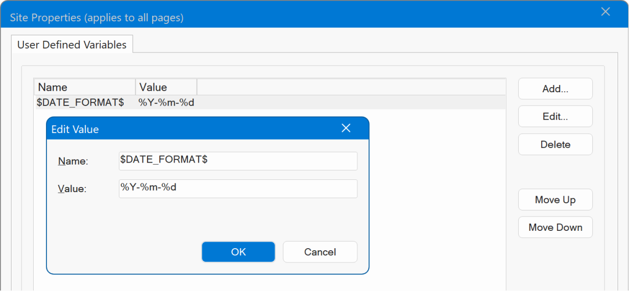
The default format for modified and publish dates is YYYY-MM-DD , but this can be changed via site variable $DATE_FORMAT$
For example:
%Y-%m-%d, 1999-03-28 or %A, %B %d, %Y Friday, March 19, 1999
Demo
https://www.wysiwygwebbuilder.com/support/wb21tryouts/wb21_sitevariables.html
Online tutorial
https://www.wysiwygwebbuilder.com/sitevariables.html
Icons
- New feature: Upgraded Font Awesome to version 7 with more than 80 new icons and many improved icons. Also, Font Awesome 7 has optimized CSS, and smaller font files.

- New feature: Added a Drop Shadow option (in addition to the existing box shadow). Unlike box shadow, which applies a shadow to the icon s container, drop shadow applies it directly to the icon and follows its exact shape, creating a more natural shadow effect.

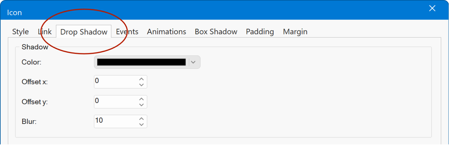
Demo
https://www.wysiwygwebbuilder.com/support/wb21tryouts/wb21_icon_dropshadow.html
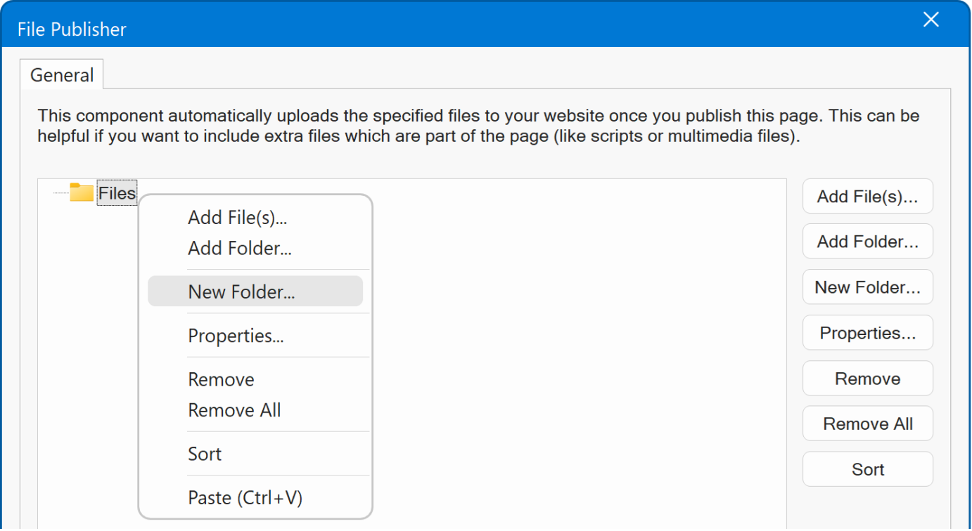
File Publisher
- New feature: You can now paste file or folder paths directly into the file list. This is useful when a path is already on the clipboard, eliminating the need to browse to the file or folder. Key: Ctrl+V
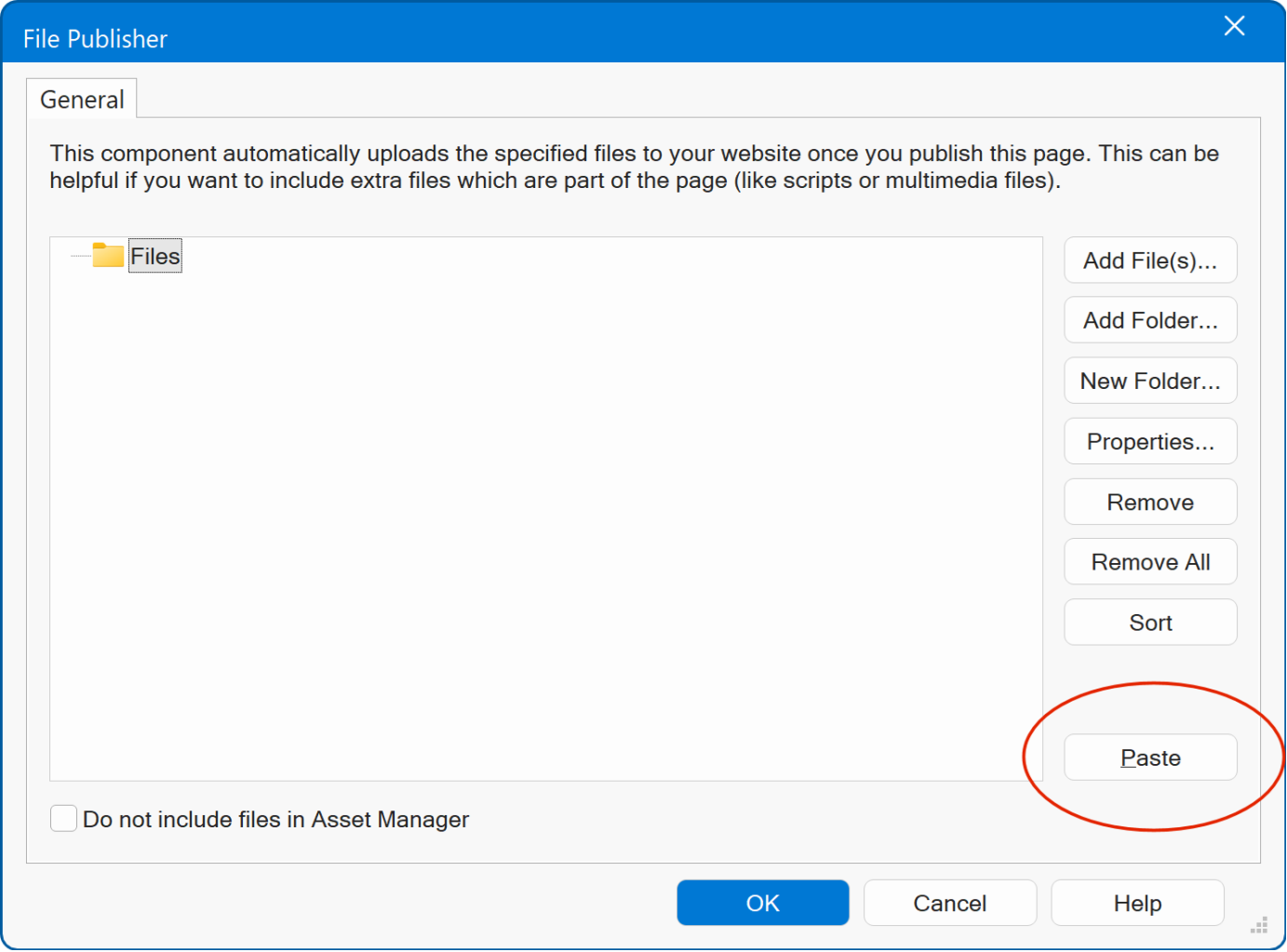
- New feature: Added the ability to drag & drop files and folders from Windows File Manager to the file list.
- New feature: Added context menu (right click) to the file list for quicker access to the available options.
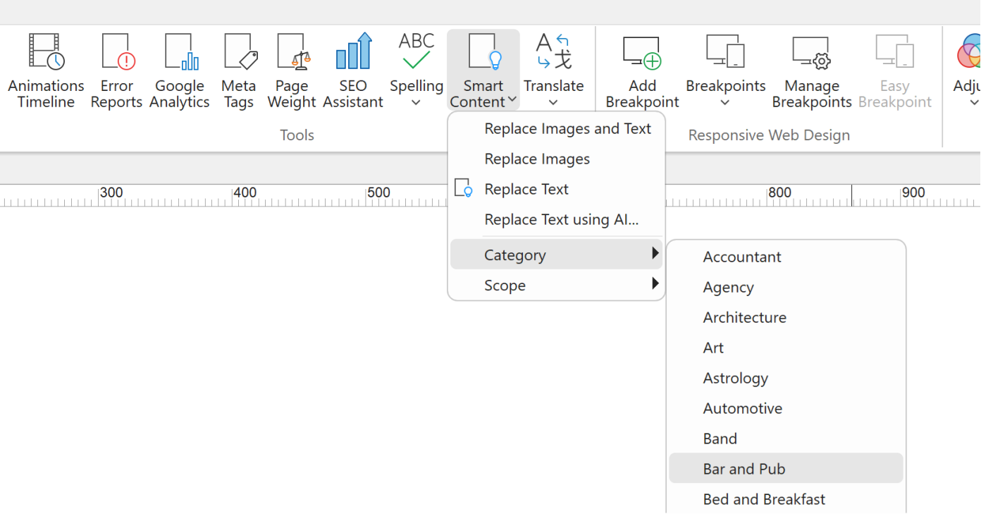
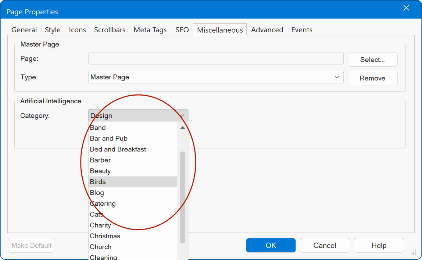
Categories
Added new categories for website wizard and smart content:
- Agency
- Architecture
- Bar and Pub
- Bed and Breakfast
- Birds
- Cats
- Christmas
- Cleaning
- Corporate
- Dentist
- Developer
- Dogs
- Fish and Aquariums
- Gallery
- Halloween
- Industrial
- Investment
- Moving Company
- News and Magazine
- Online Community
- Online Radio Station
- Pharmacy
- Realtor
- Rental
- Repair
- Reptiles
- Thanksgiving
- Web Design.
Other
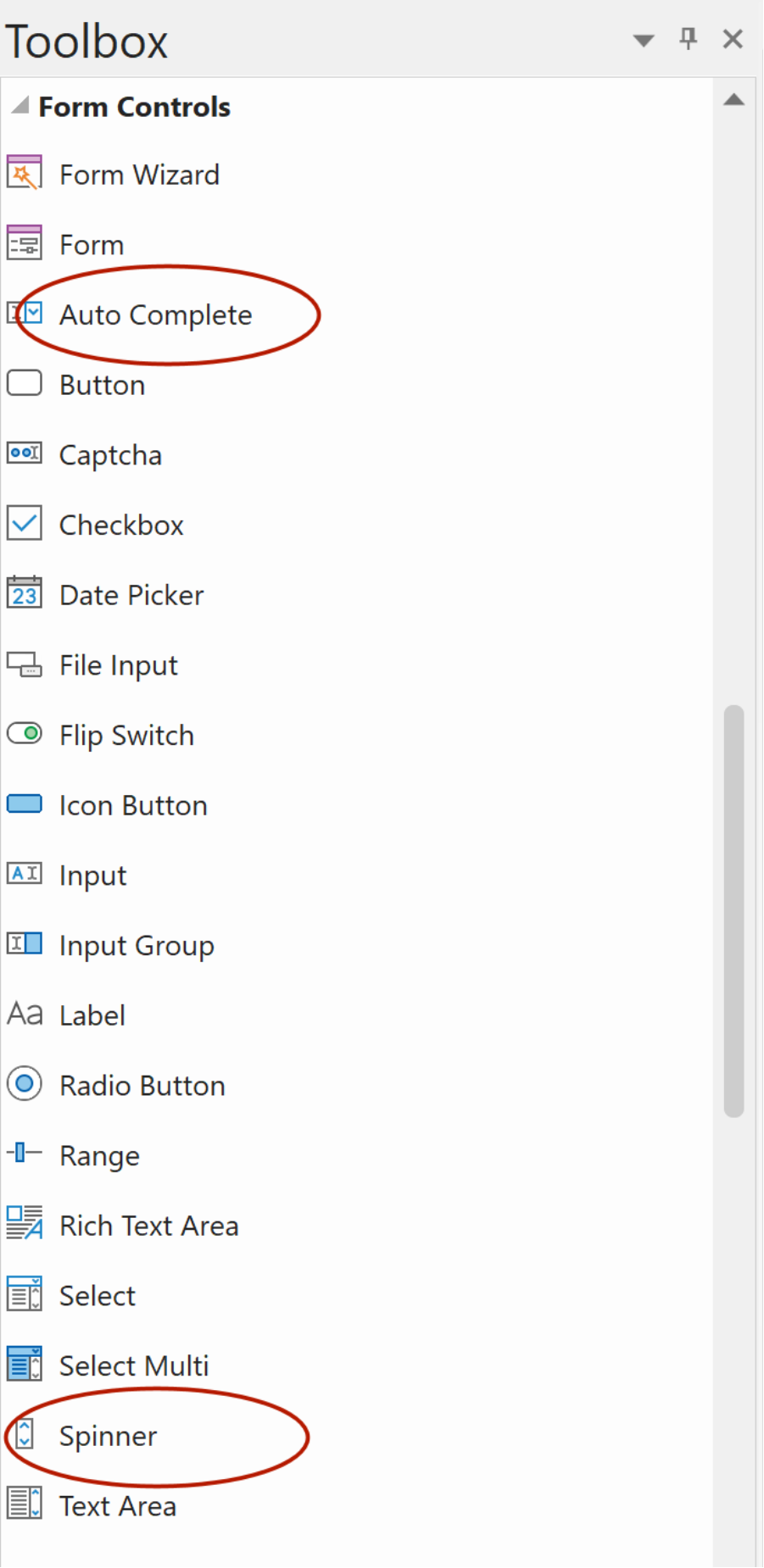
- 'Auto Complete' and 'Spinner' objects have been moved to the Form category in menus and toolbox.
Examples
Added 18 new example projects to Help -> Examples.
Box shadow
CSS Filters
CSS Lightbox
CSS Menu - Accordion
Easy Breakpoints
Events - Clipboard
Glass Morphism
Input Group
Layer Menu - Flexible
Mesh Gradients
Mix Blend - Marquee
Navigation Bar Responsive
Privacy and Cookies
Select Multi
Site Variables
Slideshow - Scroll Marquee
Visibility - Events
Visibility - Sticky
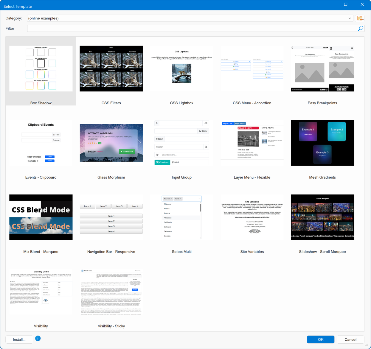
Privacy and Cookies
This release also introduces a demonstration project showcasing a customizable cookie consent popup with multiple consent categories, user controls, and script blocking based on user preferences.
The demo illustrates how third-party scripts can be conditionally loaded only after the appropriate consent has been given.
Although not a standalone feature, several underlying components have been enhanced and optimized to simplify implementation. These improvements include updates to: dialog, script handling, embedded page etc.
Together, these refinements make it easier to implement transparent, compliant consent mechanisms within your projects.
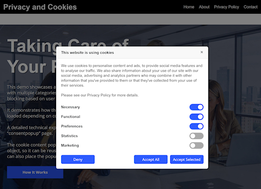
Demo:
https://www.wysiwygwebbuilder.com/support/wb21tryouts/wb21_privacycookies.html
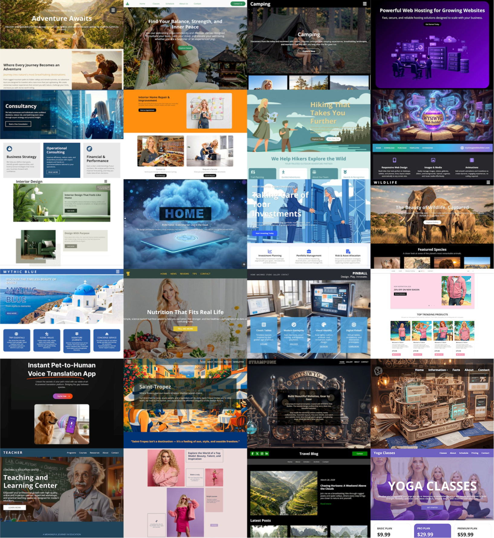
Templates
Added more than 25 new templates, designed to ignite your creativity, and showcase some of the new features in action. All new templates use Easy Breakpoints.
More Features
If you are upgrading from a version prior to version 17 then also check out what we ve added in version 20, 19, 18, 17, 16, 15, 14, 12, 11, 10, 9 and 8!
https://www.wysiwygwebbuilder.com/support/wb20.html
and
https://www.wysiwygwebbuilder.com/support/wb19.html
and
https://www.wysiwygwebbuilder.com/support/wb18.html
and
https://www.wysiwygwebbuilder.com/support/wb17.html
and
https://www.wysiwygwebbuilder.com/support/wb16.html
and
https://www.wysiwygwebbuilder.com/support/wb15.html
and
https://www.wysiwygwebbuilder.com/support/wb14.html
and
https://www.wysiwygwebbuilder.com/support/wb12.html
and
https://www.wysiwygwebbuilder.com/support/wb11.html
and
https://www.wysiwygwebbuilder.com/support/wb10.html
and
https://www.wysiwygwebbuilder.com/support/wb9.html
and
https://www.wysiwygwebbuilder.com/support/wb85.html
and
https://www.wysiwygwebbuilder.com/support/wb8.html