Easy Breakpoints
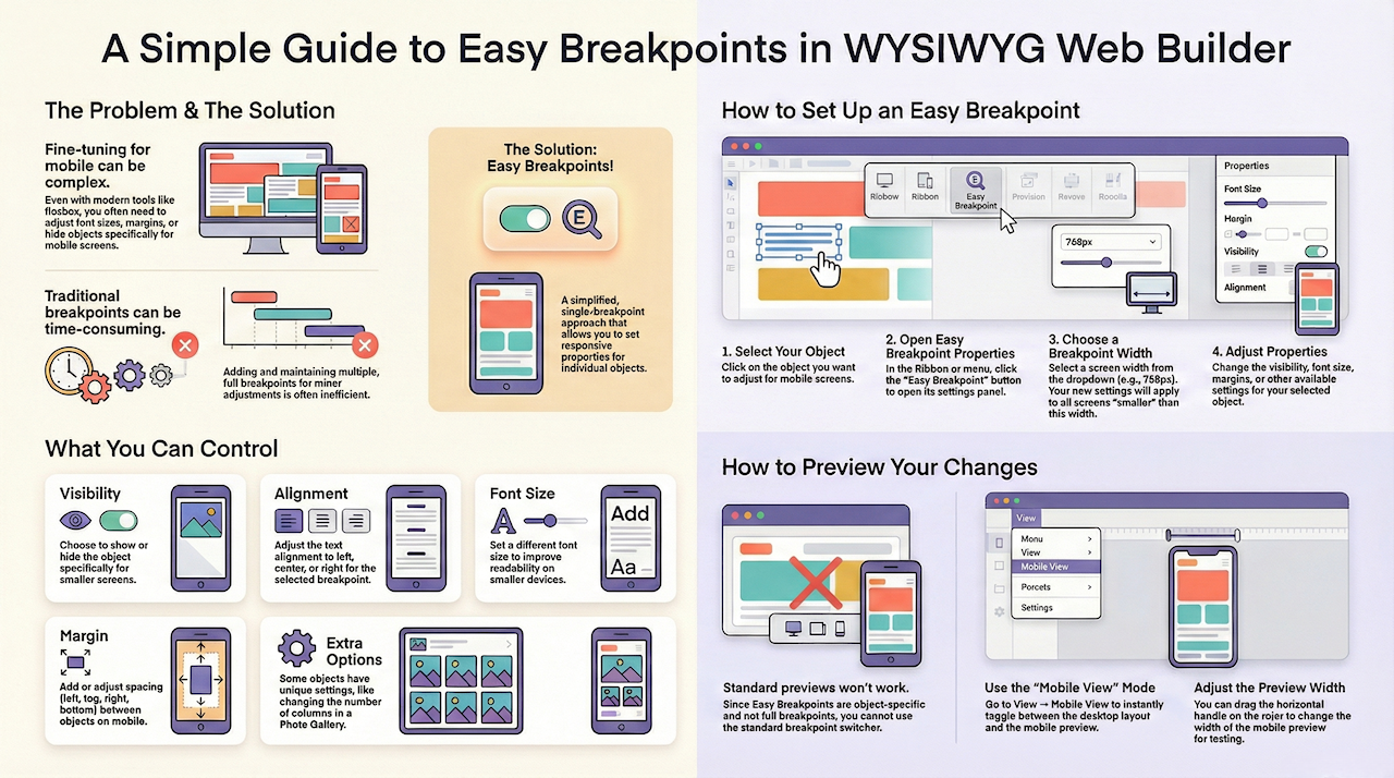
However, adding multiple breakpoints can be time-consuming and difficult to maintain. That’s where Easy Breakpoint becomes useful!
What is a Breakpoint?
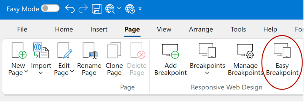
Setup an Easy Breakpoint
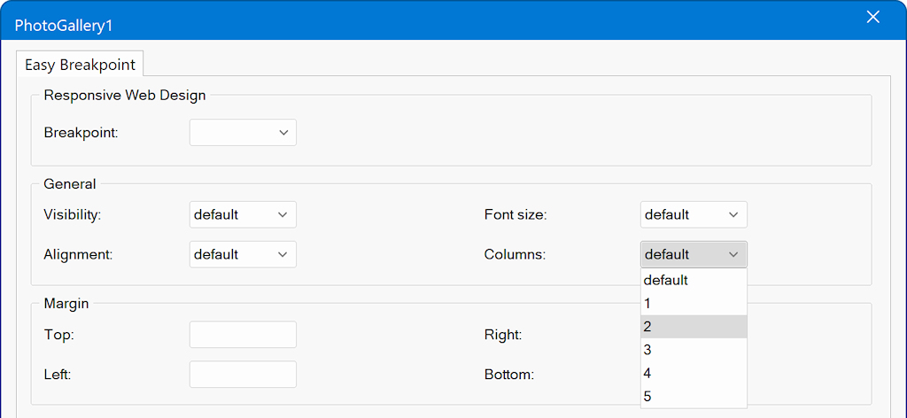
Note: when the value is empty or 'default' then it will not be affected.
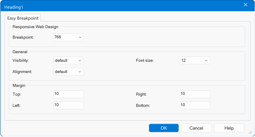
Breakpoint
Visibility
Note that you can initially hide an object via the Object Manager
Alignment
For Layout Grids, the alignment setting applies to all columns. It is quite common to center the content on smaller screens to improve readability and visual balance.
Font Size
Margin
Extra
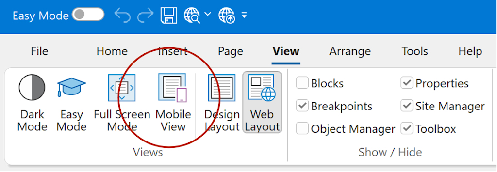
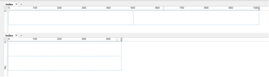
How to preview the mobile layout?
You can enable this mode via View → Mobile View to quickly toggle between Desktop and Mobile layouts.
Note that you can adjust the width of the mobile view via the horizontal handle on the ruler.
Example
Here's an example to demonstrate a common responsive design pattern:
on smaller screens, the desktop navigation menu is replaced by a mobile-friendly hamburger menu.
At the same time, margins are adjusted so the content fits better on smaller displays.
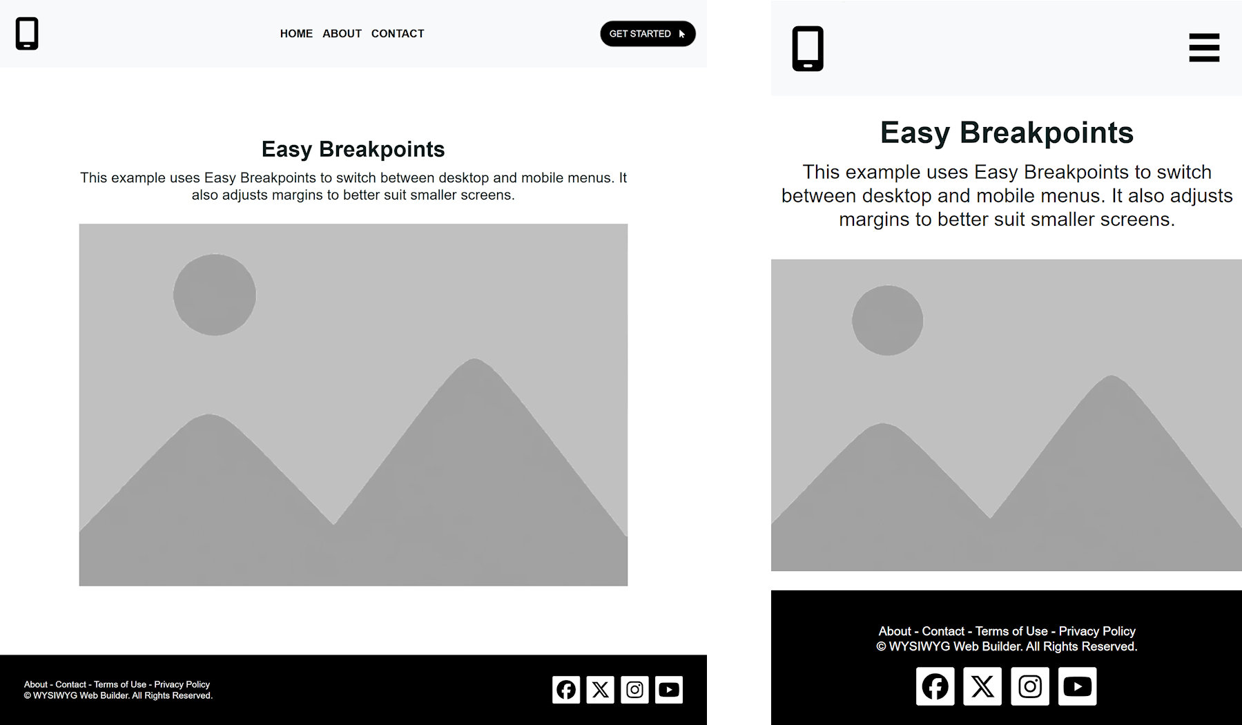
Desktop layout (width ≥ 768px)
- Full CSS menu is visible
- Mobile menu / hamburger button is hidden
- Content has generous margins
- Footer columns are aligned to left and right
Mobile layout (width < 768px)
- CSS menu is hidden
- Mobile menu / hamburger button is shown
- 'GET STARTED" button is hidden
- Content margins are reduced
- Footer columns are centered
In this example, all Easy Breakpoints use the same value: 768px.
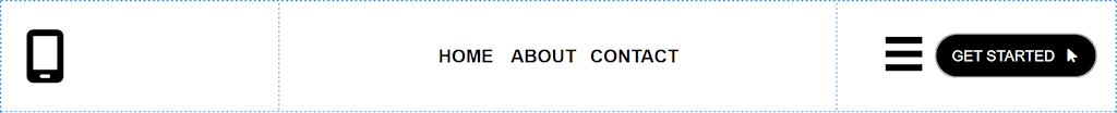
Step 1 – Create the Header Layout
We start with a simple header, built using a Layout Grid with three columns:
Column 1 (left)
Contains an icon (for example, a logo).
Column 2 (center)
Contains a CSS Menu.
This menu is intended for the desktop layout.
Column 3 (right)
Contains a "Getting Started" button and an Overlay Menu.
Synchronizing Menus
For the Overlay Menu, enable “Synchronize with another menu” and select the CSS Menu.
This ensures that both menus always contain the same items, so you only need to edit one menu.
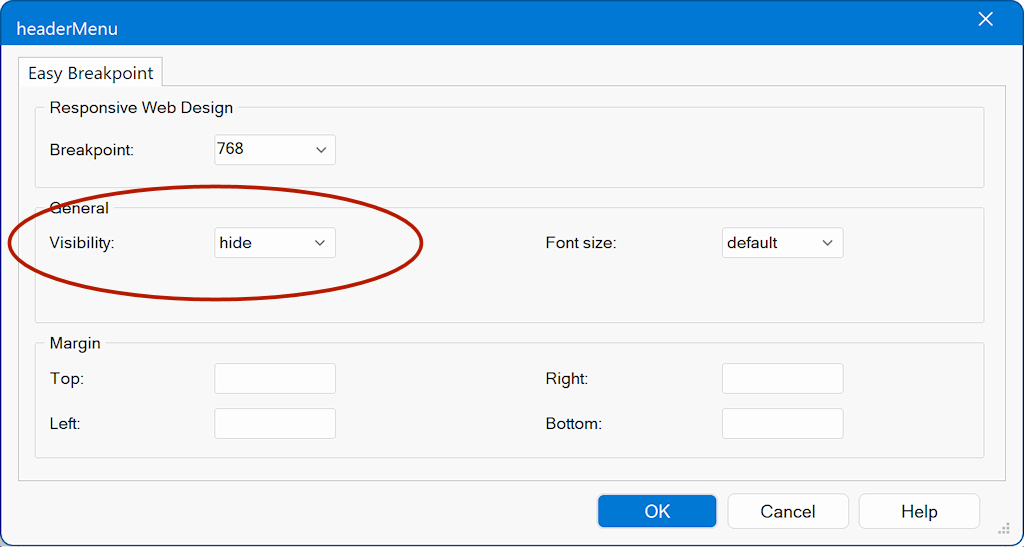
Step 2 – Hide the CSS Menu on Mobile
Select the CSS Menu and open its Easy Breakpoint settings.
Breakpoint: 768
Visibility: hide
This hides the desktop menu when the page is viewed on smaller screens.
Use the same settings to hide the "Getting Started" button.
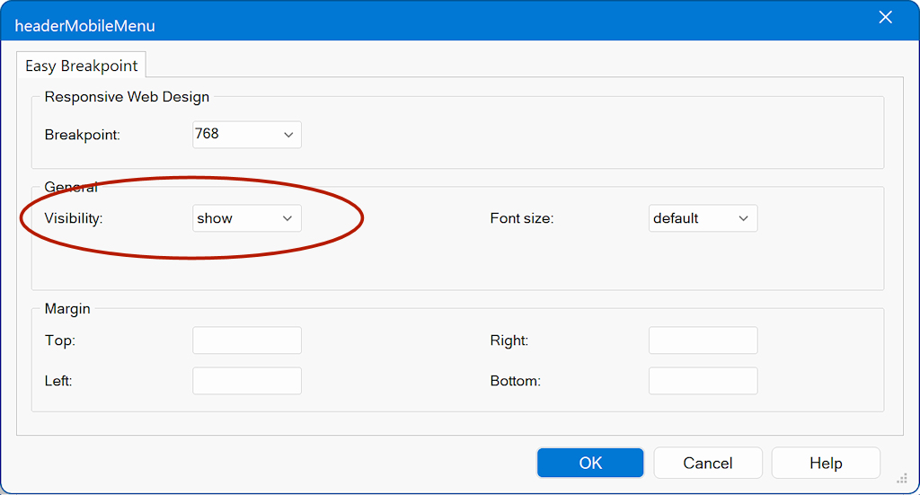
Step 3 – Show the Overlay Menu on Mobile
Select the Overlay Menu and open its Easy Breakpoint settings.
Breakpoint: 768
Visibility: show
Now the mobile menu becomes visible when the page width is below 768px.
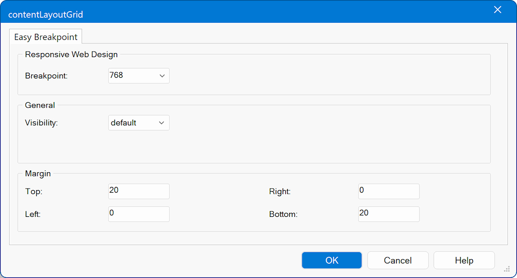
Step 4 – Adjust Margins for Mobile Layout
Next, we optimize spacing for smaller screens. For Desktop the margins are set to 100px
Select the content layout grid (contentLayoutGrid) and add an Easy Breakpoint.
Mobile margins (Breakpoint: 768):
Top: 20px
Bottom: 20px
This prevents the content from taking up too much vertical space on mobile devices.
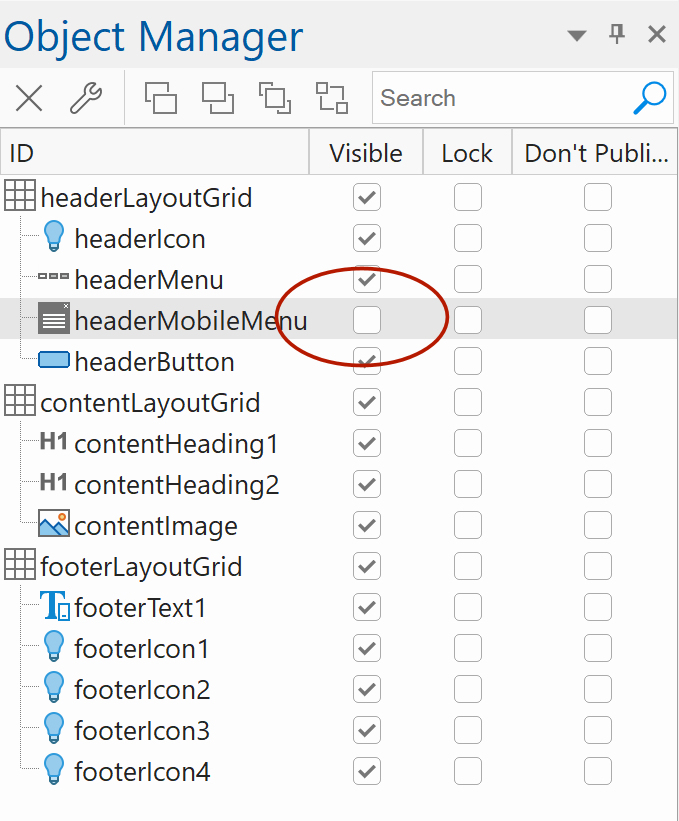
Step 5 – Hide the Mobile Menu by Default
Finally, open the Object Manager.
Set the Overlay Menu to not visible by default.
This ensures the mobile menu is hidden initially and only becomes visible when triggered by the breakpoint.
Demo
Easy Breakpoints Demo
Download the project file (wbs):
https://www.wysiwygwebbuilder.com/support/easybreakpoints.zip
Many of the recently released templates also use Easy Breakpoints, providing plenty of practical, real-world examples to explore.
https://www.wysiwygwebbuilder.com/templates2026.html
Related Tutorials
https://www.wysiwygwebbuilder.com/rwd_basics.html
https://www.wysiwygwebbuilder.com/layoutgrid_part1.html
https://www.wysiwygwebbuilder.com/layoutgrid_part2.html
https://www.wysiwygwebbuilder.com/flexbox.html
https://www.wysiwygwebbuilder.com/flexgrid_part1.html
https://www.wysiwygwebbuilder.com/flexgrid_part2.html