An introduction to the basic functionality of WYSIWYG Web Builder
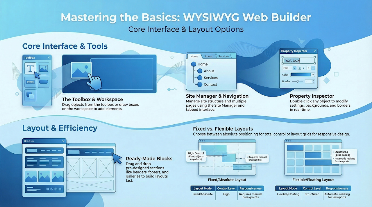
WYSIWYG Web Builder is a Web site building tool that helps you design and build full-featured Web sites without having to learn HTML. When you startup Web Builder the main screen will look something like this:

Ribbon
The Ribbon provides quick access to all available tools and commands in WYSIWYG Web Builder. It is organized into tabs, each containing related groups of tools, which eliminates the need for multiple traditional toolbars (which are still available if preferred).
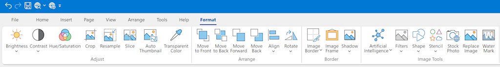
Some Ribbon tabs are context-sensitive and only appear when a specific type of object is selected. For example, when you select a text object, text formatting tools become available. When you select an image, image editing tools such as brightness, contrast, cropping, and effects are displayed.
Some Ribbon tabs are context-sensitive and only appear when a specific type of object is selected. For example, when you select a text object, text formatting tools become available. When you select an image, image editing tools such as brightness, contrast, cropping, and effects are displayed.
See also: An introduction to the Ribbon Interface.
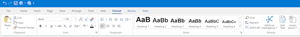
Text formatting tools are only available when a text object is in edit mode. To add text, drag the Text object from the Toolbox to the workspace. A new object with the default text "Double click to edit" will appear.
To edit the text, double-click the object to enter text edit mode. The Ribbon will automatically display text formatting options such as:
- Font type and size
- Text styles (bold, italic, underline)
- Text alignment
- Lists and paragraph formatting
- Heading styles
Some formatting commands require you to first select the text, similar to working in a standard text editor.
Related article: Adding text to a web page
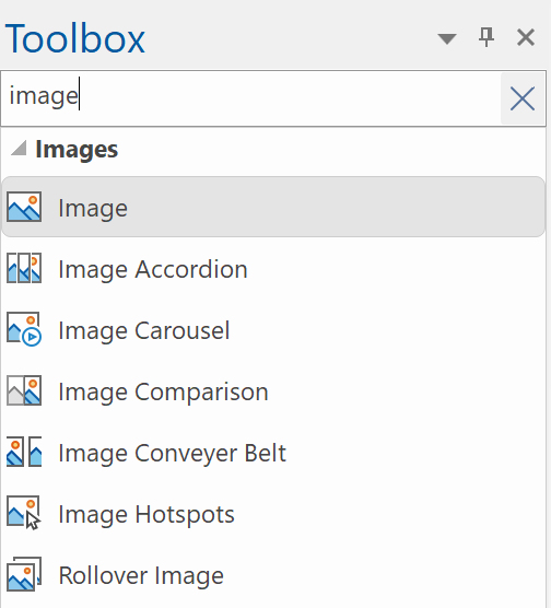
Toolbox
The toolbox can be used to add new objects to your web pages. To insert a new object, select one of the available items and draw a box to indicate the position of the object. The new object will now be inserted to the page. Another way to add objects to your page is by simply dragging them out of the toolbox onto the workspace. Via the context menu (right click), you can customize the toobox.
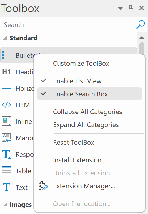
To quickly find a specific item within the toolbox, there is a 'Search' input field located at the top.
This feature functions as a filter, displaying only those items that match the entered search term.
This feature functions as a filter, displaying only those items that match the entered search term.
Blocks
Blocks are pre-designed sections that you can drag and drop onto your page to quickly build a website layout. Examples include headers, footers, text sections, image galleries, and contact forms.
A block is essentially a collection of standard objects combined into a single reusable layout. After adding a block to your page, you can fully customize its content, layout, and appearance just like any other objects.
WYSIWYG Web Builder includes many standard blocks to help you get started. You can also create your own blocks by saving a group of objects as a block, allowing you to reuse them in other pages or projects.
Optionally, blocks can automatically insert Smart Content (text and images) based on the selected category when a new block is added. Instead of using placeholder images and generic text, Smart Content inserts relevant images and text related to your website topic.
For more information, please see the Smart Content tutorial.
To show or hide the Blocks panel, select Menu → View → Blocks.

For more information about using Blocks, please read An Introduction to Blocks
Tabs
When multiple pages are open, you can use the tabs to easily switch between them. Each open page is displayed as a separate tab, allowing you to quickly navigate through your project.
To close the active page, click the small × button in the upper-right corner of the tab strip, or on the tab itself (depending on your settings).
To quickly add a new page, click the + button on the right side of the tab bar.
To close the active page, click the small × button in the upper-right corner of the tab strip, or on the tab itself (depending on your settings).
To quickly add a new page, click the + button on the right side of the tab bar.
Workspace
The center of the screen is the workspace. This is the main design area where you create and edit your web pages. You can drag objects from the Toolbox and position them anywhere within the workspace to build your layout.
Objects placed in the workspace can be selected, resized, and moved using the mouse. When an object is selected, its properties can be modified in the Property Inspector panel on the right side of the screen.
You can zoom in or out of the workspace using the zoom control in the status bar to work more precisely on detailed sections of your design.
The workspace represents the visual layout of your page as it will appear in the browser, making it easy to design your website using a WYSIWYG (What You See Is What You Get) approach.
Site Manager
The Site Manager is used to manage the structure of your web site. It represents the page structure on the web server.
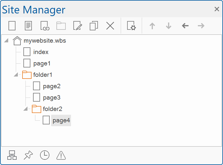
The Site Manager has its own toolbar to add, edit, clone or remove pages. There's also a button to open the properties of the selected page.
In the picture on the left you see an example of a web site structure. The filename of this example web site is called 'mywebsite.wbs', this name is always displayed at the root of web site tree. The root can have one of more pages and each page can also have sub pages.
The home page of a web site should always be named 'index', so for this reason Web builder automatically adds this page to each new project. The names of the items (pages) in the site tree are the actual file names of the target HTML files, so if you named a page 'index' is will publish as index.html.
For more details please read this: An introduction to the Site Manager
Property Inspector
You can modify an object’s properties by double-clicking it. This opens the Properties dialog, which contains all available settings for the selected object. After making your changes, click OK to apply them.
In addition to the main Properties dialog, WYSIWYG Web Builder also offers a convenient modeless (floating) window that provides quick access to commonly used properties such as background settings, borders, and text styles. This allows you to make frequent adjustments more efficiently without opening the full properties dialog.
Use the Property Inspector to view and edit the properties of the currently selected object. The Page Properties Inspector can also be used to modify page-level settings. Any changes you make through these inspectors are applied immediately and are visible in real time, making it easier to fine-tune your design as you work.
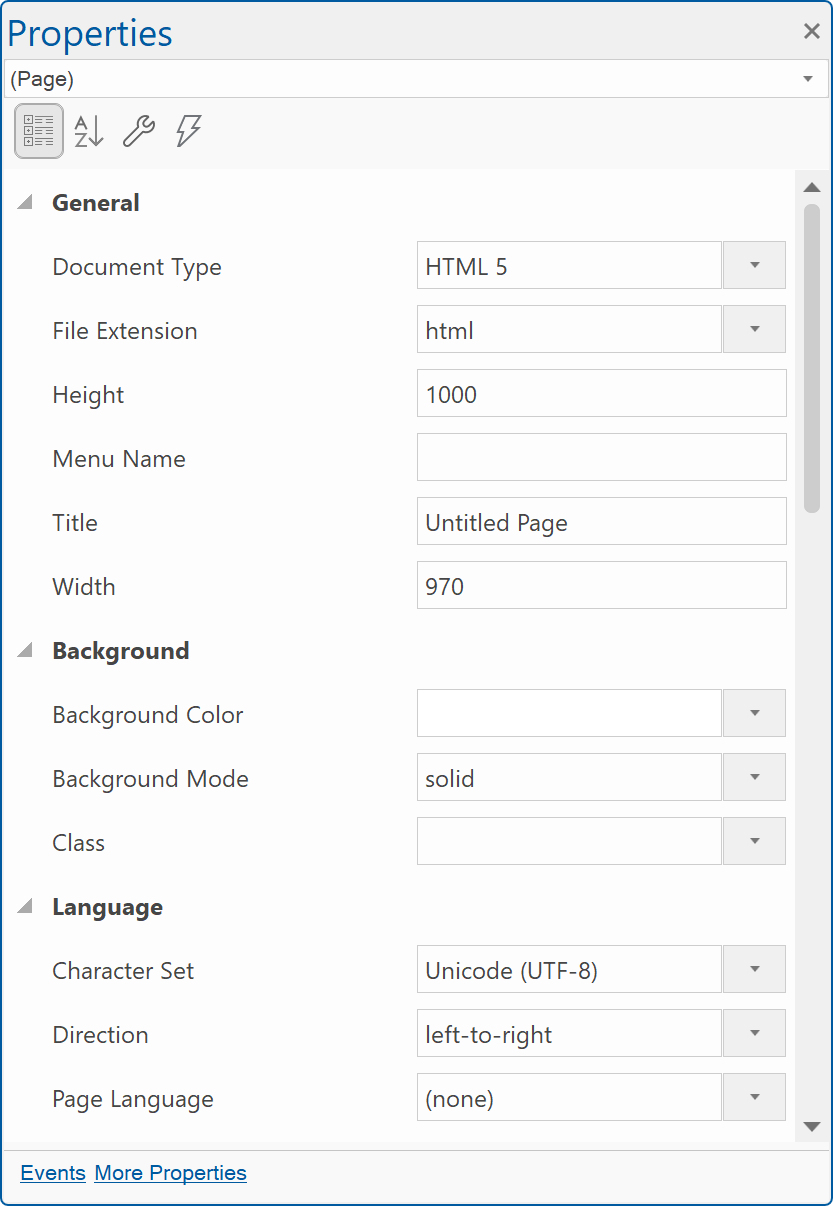
The Property Inspector displays different types of editing fields, depending on the needs of a particular property. These edit fields include edit boxes, drop-down lists, and links to custom editor dialog boxes.
It's also possible to manually modify the size and position of the selected object by changing the Position and Size properties.
It's also possible to manually modify the size and position of the selected object by changing the Position and Size properties.
Object Manager
To display the Object Manager click View -> Object Manager.
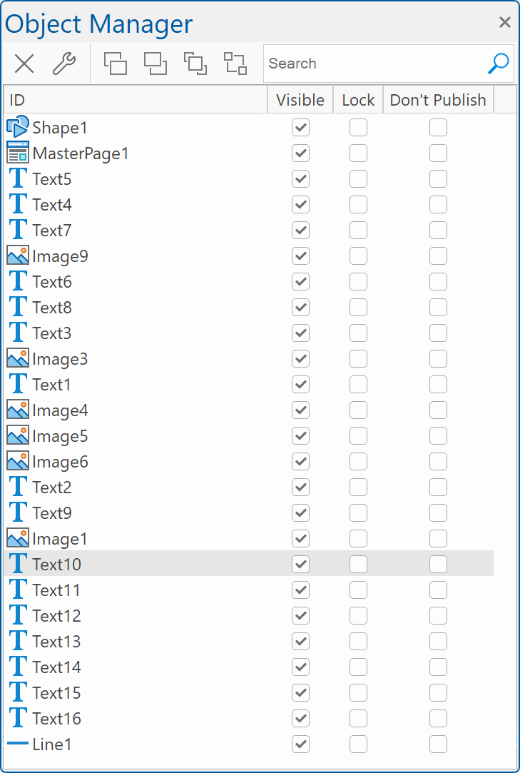
The Object Manager displays an overview of all objects in the current page, you can change the order or remove objects.
It is also possible to drag & drop an object to change its position (z-order): if you drop an object on another object then it will be moved after this object. Double click an object in the list to select it in the workspace.
The Object Manager also provides some advanced features through the context menu (right click on an object in the list).
For example: lock/unlock, rename, show/hide, response object etc.
For more information see also the Object Manager tutorial.
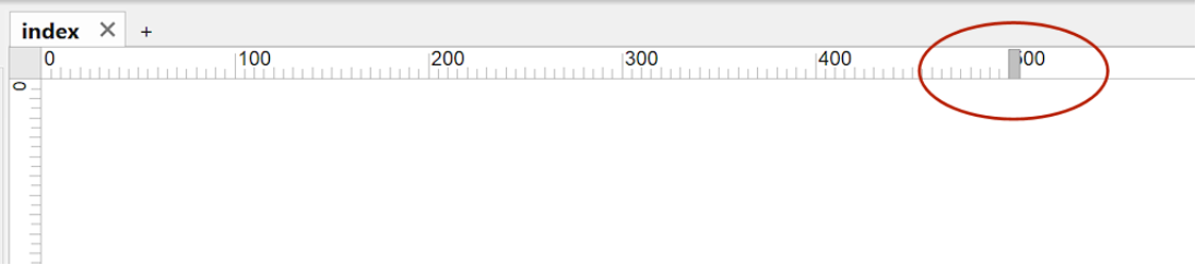
Rulers
Rulers display the horizontal and vertical measurements of the page and help you accurately position and align objects within the workspace. You can use them as a visual guide to place elements at exact coordinates and maintain consistent spacing in your design.
This is especially useful in fixed or absolute layouts, where objects can be positioned freely. They may be less useful in flexible layouts, where object sizes and positions are controlled by the grid or containers.
Note: You can quickly change the width of the page by dragging the resize handle on the horizontal ruler at the top of the workspace.
Choosing what type of layout to use (flexible vs absolute)
WYSIWYG Web Builder supports several layout modes.
Fixed/absolute layouts
By default layouts are fixed using absolute positions. This means that you can place objects anywhere you like, so you have complete control over the layout. The downside of this layout mode is that it will be harder to make the page responsive because the layout will only look perfect on the screen size it was designed for. To make sure the layout also looks good on smaller screens you will have to implement breakpoints.
Related tutorials:
https://wysiwygwebbuilder.com/responsivewebdesign.html
https://wysiwygwebbuilder.com/rwd_basics.html
Related FAQ:
https://forum.wysiwygwebbuilder.com/viewtopic.php?f=10&t=63817
Flexible/floating layout
You can implement flexible layouts by using Layout Grids. This make it possible to create Bootstrap-like layouts. When using layout grids, the layout is controlled by the grids. Objects will automatically resize based on the available space in the viewport and the grid column size.
The downside of using layout grids is that you have less control over the layout. All objects will be positioned and resized automatically. So you are forced into a structured layouts.
Related tutorials:
https://wysiwygwebbuilder.com/layoutgrid_part1.html
https://wysiwygwebbuilder.com/layoutgrid_part2.html
https://wysiwygwebbuilder.com/layoutgrid_advanced.html
Related FAQ:
https://forum.wysiwygwebbuilder.com/viewtopic.php?f=10&t=71391