Responsive Web Design - Design Techniques
WYSIWYG Web Builder supports several ways to create responsive web sites and make your website "mobile friendly".
So, what is the best way? There is not really a 'best way', it depends on your personal (or your customer's) preference.
For example, do you want to have full control over the layout or do you want objects to automatically scale?
So, what is the best way? There is not really a 'best way', it depends on your personal (or your customer's) preference.
For example, do you want to have full control over the layout or do you want objects to automatically scale?
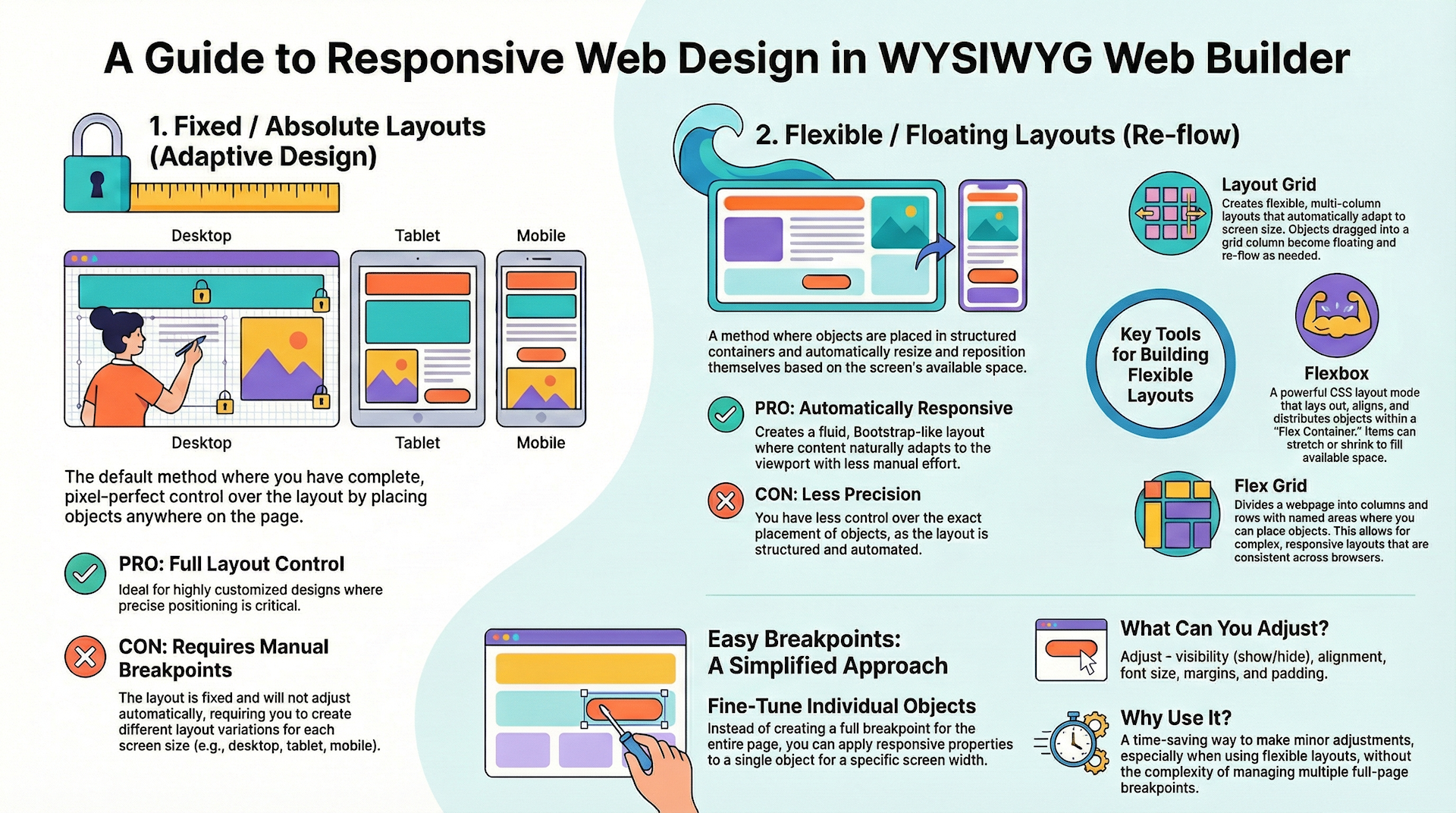
Fixed / Absolute Layouts (Adaptive Web Design)
By default layouts are fixed using absolute positions. This means that you can place objects anywhere you like, so you have complete control over the layout. The downside of this layout mode is that it will be harder to make the page responsive because the layout will only look perfect on the screen size it was designed for. And because there is no 'structure' in the layout (objects can be placed anywhere in random order), there is no way for the browser to automatically re-position and/or scale the content based on the view port.
So, to make sure the page content look good for different viewports/screen sizes, you will have to implement breakpoints (different layout variations) of the same page. This design technique is also known as "Adaptive Web Design".
So, to make sure the page content look good for different viewports/screen sizes, you will have to implement breakpoints (different layout variations) of the same page. This design technique is also known as "Adaptive Web Design".
Example
In the image provided below, you will see an illustration of a fixed/absolute layout design. This design allows for objects to be positioned with a high degree of freedom, enabling them to seamlessly overlap one another.

Note
If you already created a website in a previous version of WWB and do not want to redo all your work then adding breakpoints is probably the quickest way to make your website(s) responsive.
For websites with a lot of text, it may become difficult to maintain the pages when using 'fixed' layout because text is not always rendered the same way in different browsers. See also: https://forum.wysiwygwebbuilder.com/viewtopic.php?f=10&t=34318
Related tutorials:
https://wysiwygwebbuilder.com/responsivewebdesign.html
https://wysiwygwebbuilder.com/rwd_basics.html
Related FAQ:
https://forum.wysiwygwebbuilder.com/viewtopic.php?f=10&t=63817
https://wysiwygwebbuilder.com/responsivewebdesign.html
https://wysiwygwebbuilder.com/rwd_basics.html
Related FAQ:
https://forum.wysiwygwebbuilder.com/viewtopic.php?f=10&t=63817
Flexible / Floating Layouts (Re-flow)
You can implement flexible layouts by using Layout Grids and/or Flexbox. This makes it possible to create Bootstrap-like layouts. When using layout grids, the layout is controlled by the grids. Objects will automatically resize based on the available space in the viewport and the grid column size. The downside of using layout grids is that you have less control over the layout. All objects will be positioned and resized automatically. So, you are forced into a structured layout.
Example
In the image shown below, you'll find an illustration of a flexible layout design implemented with layout grids. In this design, all objects are floating, arranged in rows.
Note
If your pages have a lot of text then this is probably the best option because the text will be flexible, so it will automatically adjust to the available space.
If your pages have a lot of text then this is probably the best option because the text will be flexible, so it will automatically adjust to the available space.
Related tutorials:
https://www.wysiwygwebbuilder.com/layoutgrid_part1.html
https://www.wysiwygwebbuilder.com/layoutgrid_part2.html
https://www.wysiwygwebbuilder.com/layoutgrid_advanced.html
https://www.wysiwygwebbuilder.com/flexbox.html
Related FAQ:
https://forum.wysiwygwebbuilder.com/viewtopic.php?f=10&t=71391
https://www.wysiwygwebbuilder.com/layoutgrid_part1.html
https://www.wysiwygwebbuilder.com/layoutgrid_part2.html
https://www.wysiwygwebbuilder.com/layoutgrid_advanced.html
https://www.wysiwygwebbuilder.com/flexbox.html
Related FAQ:
https://forum.wysiwygwebbuilder.com/viewtopic.php?f=10&t=71391
Flex Grid
The Flex Grid is a new way of creating flexible layouts based on CSS Grid Layout. The CSS grid layout allows web developers to create complex responsive web layouts more easily and consistently across browsers.
The idea behind the Flex Grid is to divide a web page into columns and rows. The columns and rows have named areas where you can drag & drop objects to. The layout can be different in breakpoints. Each grid area supports its own padding, (flexbox) alignment, border and background styling.
The idea behind the Flex Grid is to divide a web page into columns and rows. The columns and rows have named areas where you can drag & drop objects to. The layout can be different in breakpoints. Each grid area supports its own padding, (flexbox) alignment, border and background styling.
Example
In the image shown below, you'll find an illustration of a website created with a flex grid. The position of the objects is controlled by the grid layout.