Responsive Web Design - Tools
Generally, there are two methods to create responsive websites:
- fixed / absolute layouts, where you can place objects anywhere you want. To make the layout responsive you will have to create multiple variants of the page by adding breakpoints and re-arranging the objects.
- flexible layouts, where the layout is controlled by layout grids or flexbox, so they automatically adjust to the screen size.
For more details about the main differences between the layout modes please see this related tutorial:
https://www.wysiwygwebbuilder.com/layout_modes.html
WYSIWYG Web Builder is packed with tools to create modern responsive web sites.
This tutorial gives an overview of the available tools that can be useful when creating fixed/absolute layouts with breakpoints.
If you are not yet familiar with breakpoints then it's recommended to read this tutorial first:
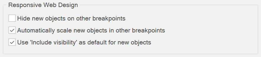
Automatically scale new objects in other breakpoints
This option is available in Tools -> Options -> General
Normally, when you insert a new object, it will be inserted at the same position and with the same size as the default view.
If the option 'Automatically scale new objects in other breakpoints' is enabled, new objects will automatically scale and reposition in other breakpoints relative to the breakpoint size. It will also scale the font size of some objects when possible. This may speed up the implementation of responsive layouts.
If the option 'Automatically scale new objects in other breakpoints' is enabled, new objects will automatically scale and reposition in other breakpoints relative to the breakpoint size. It will also scale the font size of some objects when possible. This may speed up the implementation of responsive layouts.
Notes
This option was mainly designed for fixed/absolute layouts. When you use layout grids or flex box the layout is flexible based on width of the browser window. Also, if you do not want the text to scale automatically, you can disable this option. The font-size of the Text object can only be scaled when 'Enable responsive fonts' is enabled
This option was mainly designed for fixed/absolute layouts. When you use layout grids or flex box the layout is flexible based on width of the browser window. Also, if you do not want the text to scale automatically, you can disable this option. The font-size of the Text object can only be scaled when 'Enable responsive fonts' is enabled
Hide new objects on other breakpoints
This option is available in Tools -> Options -> General
When this option is enabled then new objects will be set invisible in other breakpoints. This may be useful if you do not want to affect the layout of other breakpoints and just want to add an object in the current view. You can use the Object Manager to make the object visible in other breakpoints.
When this option is enabled then new objects will be set invisible in other breakpoints. This may be useful if you do not want to affect the layout of other breakpoints and just want to add an object in the current view. You can use the Object Manager to make the object visible in other breakpoints.
Keep inline styles with Responsive Web Design
This option is available in Tools -> Options -> General
When using Responsive Design Design/breakpoints, the application will move all inline styles of objects to the <style> section in the header of the page. This makes it possible to use CSS3 media queries to control the position, size and visibility of objects for different breakpoints. However, in some cases this may effect the behavior of an object or extension. If you enable this option then the application will not touch inline styles, but add !important to overwrite the position, size and visibility of objects with media queries.
Note: If you are not an advanced user then it's recommended to keep this option unchecked!
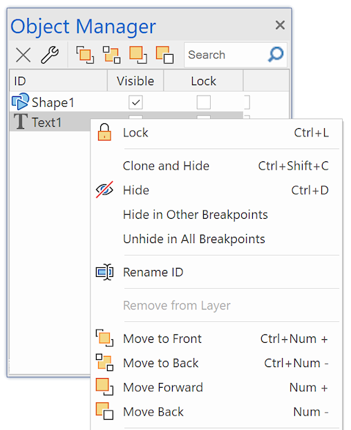
Clone and Hide (Object Manager context menu)
'Clone and Hide' can be useful if you want to create a copy of an object and hide the original object. For example, if an object is not responsive and it needs different properties in another breakpoint.
See also 'Which objects are not responsive?'
https://forum.wysiwygwebbuilder.com/viewtopic.php?f=10&t=63817
See also 'Which objects are not responsive?'
https://forum.wysiwygwebbuilder.com/viewtopic.php?f=10&t=63817
Hide in other breakpoints (Object Manager context menu)
Hide the selected object in other breakpoints (but not in the current view) .
Unhide in all breakpoints (Object Manager context menu)
Unhide the selected object in all breakpoints (including the current view) .
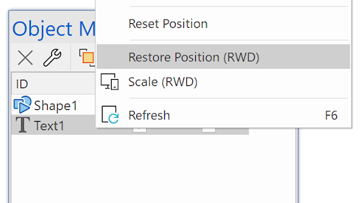
Reset position (Object Manager context menu)
This option can be useful in breakpoints when you have ‘lost’ an object because it’s outside the viewport. ‘Reset Position’ moves the object to the upper left corner of its container.
Restore position (Object Manager context menu)
This option resets the size and position of the selected object so it is the same as in the Default viewport.
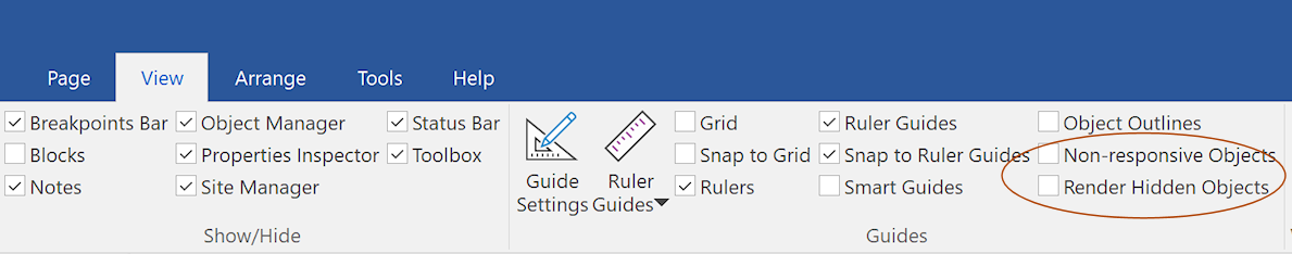
Non-responsive objects (View menu)
Enable this option to outline objects that are not responsive. This may be helpful for Responsive Web Design, so you can either change the object's properties to make it responsive or use 'Clone and Hide' to create a new instance of the object.
Render hidden objects (View menu)
This option may be useful to trace layout problems caused by hidden objects. Note that hidden objects cannot be edited., so you will first have to unhide the object (with the Object Manager) to make changes.
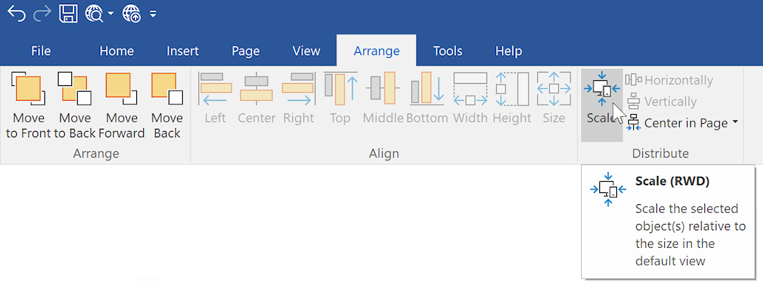
Scale (Arrange Menu and Object Manager Context Menu)
If you create a new breakpoint then sometimes it can be a lot of work to scale and reposition objects for smaller (or larger) viewports. The Scale tool may be useful for optimizing the layout in breakpoints. Basically it takes the size and position of the selected object(s) on the default view and scales it to the current breakpoint width.
Example:
Let's say the default view is 960 pixels and you are now working on the 480 breakpoint. This makes the scale factor 2, so using the Scale tool will make the object 50% smaller. By default, only the left and width (horizontal) properties will be affected. But if you hold down the SHIFT key while pressing the 'Scale' option then it will also update the top and height (vertical) properties.
Notes about scaling
This is an experimental tool and it may not be useful for all layouts types. For example, objects that are part of a layout grid will not be scaled because the layout grid controls the size and position of the object!
The Scale tool is only intended as a first step in creating a new breakpoint layout. In most cases you will still have to fine tune the layout. Remember that Response web design is not just about scaling objects so they fit on a smaller screen....
Non-responsive objects will not be scaled. Tip: set all shapes, banners to 'publish as CSS3' so they are responsive.
If you scale a form or layer then the child elements on will also be scaled.
Some objects cannot become smaller than their content. For example, text, tables and menus.
If you scale a text object with responsive fonts then the font will also be scaled. For other text objects the width of the object will be scaled but the height may increase because otherwise the text will no longer fit inside the container.
The Scale tool is only active in breakpoints, because in the default view the scaling factor would always be 1.
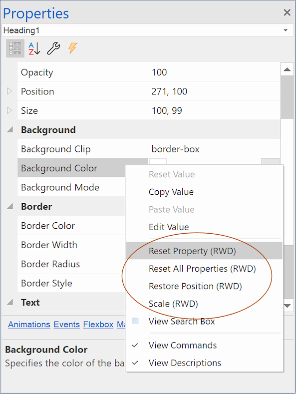
Reset Property (Property Inspector context menu)
Reset the selected property to the value of the default view, so will be the same across all breakpoints.
Reset All Properties (Property Inspector context menu)
Reset all responsive properties of the object to the values of the default view.
How to apply padding or margin to all breakpoints?
When setting Margins or Padding via the Arrange or context menu, holding Shift when clicking OK applies the settings to all breakpoints. Also, when setting Margins, Padding or font-size for Card Items, holding Shift when clicking OK applies the settings to all breakpoints.
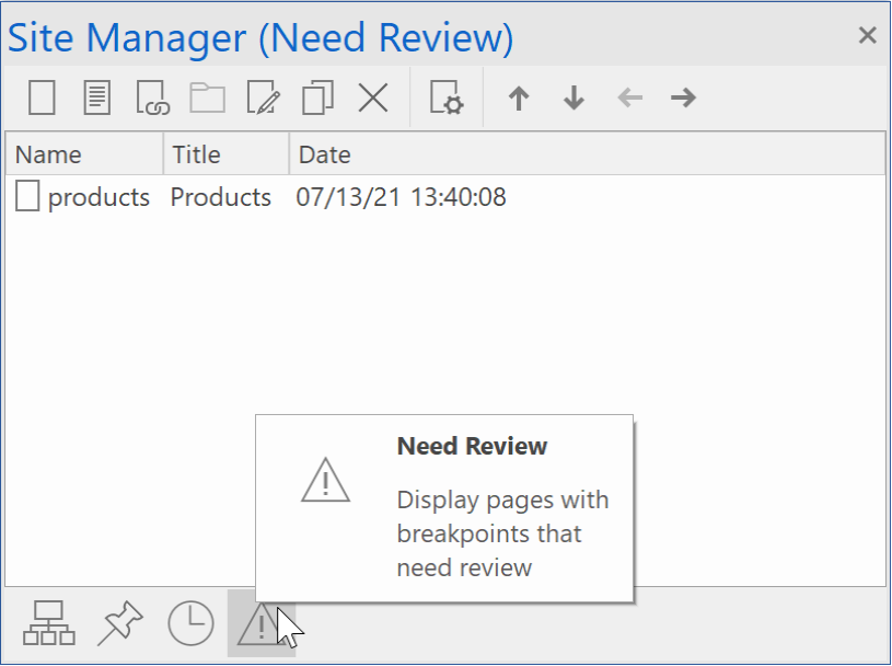
"Needs Review" functionality
When you design your website for different screen sizes, changes you make in one size can impact how it looks in others. For instance, adding something new might require adjusting its size or position in other views. WYSIWYG Web Builder has a 'needs review' icon to remind you of this. When you switch to a different screen size, it clears the 'needs review' reminder.
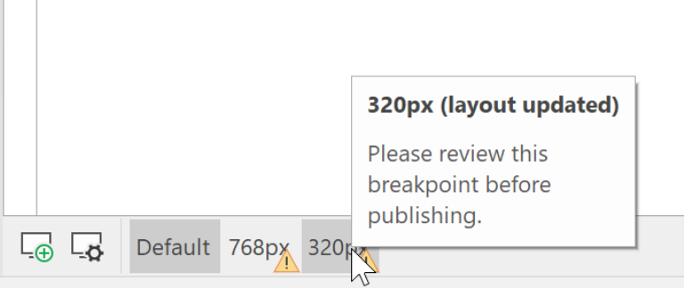
There is also a 'Need Review' section in the Site Manager. This displays a list of responsive pages where breakpoints need to be reviewed due to changes to the page or master page.