Form Input Fields
WYSIWYG Web Builder has many different type of form input fields. These fields should be placed inside a form area or a layout grid configured as a form.This tutorial will give you an overview of the available form input fields. The properties of these eleements are documented in the help. To learn more about creating a form, please see this related tutorial: Creating a Form
Button
The button can be used as submit or reset button on a form.
A form should at least have submit button to submit/send the data to the server.
A form should at least have submit button to submit/send the data to the server.
Editbox
Single-line field that can be used to add name/e-mail address fields to a form.
Editbox with floating label
With floating labels, you can insert the label inside the input field, and make it float/animate when you click on the input field.

Text Area
A Text Area is a multi-line form field where the user can enter large amounts of text.
Checkbox
Checkboxes are on/off switches that may be toggled by the user.
Use Check boxes if want to allow more than one item on a form to be selected.
Use Check boxes if want to allow more than one item on a form to be selected.
Radio Button
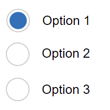
Radio buttons are like checkboxes except that when several share the same name, they are mutually exclusive: when one is switched "on", all others with the same name are switched "off".
Combobox
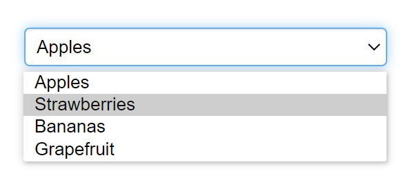
This form control can be used to allow users to make a selection from a number of different options.
File Upload
This provides a means for users to attach a file to the contents of the form. By itself, the File Upload object does nothing, except for providing a way to select a file. To process the submitted data you will need a script at the server side. For example, the built-in form processor script.
Flip Switch
A "Flip Switch" (also known as Toggle switch) can be used as alternative for a checkbox. Inspired by the iPhone checkbox.
Label
The HTML Label Element (<label>) represents a caption for an item in a form (editbox, textarea, combobox, checkbox, radio button, file upload). The <label> element provides a usability improvement for mouse users, because if the user clicks on the text within the <label> element, it toggles the control. Screen readers and 'voice browsers' use the label to identify and use form inputs.
Range
The 'Range' object implements a slider-like control for entering numbers. It can be used as a value input field in forms. You can set a min and max value and steps to define the number intervals. The object also supports events and conditions. With conditions, the range can be linked with another input field, for example an editbox to display the selected value.
Date Picker
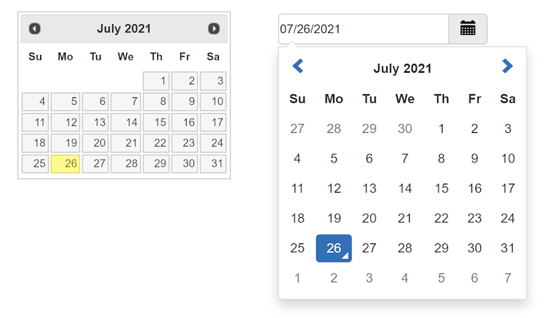
DatePicker offers a sophisticated and feature-rich UI component for inputting dates into a form.
The object provides a graphical calendar that pops up if you click inside the input (editbox) field.
The object provides a graphical calendar that pops up if you click inside the input (editbox) field.
Captcha
The CAPTCHA object was designed to work in combination with (PHP) forms. It helps to stop spammers from submitting form data automatically. The letters, because they're part of an image and not text, are difficult for a spambot or other computer program to read. Yet, a person has little trouble reading the letters in a captcha image.
There is also built-in support for third party solutions like reCAPTCHA v2, reCAPTCHA v3 and hCAPTCHA.
There is also built-in support for third party solutions like reCAPTCHA v2, reCAPTCHA v3 and hCAPTCHA.
Events
Most form input elements support events. This may be useful to override default keyboard or mouse behaviour.
More information about events is available in this tutorial: Events
More information about events is available in this tutorial: Events
Conditions and calculations
Form conditions make it possible to show/hide/enable/disable other objects based on the value or selection of a form input field.
For example, you can disable the form's submit button until the user checks a box. It is also possible to do calculations in form fields. Calculations are available in the 'Conditions' section of input fields.
More information about conditions and calculations is available in this tutorial: Form Conditions and Calculations
Validation
The validation tools can be used to validate user input. For example, to make sure the user has enter a valid value or the field is not empty. More information about form validation s available in this tutorial: Form Validation


