An introduction to the Layout Grid - Part 2
This is the second part of the layout grid tutorial. See also: An introduction to the Layout Grid - Part 1
In this tutorial, we will create a simple responsive page layout with three main sections:
- a header with a heading
- a content area with three columns
- a footer with copyright text and social media icons
Each section will use its own Layout Grid, so the page can automatically adapt to smaller screen sizes.
Adding the header
Optionally, set a background color, image, or gradient for the grid.
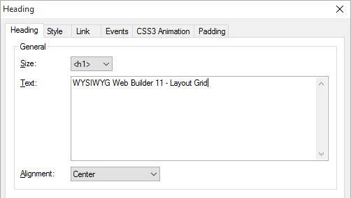
Add a Heading object and drag it into the grid. To create extra spacing around the heading, set the heading’s margin to 10.

Objects inside a column are displayed in the order they are added. You can change this order later with the Arrange tools.
Adding content
Insert another Layout Grid. This grid will be used for the main content area.
Note that the grid will automatically be positioned below the first grid.
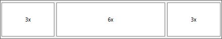
Set the column count to 3:
- Column 1: menu
- Column 2: text
- Column 3: image

Adding a footer
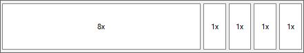
Set the column count to 5. Use the first column for copyright text or other footer information. Use the remaining four columns for the social media icons.
This makes it easy to align the text and icons horizontally on larger screens, while still allowing them to stack on smaller screens.

Testing the responsive behavior
The Layout Grids will scale with the available width. When the browser window becomes smaller than the grid’s breakpoint, the columns will stack vertically.
Each Layout Grid can have its own breakpoint, so the header, content area, and footer can each respond differently if needed.


In this tutorial, you created a responsive page layout using three Layout Grids:
- a one-column grid for the header
- a three-column grid for the main content
- a five-column grid for the footer
You also learned that Layout Grids are positioned automatically in the page flow and that their columns can stack vertically at smaller screen widths.
You can view a live demo here:
http://www.wysiwygwebbuilder.com/support/layoutgrid
Download the demo project:
http://www.wysiwygwebbuilder.com/support/layoutgrid/layoutgrid.zip
Examples
https://www.wysiwygwebbuilder.com/templates.html
Frequently Asked Questions
See: Layout Grid FAQ
Related Tutorials
Responsive Web Design in WYSIWYG Web Builder
Create a responsive website with floating layers
Mobile Web Design in WYSIWYG Web Builder
Responsive Web Design FAQ (must read!)
How to use Master Frames with Layout Grids?