An introduction to the Layout Grid - Part 1
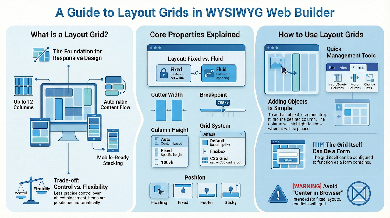
A Layout Grid is a flexible container: you place objects inside columns, and the grid controls how those objects resize, align, and stack on different screen sizes.
The layout grid in WYSIWYG Web Builder helps you quickly design responsive web pages with multiple columns. Each grid can have up to 12 columns, sized by percentage, to adapt across screen sizes. Objects placed in the grid automatically adjust to fit side-by-side if space allows, and wrap to a new row if they don’t. Certain elements, like images or text, can span the entire width of the grid, stretching or shrinking with screen size. On smaller screens, all columns stack vertically based on set breakpoints, making it easy to create flexible, mobile-friendly layouts like those in Bootstrap.
The layout grid in WYSIWYG Web Builder helps you quickly design responsive web pages with multiple columns. Each grid can have up to 12 columns, sized by percentage, to adapt across screen sizes. Objects placed in the grid automatically adjust to fit side-by-side if space allows, and wrap to a new row if they don’t. Certain elements, like images or text, can span the entire width of the grid, stretching or shrinking with screen size. On smaller screens, all columns stack vertically based on set breakpoints, making it easy to create flexible, mobile-friendly layouts like those in Bootstrap.
Notes
A Layout Grid works differently from an absolute or fixed layout. You cannot freely drag objects to any position on the page, because their position is controlled by the grid structure and the normal page flow.
You also cannot manually set the size or position of the Layout Grid itself. Its height is determined by the content inside it, and it will appear directly after the previous floating object on the page.
Do not use Center in browser window together with Layout Grids. That option is intended for fixed-position content only.
To learn more about the difference between fixed and flexible layouts, see the tutorial Responsive Web Design – Design Techniques.
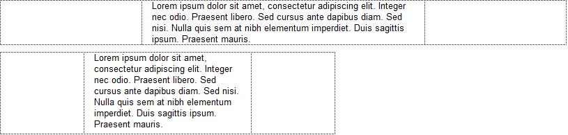
Desktop layout:

Mobile layout:

Key Concepts
Before working with Layout Grids, it helps to understand a few important layout terms:
Fixed layout
Objects have a fixed size and position. They do not automatically adapt to different screen sizes.
Flexible layout
Objects can resize or reposition themselves based on the available screen width.
Floating layout
Objects are placed in the normal page flow. This means each Layout Grid appears directly after the previous floating object on the page.
Full width
The object stretches across the full width of the browser window.
Breakpoint
A screen width where the layout changes. For example, columns may stack vertically on smaller screens.
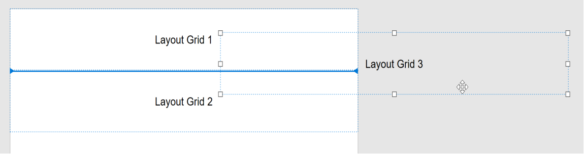
Managing columns
Once a Layout Grid has been added to the page, you can control its structure by adding, removing, resizing, and aligning columns.
To insert an extra column, click the 'Add' button. The width of the columns can be adjusted by dragging the handles between the columns. To remove a column, first select it and then click 'Remove'. It's also possible to remove a column by dragging the right handle of a column to the right.
To insert an extra column, click the 'Add' button. The width of the columns can be adjusted by dragging the handles between the columns. To remove a column, first select it and then click 'Remove'. It's also possible to remove a column by dragging the right handle of a column to the right.

Each column can have its own alignment. To change the alignment, first click the column and then select the alignment.
Note that the vertical alignment can only be set when the Grid System is set to 'flexbox'.
Edit
To change the style properties of the select grid column, click the Style button.
Here you can set background color, image, gradient, borders and padding. These settings can be different for each column!
Order
The order property can be used to control the display order of the columns. This can be useful to define a different column order in breakpoints.
The value should be a number. For example: 1, 2 etc
The default value is <empty> which means the column will use the normal order. If you set the order of one column then make sure all other columns also have a valid order value (in all breakpoints) otherwise the behavior of the grid may be undefined.
Note:
The order property is only available if the grid system is set to flexbox or css grid.
Fixed width
This option makes it possible to give one or more grid columns a fixed width (in pixels). This property is responsive so it can be different in breakpoints.
This option makes it possible to give one or more grid columns a fixed width (in pixels). This property is responsive so it can be different in breakpoints.
Grid System
The "grid system" option selects the layout framework for responsive, flexible content alignment.
· Default
This will use a Bootstrap-like grid. This grid is compatible with all modern browsers.
· Flexbox
When this option is enabled, the grid will use CSS flexbox layout. This results in cleaner code and also enables some extra features like vertical alignment and entire column will be filled with the background.
Note that this is a relative new CSS feature, it is not supported by older browsers (< IE11). http://caniuse.com/#feat=flexbox
· CSS Grid
This will use CSS's native Grid Layout. Note that this is only supported by modern browser. It is not supported by Internet Explorer and older mobile browsers! https://caniuse.com/#search=grid%20layout
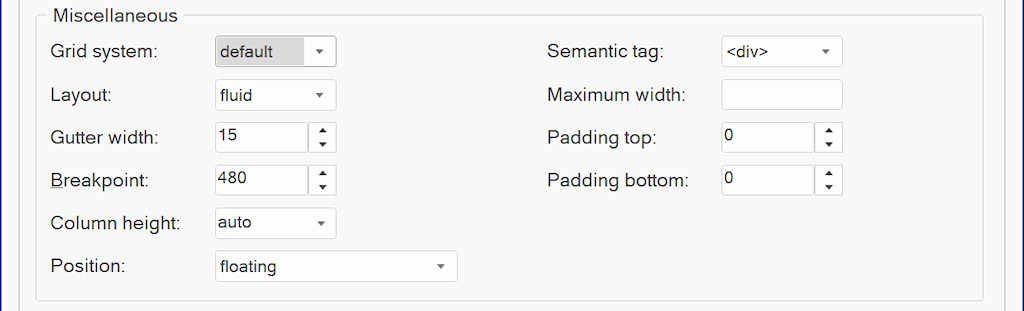
Gutter Width
The gutter width specifies the spacing on each side (left/right) of a column.
Padding
Padding (top/bottom) can be use to create spacing at the top or bottom of the layout grid.
Semantic HTML5
Specifies whether to use semantic HTML5 tags instead of generic <div>. Available options: <article>, <aside>, <footer>, <header>, <nav>, <section>.
Position
The position of a layout grid can either be floating (default) or fixed. When fixed, the layout grid will be fixed to the top of the page (like a header). This can be useful to create a page header which is always visible.
Breakpoint
The breakpoint specifies at which viewport width the layout will be switched to mobile/stacked layout.
Column Height
The column height specifies whether the height of the grid columns is variable, fixed or full screen.
- auto, the column height depends on the content inside the grid.
- fixed , the column height is fixed. If the column has a background then the entire column will be filled.
- 100vh , the column height is 100% of the viewport height (full screen).
Maximum Width
Specifies the maximum width of the layout grid's content in the browser window. This can be useful to prevent items from being stretched too wide. If the browser window is wider than the specified width then the grid content will be centered.
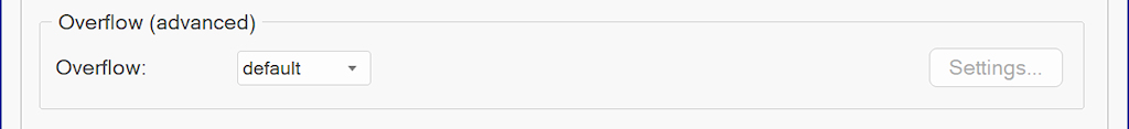
Overflow
Overflow can be used to change the number of columns in breakpoints. This option is for advanced users and has a dedicated tutorial:
Advanced Layout Grid Features
Advanced Layout Grid Features
Adding objects
After setting up the columns, you can drag objects into the grid. The behavior of each object depends on whether it is fixed-size or flexible.
To add objects to the layout grid, simply drag & drop the object inside a column. The column will highlight to indicate where the object will be added. Note that the mouse cursor needs to be inside the column.
To add objects to the layout grid, simply drag & drop the object inside a column. The column will highlight to indicate where the object will be added. Note that the mouse cursor needs to be inside the column.

Objects that are part of the layout grid will no longer have a fixed position. They will be 'floating' inside the column.
Adding text
When text is added to the layout grid, it will automatically use the full width of the column. So if you resize the width of the page, the text will dynamically adjust.
Adding images
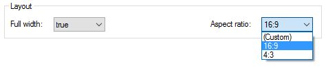
Images that are part of a grid can either be responsive (adjust to the size of the column) or have fixed size. This can be configured with the
"Full width' option in the Image properties. Note that this option is only available if the image is part of a Layout Grid!
"Full width' option in the Image properties. Note that this option is only available if the image is part of a Layout Grid!

Maximum width specifies the maximum size of the image when it is set to full width. This prevents the image from getting too large in responsive layouts.
Note: the Full Width option is also available for the Rollover Image and SlideShow.
Note: the Full Width option is also available for the Rollover Image and SlideShow.
Adding video (YouTube/Vimeo/HTML5)
Just like images, videos can also be responsive or have fixed size. However unlike images, the browser cannot automatically determine the aspect ratio of the video. By specifying the aspect ratio in Web Builder, the video will be responsive while maintaining a certain aspect ratio!
Adding other objects
Different objects have different behavior in the layout grid. Some objects are flexible, so they use the full width of a column while others have a fixed size (not affected by the column width).
Examples of 'flexible' objects:
• Text
• Photo Gallery
• Horizontal Line
• Inline Frame
• Blog
• Form input fields, such as Editbox, Combobox, and Text Area
• Login forms
• News Feed Ticker
Examples of 'fixed' objects:
• Shapes and other drawing tools
• Buttons
• Navigation objects
Some objects cannot be part of a layout grid because they conflict with the flexible behavior of the grid.
For example, Layers and standard Forms cannot be placed inside a Layout Grid because they are fixed/absolute containers.
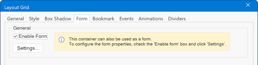
Using a Layout Grid as a form
A standard Form object uses a fixed/absolute layout, so it cannot be placed inside a Layout Grid. Instead, enable form functionality on the Layout Grid itself. This lets you build responsive forms while still using the same form-processing features.
You can also use the Form Wizard to create flexible forms using layout grids.
You can also use the Form Wizard to create flexible forms using layout grids.
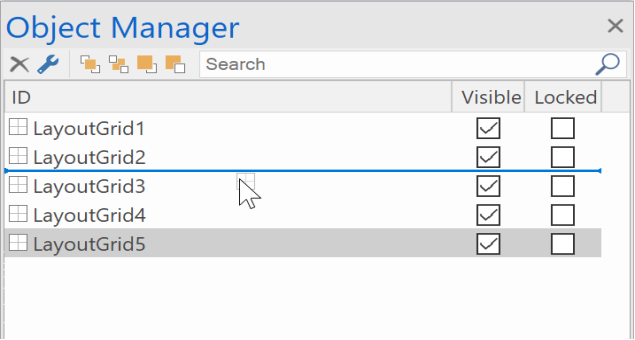
Reordering Layout Grids and Objects
The position of Layout Grids is determined by their order on the page. A grid that appears later in the page structure will be displayed below the previous floating grid.
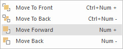
You can use the Arrange tools (Move forward/ Move backwards) to rearrange Layout Grid.
The arrange tools are available in the Object Manager, Menus/Ribbon and in the context menu (right click). You can also use the '+' and '-' keys on the numeric keypad.
You can also use this to re-arrange the objects inside the grid.
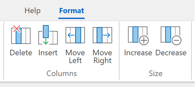
Layout Grid Management Tools
When you select a Layout Grid in the workspace, the Ribbon will display a dedicated 'Format' context tab to quickly modify properties of the Layout Grid, like background, border and arrange tools (move up, move down, move to top, move to bottom).
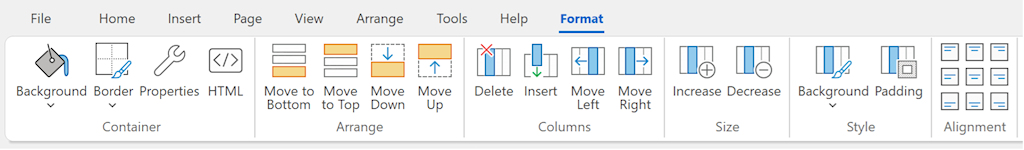
Style
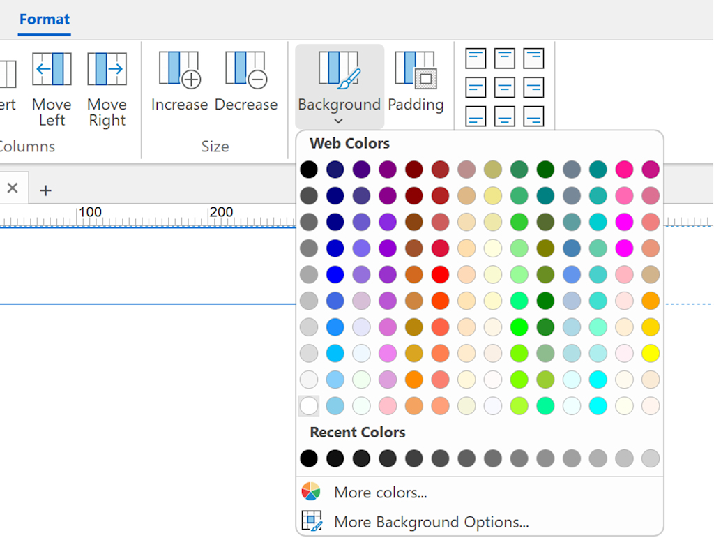
Set the background, alignment, and padding of the selected Layout Grid column directly from the Ribbon or menu.
This eliminates the need to first open the Layout Grid properties, select the column, and then click "Style".
Set the background, alignment, and padding of the selected Layout Grid column directly from the Ribbon or menu.
This eliminates the need to first open the Layout Grid properties, select the column, and then click "Style".
Delete
Quickly remove the selected Layout Grid column (including the content).
Insert
Quickly insert a new Layout Grid column.
Move Left / Move Right
Quickly change the order of Layout Grid columns (including the content).
Increase / Decrease
Quickly change the size of the selected column.
Quickly remove the selected Layout Grid column (including the content).
Insert
Quickly insert a new Layout Grid column.
Move Left / Move Right
Quickly change the order of Layout Grid columns (including the content).
Increase / Decrease
Quickly change the size of the selected column.